Lucy Campbell and Barbara Opar, column editors
Column by Kara Conley, Syracuse University
On March 29th of this year, the King + King Architecture Library at Syracuse University celebrated its grand reopening after a substantial makeover. The renovation represents a shift toward a library design that (1) accommodates the ever-changing information needs of students and faculty members and (2) allows the library to further strengthen its relationship with the School of Architecture through instruction, outreach, and research.
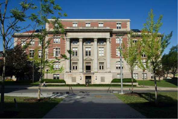
Slocum Hall, home to the King + King Architecture Library.
The King + King Architecture Library is located in Slocum Hall, a five-story Beaux Arts building that is home to Syracuse’s School of Architecture (SOA). Since 2008, the library has been located in a high-traffic area on the third floor of Slocum next to the building’s design studios. It consists of three adjoining rooms that were originally used as classrooms and faculty offices. Although space is limited, it is a welcoming and light-filled environment. Visitors enter the library in the middle of the three adjoining rooms. Historically, this room has been utilized for circulation, course reserves, current periodicals, and computers for student and faculty use. This has remained the same post-renovation. While the design team did not change the function of the room, they implemented a number of changes to the room’s layout that have enhanced the accessibility and usability of the space.
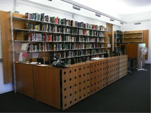
The circulation desk before the renovation. The Architectural Librarian’s cubicle in the back corner of the room.
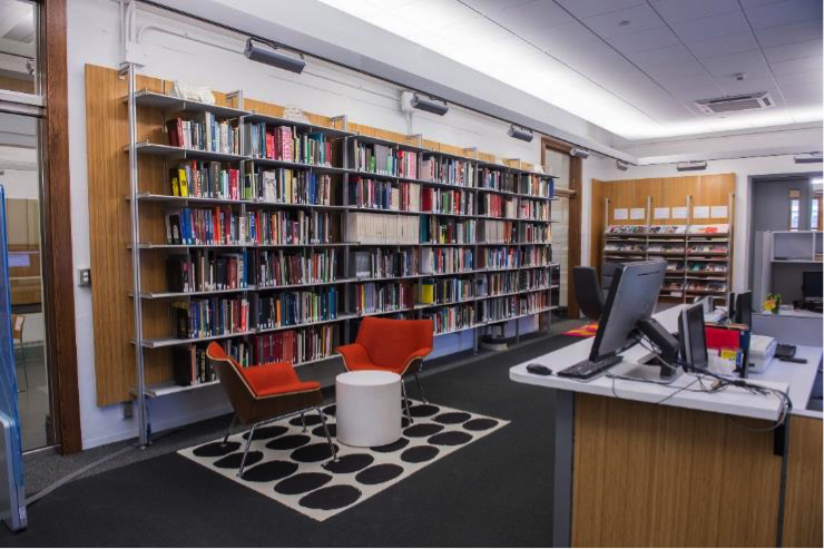
The first of these changes revolved around the circulation desk. Prior to the renovation, the circulation desk was one long wooden counter that took up a large swath of the room. At the end of the circulation desk stood a cubicle which served as the work station for Barbara Opar, the University’s Architecture Librarian. The room’s redesign (largely based on the results of a charrette) condensed the size of the circulation desk and moved it to the opposite side of the room. It is now the very first thing visitors see when they walk through the doors of the library. Students and faculty members can approach the desk to talk to a student support staff member or use a computer with the library’s catalog to search for items. As for Barbara’s desk, it has also been moved to the same side of the room as the circulation desk. She is no longer required to sit in an isolated corner. Instead, her desk is an open cubicle that has a side table with extra chairs for research consultations, reference transactions, and small meetings. These changes, albeit small, are impactful. There is now a logical flow of movement from the entrance of the library to the circulation desk, which improves the information search and retrieval process as a whole.

A second impactful design choice in this room was the decision to keep the library’s essential architecture texts in their original location, rather than moving them behind the new circulation desk. Now, students, faculty, and staff members are welcome to leisurely browse and access the materials. These items circulate for two-hour loans. This decision to “open” the materials reflects the findings of a recent study of architecture faculty in the United States (Campbell, 2017). The study found that architecture faculty members are “frequently looking for inspiration or current trends” when seeking information (Campbell, 2017). By placing the essential texts and current periodicals in an open and accessible location, the library invites faculty members to fulfill their need for relevant and significant materials.
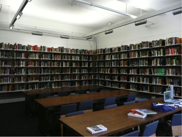
One of the reading rooms prior to renovation.
Before the renovation, the second and third rooms in the King + King Architecture Library contained mostly physical items. One room housed the working drawings collection and the library’s circulating physical materials collection. The other room contained massive wooden tables for studying. Its exterior walls were lined with shelves chock full of books. The space was overcrowded, to say the least.
To open up the space, Barbara worked directly with architecture faculty members to condense the collection and move a number of “non-essential” books to Bird Library, Syracuse University’s art, humanities, and social sciences library. Secondly, the design team decided to move the bulk of the library’s physical materials collection to the Digital Fabrication Lab in the basement of Slocum Hall. The renovation also helped jumpstart a project that had been in the planning stages for years: the digitization of the library’s working drawings collection. The majority of the drawings were shipped to the main library where they are awaiting digitization. That being said, the library did retain a number of drawings that are frequently used by architecture faculty members in their courses.
The new seminar room after renovations.
Today, the space is filled with flexible furniture that can be repositioned depending on its use. Shelves of course reserves and select bound periodical runs line the walls of the rooms, but there is significantly more space than before. On one wall, the shelves have been replaced with two large smart TVs that enhance the technological capability of the library. These changes have allowed the library to better serve the diverse information needs of its users. Students, for example, now have more space to study independently or collaboratively. Faculty members can now conduct lessons in the library with differentiated learning activities. Barbara Opar can now expand her instruction and outreach responsibilities with interactive thesis seminars and instructional sessions. These examples represent a few of the many expanded educational opportunities for the SOA community. Over time, I believe that the design changes will help the King + King Architecture library create strategic and long-lasting partnerships with SOA faculty and students, especially in the areas of instruction, research, and outreach.
Ultimately, the renovation has created a dynamic and flexible space that will be utilized by the School of Architecture at Syracuse University for years to come. If you’re ever in Syracuse, please feel free to stop by King + King Architecture Library on the third floor of Slocum Hall to see the transformation with your own eyes.
The renovations were made possible thanks to a generous donation from the King family in honor of the 150th anniversary of King + King Architecture. King + King Architecture is a Syracuse-based firm that is the oldest architectural firm in continuous practice in New York State.
Sources: Campbell, L. (2017). The information-seeking habits of architecture faculty. College & Research Libraries, 78(6), 761. Retrieved from https://crl.acrl.org/index.php/crl/article/view/16734/18244

 Study Architecture
  ProPEL


