AASL Column, February 2018
Column by Lucy Campbell and Kaegan Cusenbary, NewSchool of Architecture and Design
Across the United States, campuses are pouring money into library renovations. From gyms to cafes to makerspaces, we see growing efforts to keep libraries relevant as students diversify their information sources. These updates are sparked by the changing needs of students and the shifting definitions of academic libraries. As explored in Library Buildings 2017, “libraries these days are no longer quiet bastions filled with books, if they ever were only that. Libraries today offer beautiful and comfortable common spaces, up-to-the-minute technology…and elegant overall design that makes these institutions anchors in their communities” (p.5). As community hubs, academic libraries can provide spaces that foster creativity and innovation in support of their institution’s educational goals and mission.
The mission of NewSchool of Architecture and Design is to nurture and inspire design-minded students. It endeavors to be a vibrant educational setting where the academic community finds meaning and inspiration in the pursuit of professional goals. However as a downtown school of 500 architecture, design, and construction management students, with a library of just 2,200 square feet, space is at a premium. Although we knew our library needed attention, we recognized its limitations.
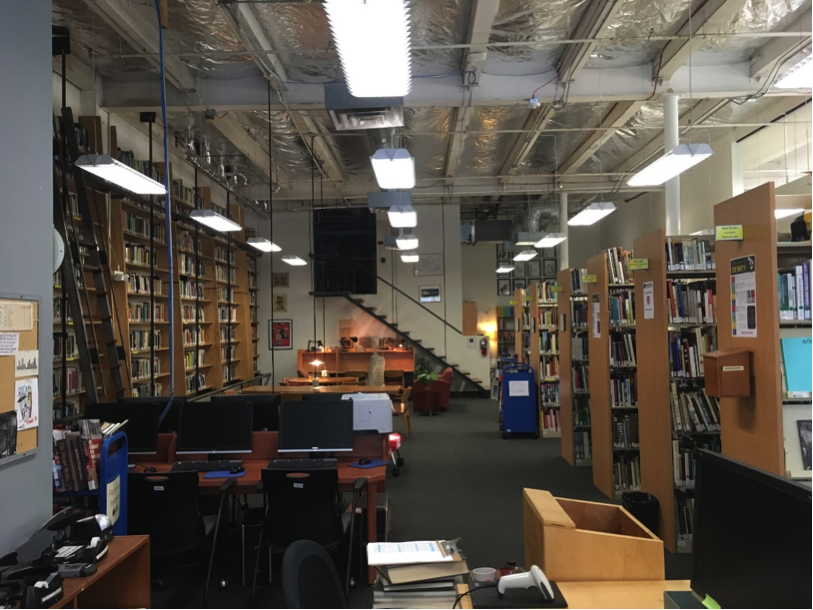
Figure 1. Prior to renovations the library featured wood in every shade
According to Bieraugel & Neil (2017) libraries need to “be mindful of the need for students to have spaces for quiet contemplation and reflection, collaboration and noisy interaction. These are places to observe, question, experiment, and network. To provide high value for students, it is important that academic libraries use their spaces to foster the highest level of…creativity and innovation” (p.50).
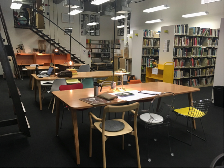
As a design school focused on human centeredness and design thinking, we convened a committee of educators and design professionals who began by asking, what do our students need to be successful? One white paper, twelve meetings and innumerable discussions later, we landed on an idea. Instead of simply updating the space, we would integrate an educational element by creating a curated exhibition of celebrated design chairs. Coupled with a fact sheet outlining why each chair was significant to design history, this would serve as an educational tool, while also arguably making ours the hippest library in San Diego.
Choosing the chairs was a fun but formidable task. In addition to style and pedigree, the committee considered practicality, comfort, mobility, and of course space concerns. Some chairs were disqualified for outrageous dimensions, others for being obviously awkward. Balancing comfort and style meant going through six iterations of the chair proposal before all committee members were satisfied. This type of back and forth is time consuming, yet a hallmark of design education. Ultimately the process was hugely valuable to ensuring we had the best chairs possible for our students and our library space.
Figure 2. A curated collection of chairs serve as an educational tool
Of course, new chairs alone do not provide the wow factor expected from an expensive update, no matter how stylish they may be. Our committee set their eyes on every non-structural element of the library and, with a budget in mind, began to imagine a space worthy of the new chairs. Everything from carpets and paint down to cushions and corkboards was game. When we finally had a plan in place, there was a lot of moving parts, and a lot of books to move. In just one week during the Christmas Break, half the collection was removed and replaced to allow renovations to take place.
Figure 3. Removing and replacing the collection was a complicated process
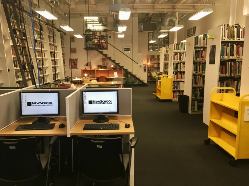
Our old library, with its mismatched furniture and heavy shelving, was not exactly conducive to the multiple environments students need to flourish. We focused on what we could change, maximizing the space and creating brighter, more inviting areas. The first day of the new space, students were already spending more time in the library. They debated their favorite chair and tried to guess which was most expensive. They sat in each, one by one, and snapped pictures. The new layout included group spaces, individual tables and private study carrels to provide the range of options that students really needed.
Figure 4. New spaces provide a variety if study environments
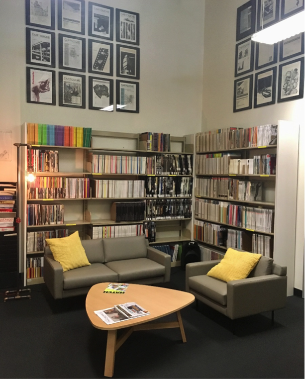
The first step towards encouraging library use is getting new students in the door. Come Fall of this year we will compare new student use and get an idea of the impact our renovation has had. Until then, we can already see students respecting and appreciating the space. The library has been reincarnated from a depository for books and information, to a space students, faculty, staff, and visitors can enjoy while learning and researching. As one student put it “this is a place I’d like to have a party now.”
Figure 5. The updated library is bright and welcoming
References:
Bieraugel, M. m., & Neil, S. (2017). Ascending Bloom’s Pyramid: Fostering Student Creativity and Innovation in Academic Library Spaces. College & Research Libraries, 78(1), 35-52.
Library Buildings 2017. (2018). ILA Reporter, 36(1), 4-17.

 Study Architecture
  ProPEL