WINNERS OF THE 2023 STEEL COMPETITION
The American Institute of Steel Construction (AISC) and the Association of Collegiate Schools of Architecture (ACSA) are pleased to announce the recipients of the 2023 Steel Design Student Competition. The competition recognizes eleven exceptional projects, in two categories, that explore a variety of issues related to the use of steel in design and construction.
CATEGORY I: SPIRITUAL SPACE
This category asks students to design “A Place for the Spirit” on a campus, welcoming to all, where members of the campus community and visitors can learn about and express spirituality. Program spaces include places for worship, meditation, learning, and fellowship. Steel is the primary material.
CATEGORY II: OPEN
Offers architecture students the opportunity to select a site and building program using steel as the primary material. This competition category permits the greatest amount of flexibility for any building type.
1st Place
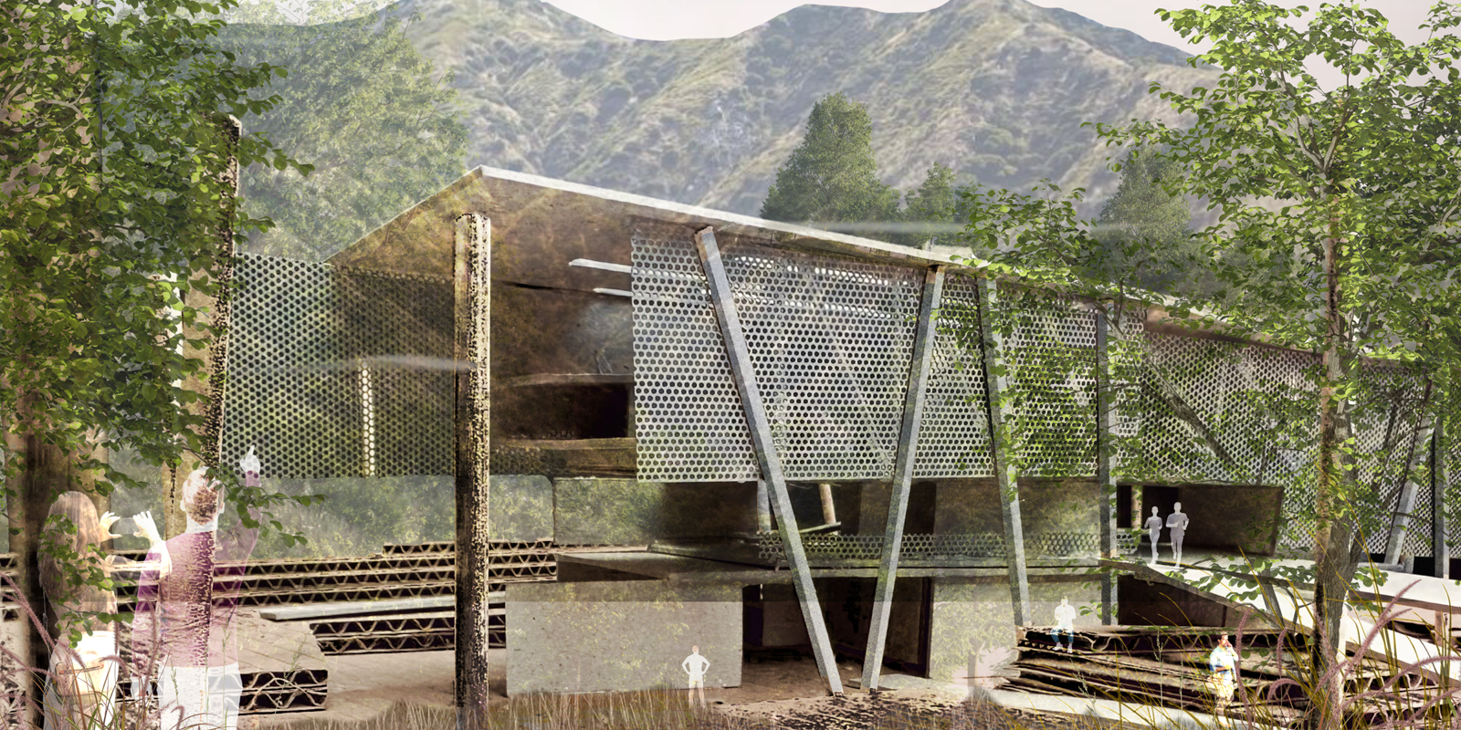
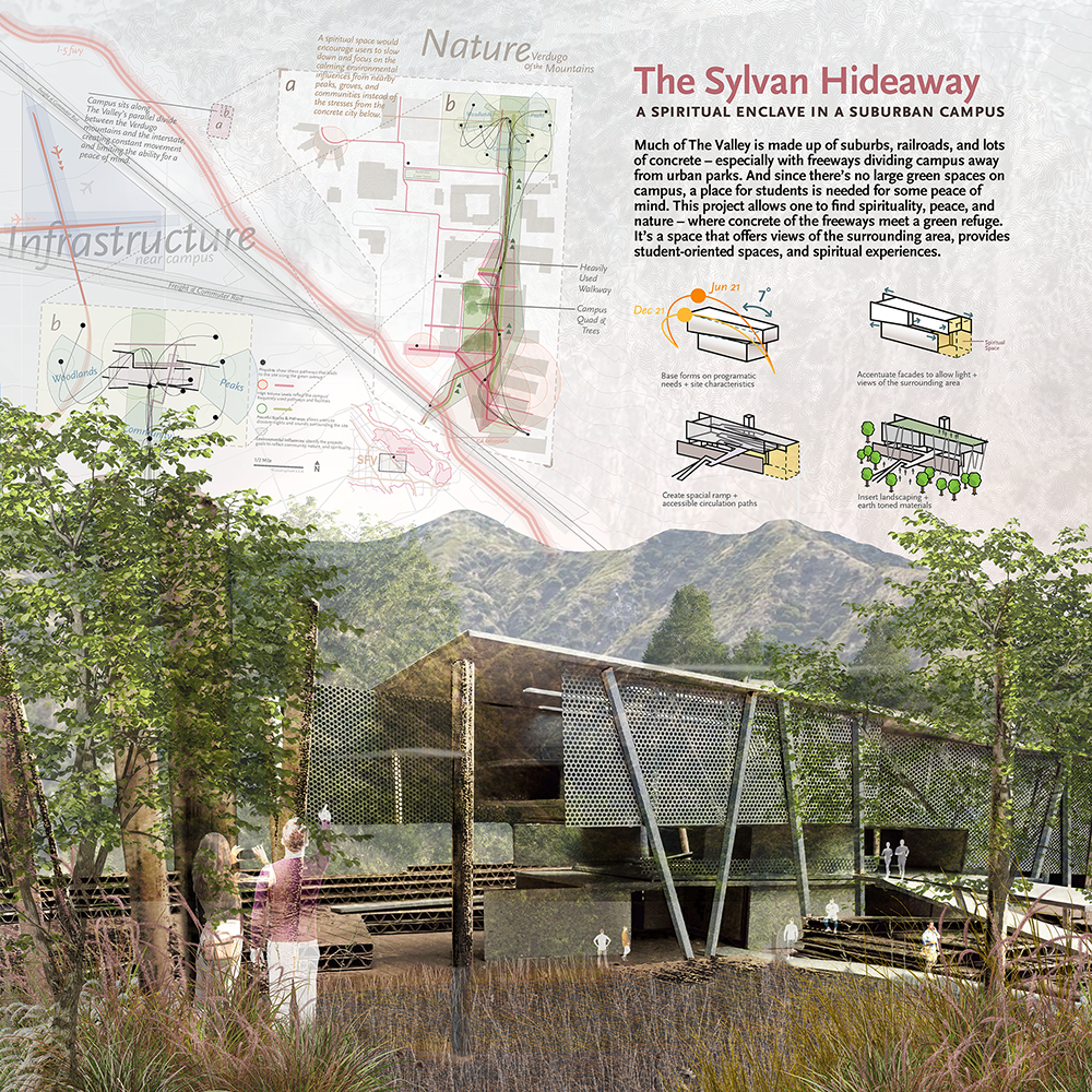
The Sylvan Hideaway
Student: Ludwig Rodriguez
Faculty Sponsor: Gerard Smulevich
Institution: Woodbury University
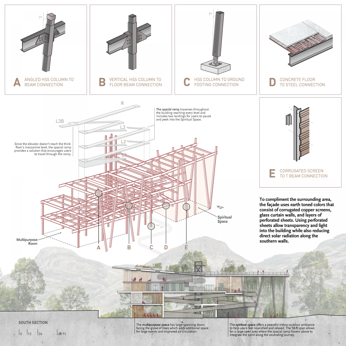
Juror Comments: The Sylvan Hideaway is a winning design with a clear and stunning structural system. The engagement of the steel detailing and steel material is thorough and compelling. The student demonstrate sustainable design concepts and a clear understanding, through the drawings, of how nature can coincide with a spiritual experience.
Project Description
The Sylvan Hideaway, situated on a suburban university campus in the San Fernando Valley, is a space that allows one to find spirituality, peace, and nature. With nearby infrastructure like freeways and railroad right-of-ways, campus is divided away from urban parks. And since there’s no significant green spaces on campus, a place for students is needed for some peace of mind. This Hideaway provides a space that offers views of the surrounding area, provides student-oriented spaces, and spiritual experiences all around.
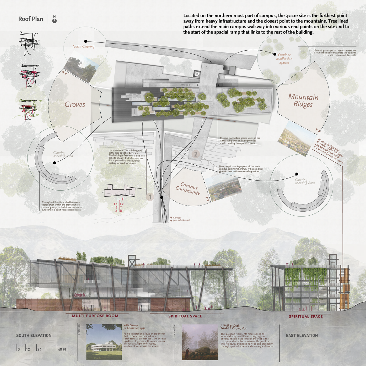
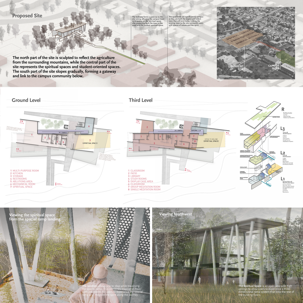
Using site contexts of the campus and identifying heavily used walkways, helped determine a path that can lead users directly to the site. The site is located at the furthermost point on campus, where suburban intersects with the natural world through the nearby mountains. Here, oak trees wrap the building in a densely covered canopy creating a calming spiritual environment. The program is divided between floors and amenities. The ground floor contains the spiritual space and the multipurpose room while the second floor houses all administrative offices and entries to the building. The third floor offers student-oriented spaces, like study rooms, a library, and meditation rooms. Below are three highlighted key concepts about the Hideaway that were integrated with the design.
A Place For The Spirit:
The spiritual space is located on the ground floor of the building and offers a peaceful indoor-outdoor ambiance to help users feel nourished and relaxed. The 50-ft span allows for a large open area with high ceilings, where the spacial ramp hovers within to integrate the spirit along the ascending journey throughout the building. Nature contributes a major role in the making of this space as it takes inspiration from a painting by Friedrich Casper. Making an outdoor environment that’s both inviting and relaxing helps create an enchanted ambiance to go along with the spirit.
The Spacial Journey:
Navigating through the building is a key part in finding the spirit. The spacial ramp takes inspiration from Le Corbusier’s definition of an “architectural promenade”, which links two floors together to create a space with shadows, light, and shapes, in an attempt to surprise the viewer. The Spacial Ramp was integrated into the building as an alternative way to reach all floors and the spirit. At select levels, two landings hover into the spiritual space and serve as a pause point for users to peek into the space.
Student-Oriented spaces:
The third floor was designed specifically for students. Accommodating a 16-ft high ceiling allows for a section of study rooms to have a mezzanine level above, where users in need of a private study area can study with large tables and peaceful views of the groves. The gallery space, study rooms, and reading spaces are all part of an open floor plan which helps create multiple options for student interactions through nearby classrooms, reading areas, and casual conversations. For those looking for isolation, two meditation rooms face the spiritual space and the outdoor environment for a calming meditation environment ultimately creating a place for the spirit — and the student.
1st Place
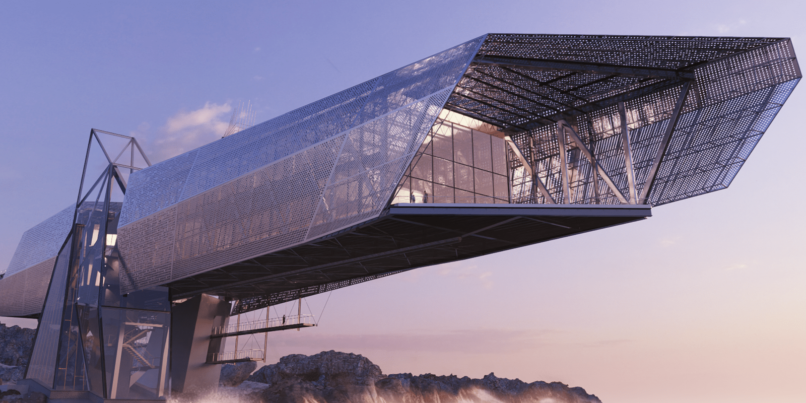
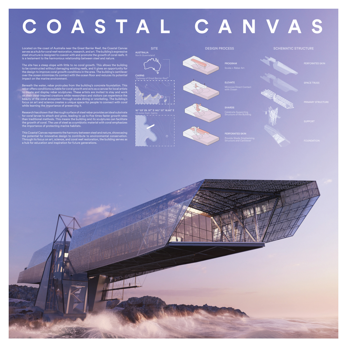
Coastal Canvas
Students: Nolan Courville & YunIn Jeung
Faculty Sponsor: Pasquale De Paola
Institution: Louisiana Tech University
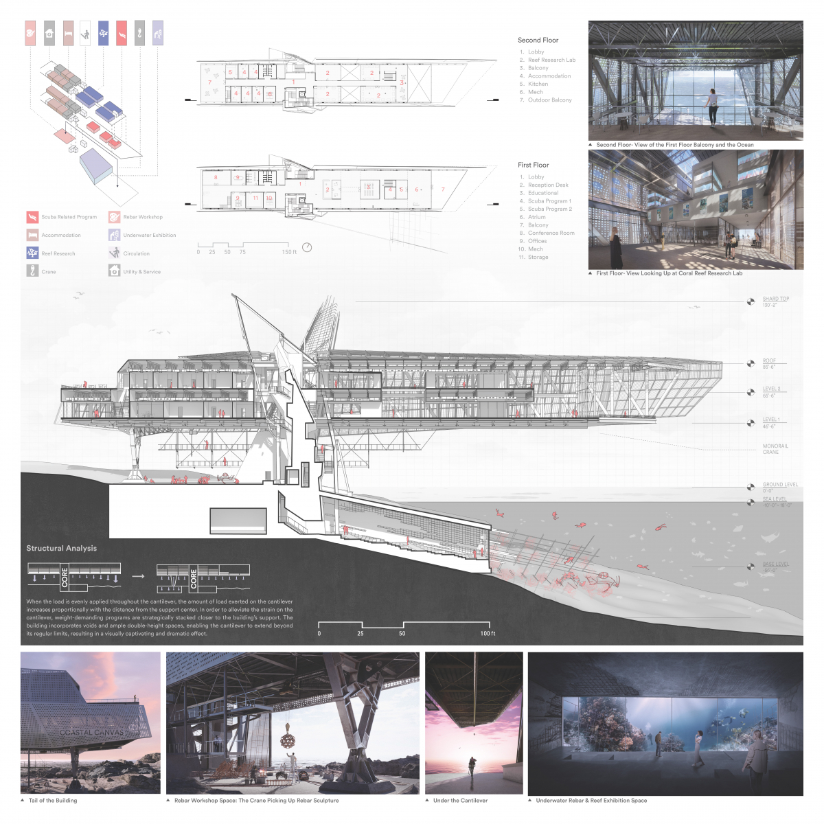
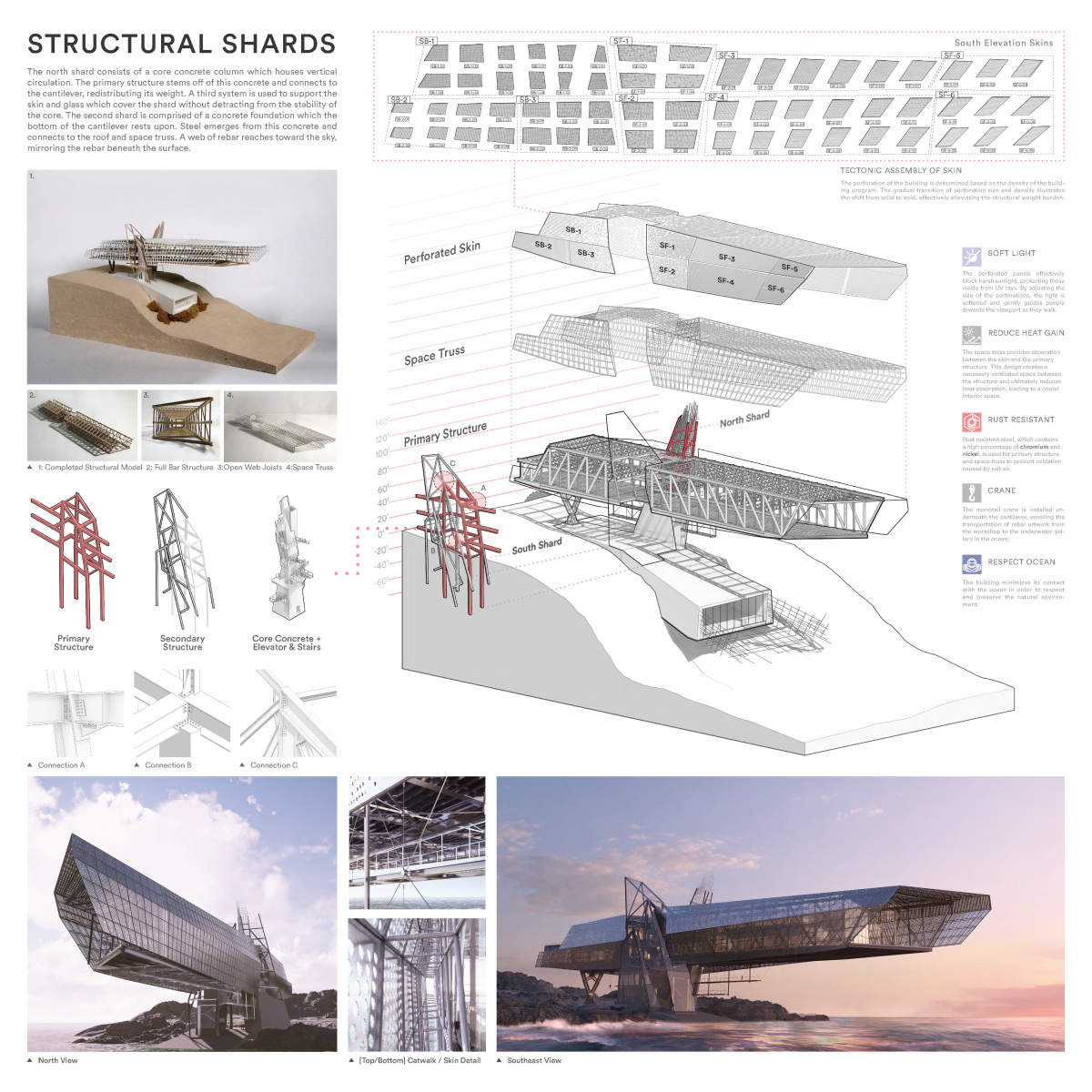
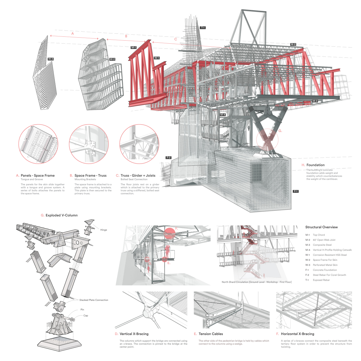
Juror Comments: Coastal Canvas is a top winning design using concise and engaging drawings. The students presented a beautiful story of the project with the board design. The level of sophistication and clarity in the diagrams and sections shows care and attention to detail. The incorporation and time spent creating a physical model elevates the design.
Project Description
Located on the coast of Australia near the Great Barrier Reef, the Coastal Canvas serves as a hub for coral reef restoration, research, and art. The building’s expressive steel structure is designed to coexist with and promote the growth of coral reefs. It is a testament to the harmonious relationship between steel and nature.
The site has a steep slope with little to no coral growth. This allows the building to be constructed without damaging existing reefs, and it gives an opportunity for the design to improve coral growth conditions in the area. The building’s cantilever over the ocean minimizes its contact with the ocean floor and reduces its potential impact on the marine environment.
Beneath the water, rebar protrudes from the building’s concrete foundation. This rebar offers conditions suitable for coral growth and acts as a canvas for local artists to create and display rebar sculptures. These artists are invited to stay and work on their coral-inspired creations while researchers and visitors can experience the beauty of the coral ecosystem through scuba diving or snorkeling. The building’s focus on art and science creates a unique space for people to connect with coral while learning the importance of preserving it.
Research has shown that the rough surface of steel rebar provides an ideal substrate for coral larvae to attach and grow, leading to up to five times faster growth rates than traditional methods. This means the building and its sculptures can facilitate the growth of coral. The use of steel as a symbiotic material with coral emphasizes the importance of protecting marine habitats.
This Coastal Canvas represents the harmony between steel and nature, showcasing the potential for innovative design to contribute to environmental conservation. Through its focus on art, science, and coral reef restoration, the building serves as a hub for education and inspiration for future generations.
Site:
Australia
North Queensland
Cairns
“Gateway of Great Barrier Reef”
16 ° 53’ 29. 97” S 145 ° 57’ 16.60” E
13 miles from Cairns
Design Process:
Program
Scuba + Rebar Art
Elevate
Minimize Direct Contact with Ocean
Shards
Celebrate Supporting Structure of the Building
Perforated Skin
Provide Shade Emphasizing Structure and Cantilever
Schematic Structure:
Perforated Skin
Space Truss
Primary Structure
Support
Foundation
2nd Place
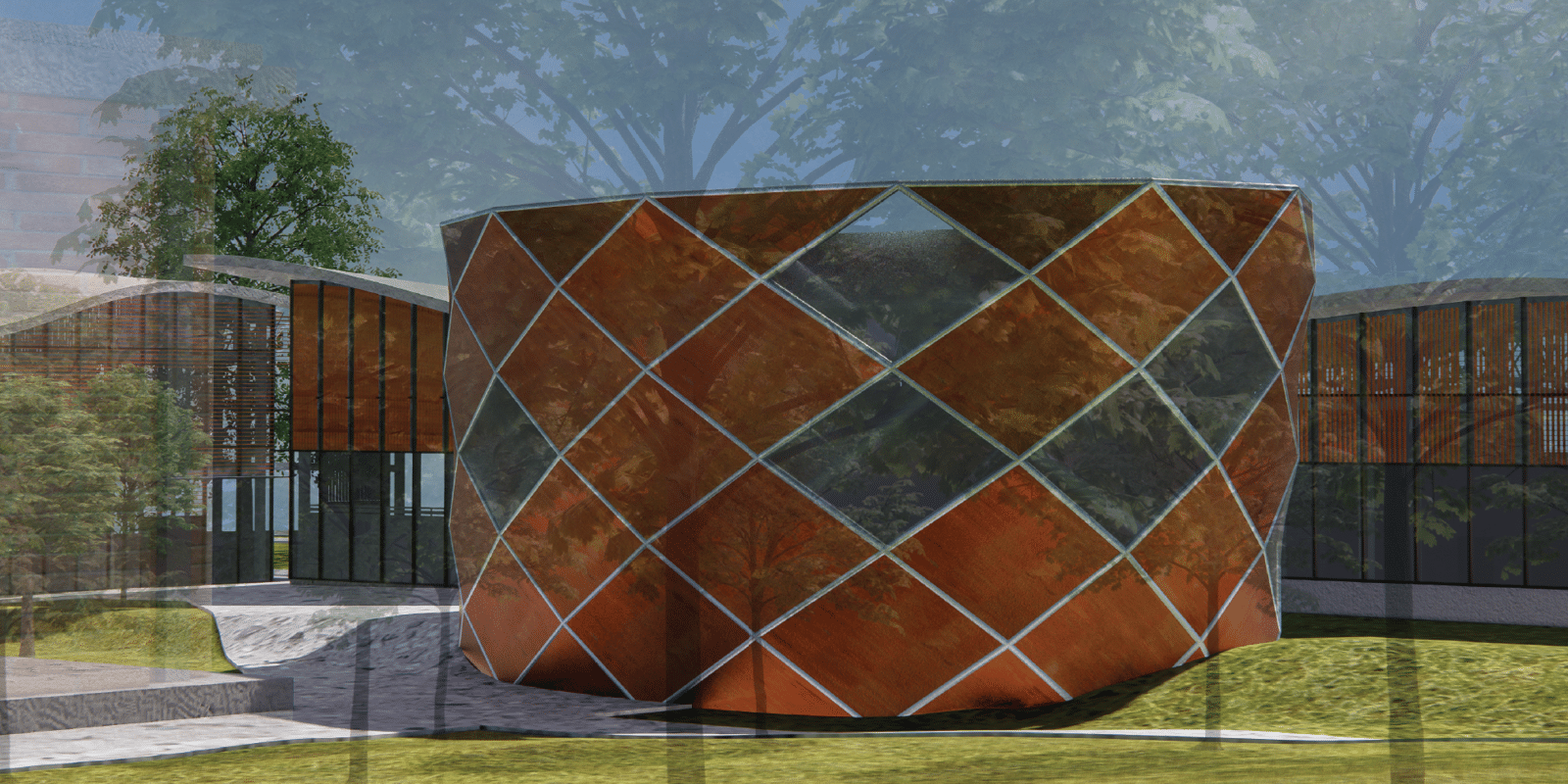
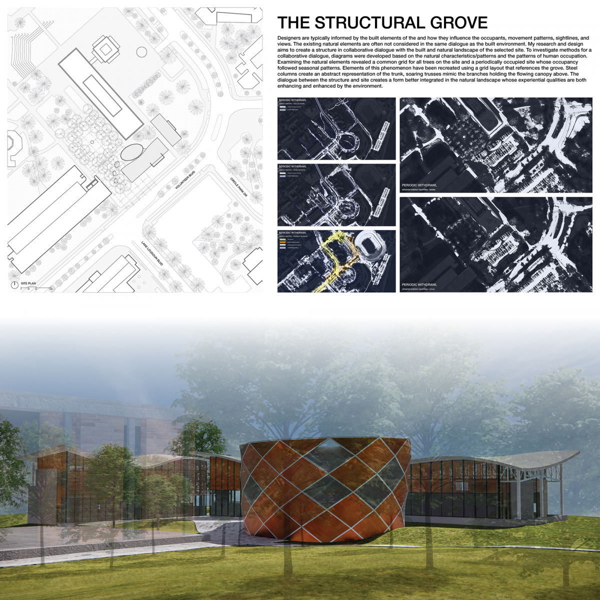
The Structural Grove
Student: Grahm Mapes
Faculty Sponsor: A. Katherine Ambroziak
Institution: University of Tennessee-Knoxville
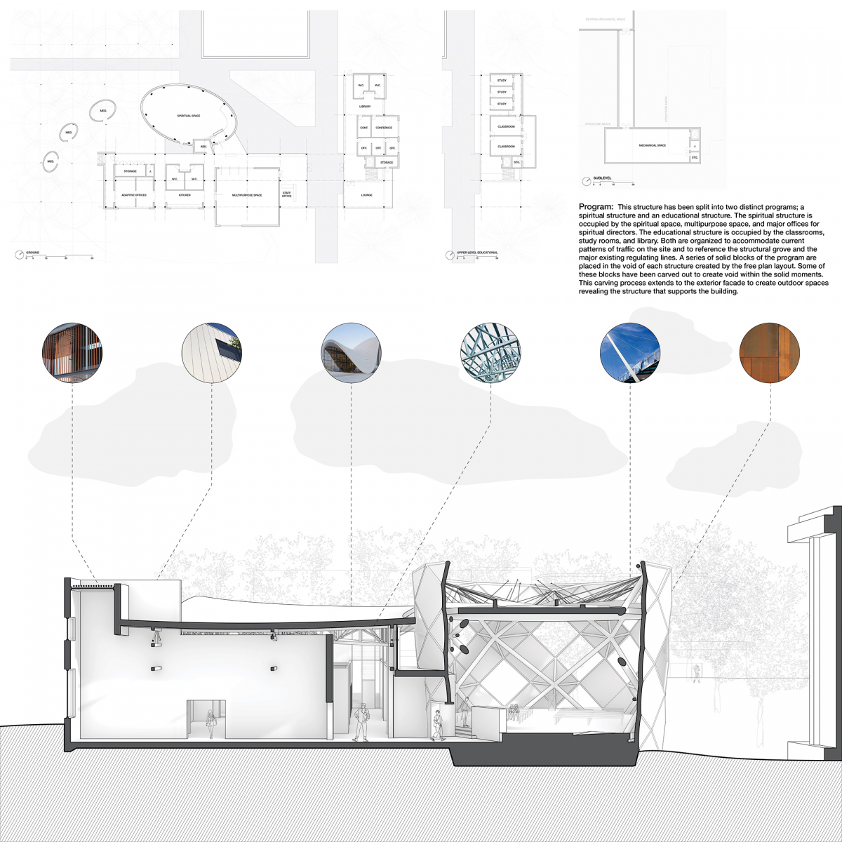
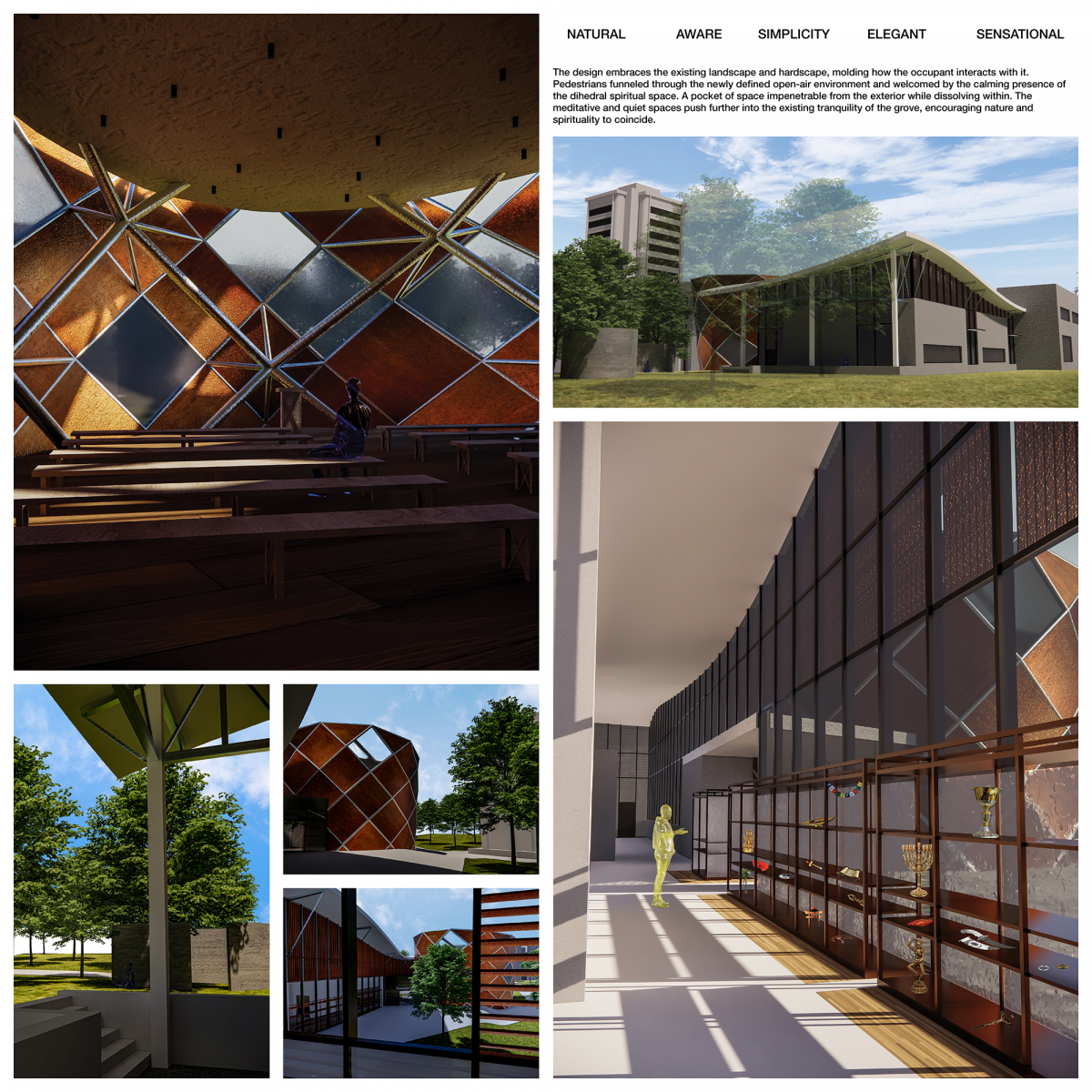
Juror Comments: The Structural Grove captivated the jury through the drum shaped structural system and creative use of material. The beautiful renderings demonstrate the functional interior of the spiritual space. The student masterfully explain how sacred artifacts and ritual items are used in different faith communities.
Project Description
Existing natural elements are often not considered in the same dialogue as the built environment despite the natural environment connecting every person on Earth. As the twenty-first century college campus grows, the existing greenspace is overtaken by the built environment and the spiritual nature of a natural environment is sequestered. A communal space in a collaborative dialogue with the natural landscape becomes more than a simple gathering space, it becomes a spiritual center reinforcing the relationship between the occupant and the spirit of a place.
The Structural Grove is situated in the landscape to preserve a public greenspace located on the University of Tennessee Knoxville(UT) Campus currently scheduled for demolition. It embraces the existing landscape and hardscape, molding how the occupant interacts with it. Pedestrians funneled through the newly defined open-air environment and welcomed by the calming presence of the dihedral spiritual space. A pocket of space impenetrable from the exterior while dissolving within. The meditative and quiet spaces push further into the existing tranquility of the grove, encouraging nature and spirituality to coincide.
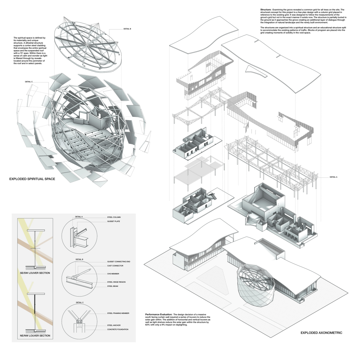
The structural concept takes inspiration from the most prominent natural feature of the site, a grove of trees planted in a common grid. Elements of this phenomenon have been recreated using a grid layout that references the grove. Steel columns create abstract representations of the trunk, soaring trusses mimic branches holding the flowing canopy above. Placed within the void of the steel grove is a series of solid programmatic blocks, select blocks have been carved out to create voids within the solid moments. Extending this process to the exterior creates occupiable outdoor spaces revealing the supporting structure. An existing and frequently traveled path splits the structure into two distinct programs; a spiritual structure and educational structure. The spiritual structure is occupied by the spiritual space, multipurpose space, and major offices for spiritual directors while the educational structure is occupied by the classrooms, study rooms, and library.
Inspired by a nest, an expanding lattice of steel diamonds form the spiritual space. The geometric strength of a dihedral gives the space strength and flexibility. With its curved facade, the spiritual space flows into the grove. A corten steel and frosted glass facade transforms with the landscape. Simultaneously the gently shaped interior space embraces visitors and shields them from the stress of campus life. The 70-ft open space is flexible for any spiritual or communal purpose. It is a calm and open space, in which the lively campus feels distant. Light touching down on curved panels, frosted glass allowing only an abstraction of the outside to define the space.
2nd Place
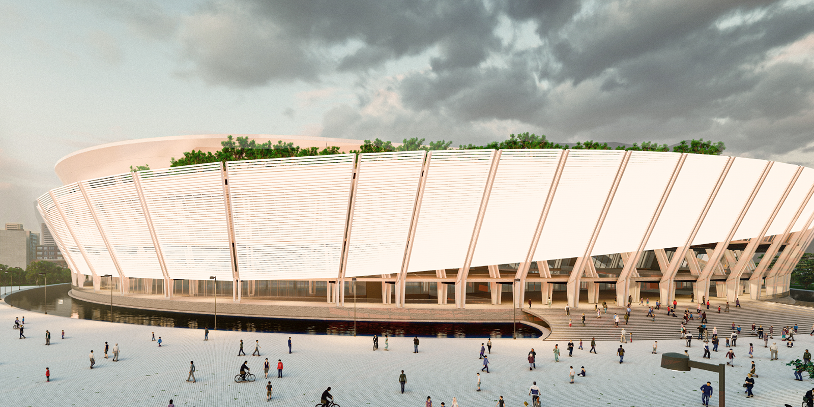
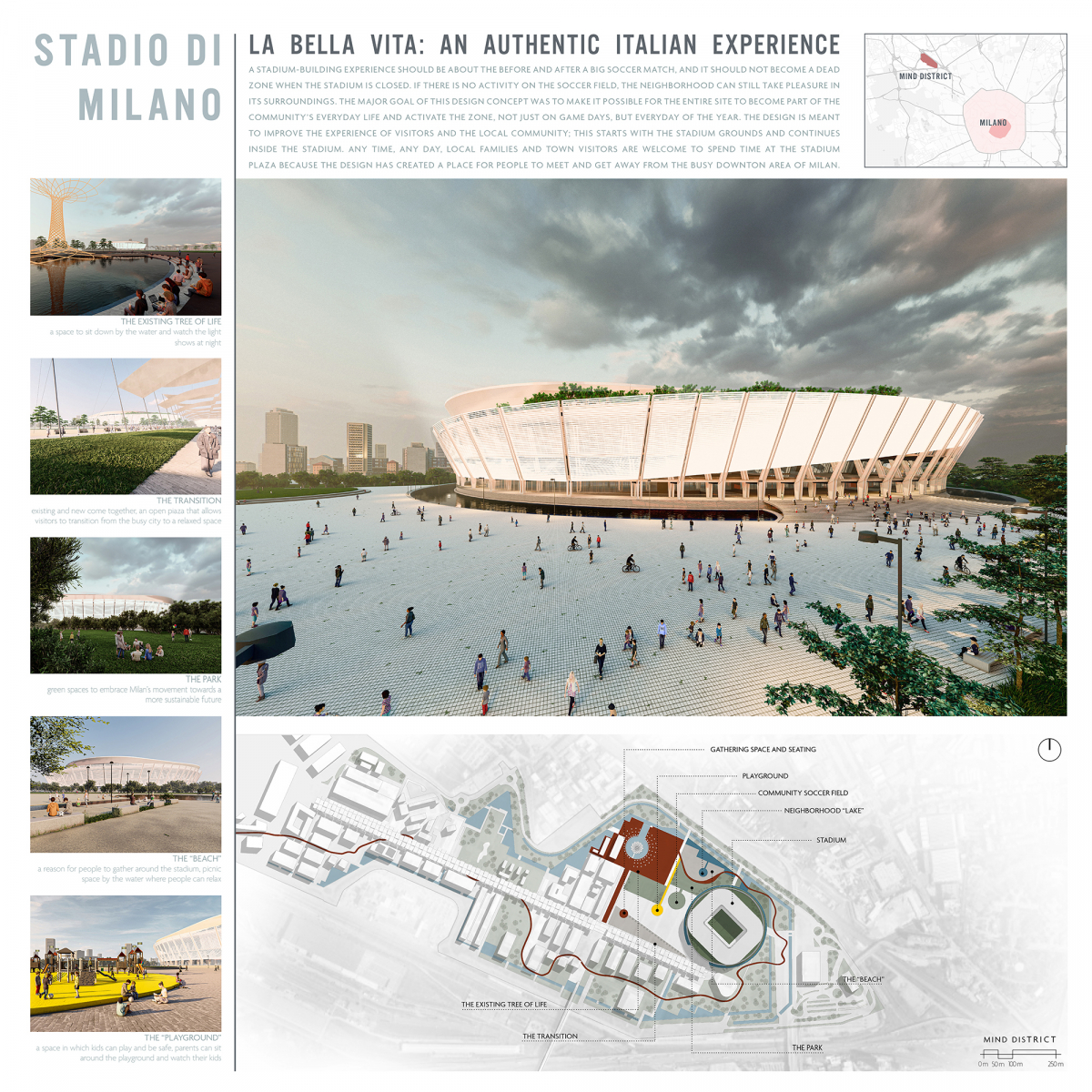
La Bella Vita
Student: Maiten Rodriguez
Faculty Sponsors: Awilda Rodriguez, Paolo Sanza & Blake Mitchell
Institution: Oklahoma State University
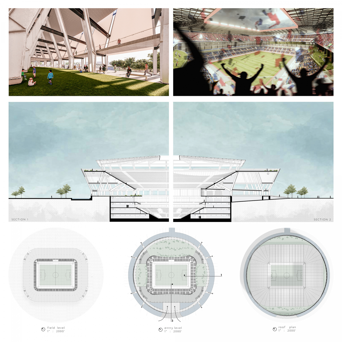
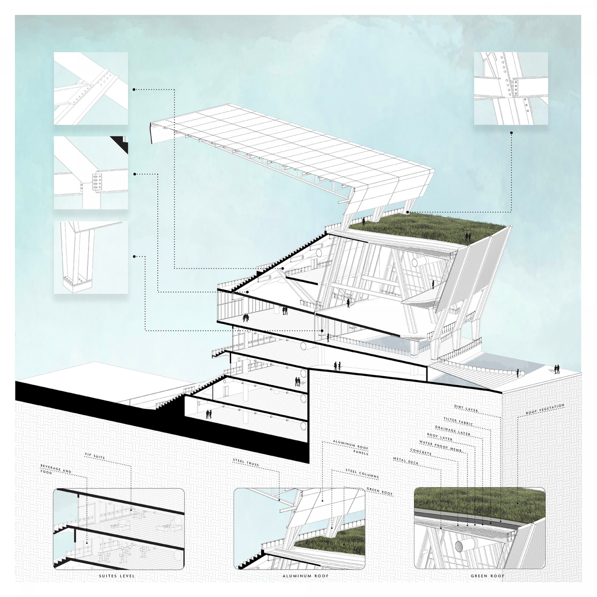
Juror Comments: La Bella Vita is a winning design showing rich graphical representation of the human experience moving throughout the stadium. The structural double system presented in the sections is compelling and thought-provoking. The feature of a green roof on top of a stadium is unique and refreshing.
Project Description
STADIO DI MILANO
LA BELLA VITA: AN AUTHENTIC ITALIAN EXPERIENCE
A stadium-building experience should be about the before and after a big soccer match, and it should not become a dead zone when the stadium is closed. If there is no activity on the soccer field, the neighborhood can still take pleasure in its surroundings. The major goal of this design concept was to make it possible for the entire site to become part of the communityís everyday life and activate the zone, not just on game days, but every day of the year. The design is meant to improve the experience of visitors and the local community; this starts with the stadium grounds and continues inside the stadium. Any time, any day, local families, and town visitors are welcome to spend time at the stadium plaza because the design has created a place for people to meet and get away from the busy downtown area of Milan.
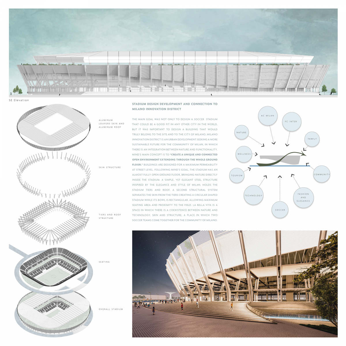
STADIUM DESIGN DEVELOPMENT AND CONNECTION TO MILANO INNOVATION DISTRICT
The main goal was not only to design a soccer stadium that could be a good fit in any other city in the world, but it was important to design a building that would truly belong to the site and to the city of Milano. Milano innovation district is an urban development seeking a more sustainable future for the community of Milan, in which there is an integration between nature and functionality. MINDís main concept is to ìcreate a unique and connected open environment extending through the whole ground floor.î Buildings are designed for maximum permeability at street level. Following MINDís goal, the stadium has an almost fully open ground floor, bringing nature directly inside the stadium. A simple, yet elegant steel structure inspired by the elegance and style of Milan holds the stadium tiers and roof. A second structural system separates the skin from the tiers creating a circular shaped stadium while its bowl is rectangular, allowing maximum seating area and proximity to the field. La Bella Vita is a space in which there is a coexistence between nature and technology, skin and structure, a place in which two soccer teams come together for the community of Milano.
3rd Place
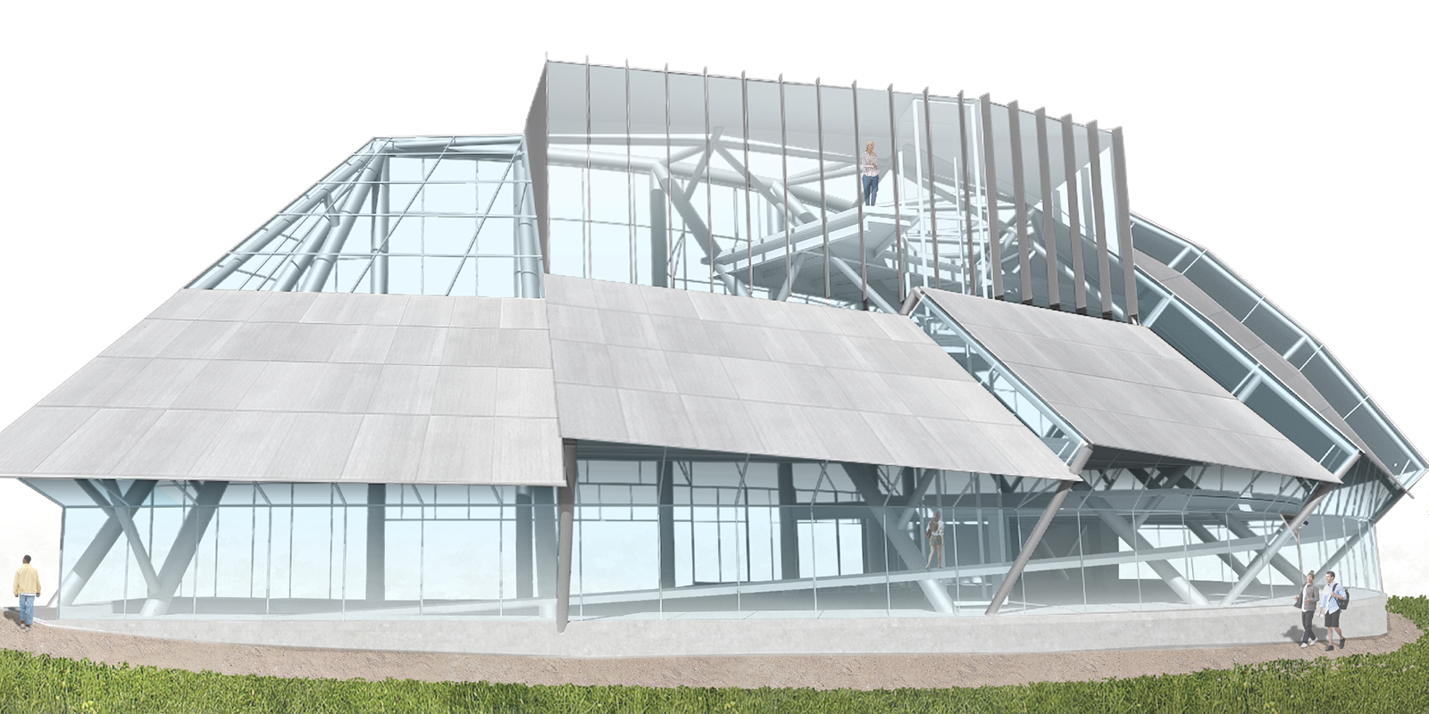
Luminae Sanctum: Bend, Diffuse, Self-Reflect
Student: David Covarrubias
Faculty Sponsor: Gerard Smulevich
Institution: Woodbury University
Juror Comments: Luminae Sanctum: Bend, Diffuse, Self-Reflect is a robust sustainable design with a cohesive circular structure to form a beautiful spiritual space. The boards brilliantly display the interaction of reflection, light, and spirituality. The overall design is inviting to all faiths not pertaining to a specific religion.
Project Description
Luminae Sanctum: Bend, Diffuse, Self Reflect aims to create a welcoming environment on campus where individuals from various religious backgrounds can explore and express their spirituality. Steel is the primary material used in the construction of this project.
The program for Luminae Sanctum includes a diverse range of indoor and outdoor spaces that cater to the needs of the campus community and visitors, irrespective of their religious or non-religious beliefs. The objective is to promote the selfless sharing of one’s spiritual dimension. The design incorporates educational spaces to facilitate learning about different religions and belief systems, as well as areas for worship, meditation, and refuge. The placement of the building on campus, being near the entrance and diagonal to the main quad, is intended to communicate a sense of welcome and curiosity, with functional outdoor spaces visible from other areas.
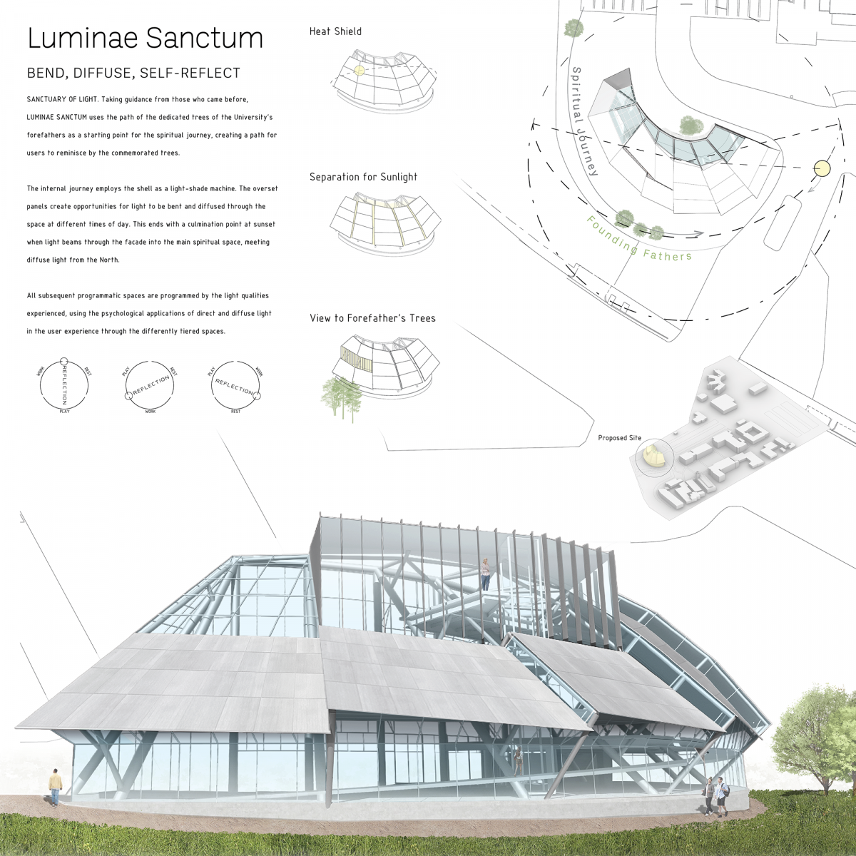
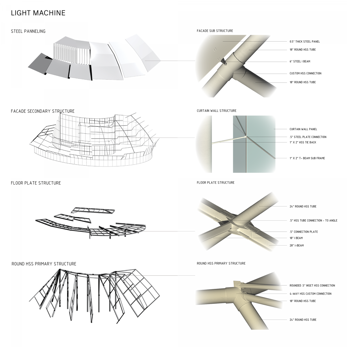
The central concept of Luminae Sanctum revolves around creating a multicultural spiritual space that utilizes natural light to evoke different moods and inspire self-reflection. The design incorporates a Hollow HSS structure that supports an exterior facade system, creating a sundial effect with the sun. Overset panels are employed to allow bands of harsh light to enter the spaces, enhancing the overall atmosphere.
Luminae Sanctum takes inspiration from the dedicated trees of the University’s forefathers, using their path as a starting point for the spiritual journey. The internal journey is guided by the manipulation of light through the shell of the building, creating opportunities for bending and diffusion of light at different times of the day. The culmination of this journey occurs at sunset when direct light beams through the facade into the main spiritual space, merging with the diffuse light from the North.
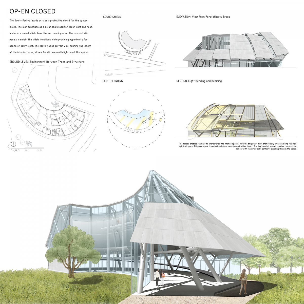
The arrangement of programmatic spaces within Luminae Sanctum is determined by the qualities of light experienced in each area. The South-Facing facade acts as a protective shield, shielding the interior spaces from harsh light, heat, and sound from the surroundings. The overset skin panels maintain this shield function while allowing beams of south light. The north-facing curtain wall runs along the interior curve, enabling diffuse north light to illuminate all spaces.
The facade serves as a medium for characterizing the interior spaces, with the main spiritual space being the brightest and most dramatically lit. This central space is visible from all other levels, creating a focal point within the structure. At sunset, the direct light perfectly gleams through the space, creating a captivating moment.
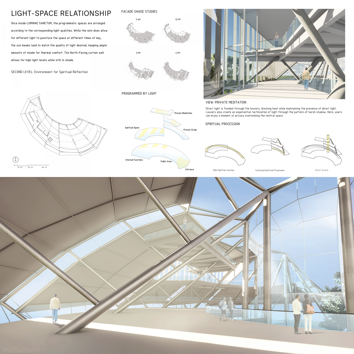
Inside Luminae Sanctum, the programmatic spaces are arranged based on the desired light qualities. While the skin allows different types of light to penetrate the space at various times of the day, the desired light beams are carefully directed to ensure ample shade for thermal comfort. The North-Facing curtain wall allows for high light levels while keeping the spaces shaded.
Luminae Sanctum orchestrates steel and light to craft a spiritual haven. It carefully captures and diffuses sunlight, harnessing it to evoke a greater sense of self and provide a moment for reflection.
Board 1:
SANCTUARY OF LIGHT. Taking guidance from those who came before, LUMINAE SANCTUM uses the path of the dedicated trees of the University’s forefathers as a starting point for the spiritual journey, creating a path for users to reminisce by the commemorated trees.
The internal journey employs the shell as a light-shade machine. The overset panels create opportunities for light to be bent and diffused through the space at different times of day. This ends with a culmination point at sunset when light beams through the facade into the main spiritual space, meeting diffuse light from the North.
All subsequent programmatic spaces are programmed by the light qualities experienced, using the psychological applications of direct and diffuse light in the user experience through the differently tiered spaces.
Board 2:
OP-EN CLOSED
The South-Facing facade acts as a protective shield for the spaces inside. The skin functions as a solar shield against harsh light and heat, and also as a sound shield from the surrounding area. The overset skin panels maintain the shield functions while providing opportunity for beams of south light. The north-facing curtain wall, running the length of the interior curve, allows for diffuse north light in all the spaces.
The facade enables the light to characterize the interior spaces. With the brightest, most dramatically lit space being the main spiritual space. This main space is central and observable from all other levels. The day’s end at sunset creates the precipice moment with the direct light perfectly gleaming through the space.
Board 3:
LIGHT-SPACE RELATIONSHIP
Once inside LUMINAE SANCTUM, the programmatic spaces are arranged according to the corresponding light qualities. While the skin does allow for different light to puncture the space at different times of day, the sun beams land to match the quality of light desired, keeping ample amounts of shade for thermal comfort. The North-Facing curtain wall allows for high light levels while still in shade.
Direct light is flooded through the louvers, blocking heat while maintaining the presence of direct light. Louvers also create an experiential tactilization of light through the pattern of harsh shadow. Here, users can enjoy a moment of privacy overlooking the central space.
Board 4:
LIGHT MACHINE
3rd Place
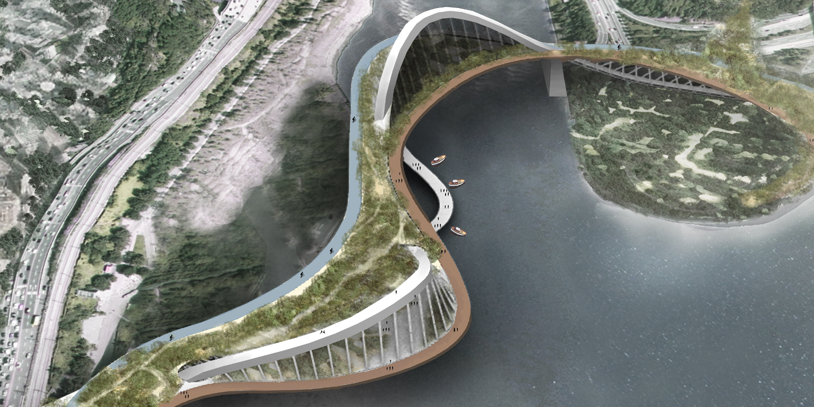
Back to the Nature
Students: Chunya Wu, Siwei Su, Yiwei Liu, Jiaqi Xu & Matthew Lawson
Faculty Sponsor: Clark Llewellyn
Institution: University of Hawaiʻi at Mānoa
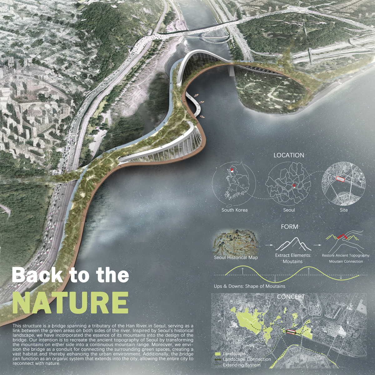
Juror Comments: Back to the Nature is a winning design with strong graphical representation and historical context of the country and landscape. The creative use of a curve linear truss is well executed through the plan and diagrams. The incorporation of tectonics and structural composition is brilliantly executed throughout the program.
Project Description
Seoul is a famous and densely populated city. And the Han River is known as South Korea’s mother river. As a bridge in Seoul spanning a Han River tributary, this structure holds not only structural importance but also significant social significance in the urban context. Our goal is to enhance the quality of life for residents by increasing green spaces and public areas, providing opportunities for people to connect with nature and engage in communal activities. This bridge serves as a vital connection between the green landscapes on either side. Inspired by the historical topography of Seoul, we have incorporated the essence of its mountain range into the design of the bridge. Historical maps reveal that the bridge’s location was once part of a continuous mountain range, which was lost over time due to urban development. Our objective is to restore the ancient topography of Seoul by reconnecting the mountains on both sides of the river, forming a seamless mountain range once again.
The surrounding area near the bridge’s base currently boasts lush greenery; however, these green areas are fragmented and separated by the river. Our vision for the bridge extends beyond its structural function to serve as a unifying link between the green spaces on both sides, creating a vast habitat and enhancing the urban environment. We aim to preserve and protect the plant life surrounding the bridge, fostering a thriving ecological system for the city. Moreover, the bridge can act as a catalyst for growth, with its branches extending into the city, inviting the entire community to embrace nature’s embrace once more and let the public Back to the NATURE.
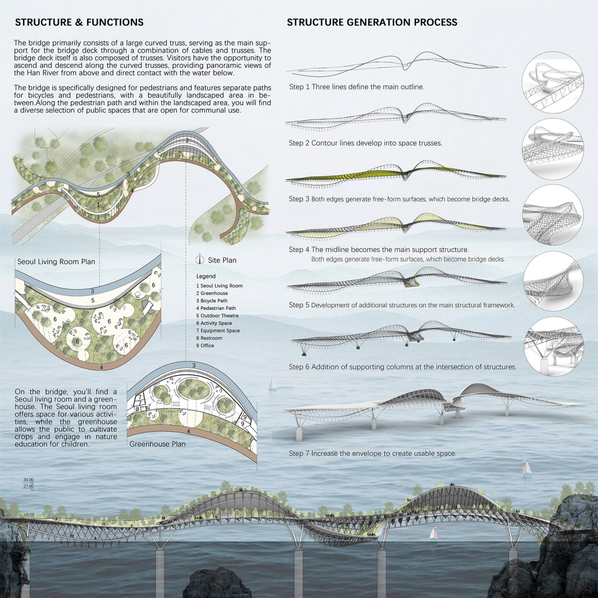
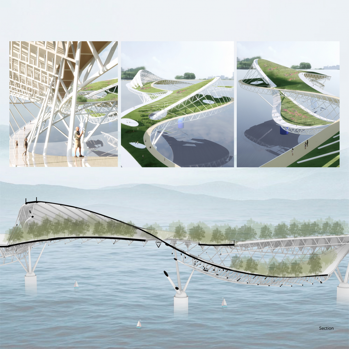
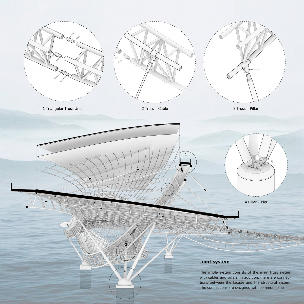
The bridge’s main structure consists of a large curved truss, which provides essential support to the bridge deck through a combination of cables and additional trusses. The bridge deck itself is also constructed using trusses. Visitors to the bridge can traverse along the curved trusses, allowing them to enjoy panoramic views of the Han River from above and directly connect with the water below. The whole system consists of the main truss system with cables and pillars. In addition, there are connections between the facade and the structural system. The connections are designed with common joints.
Designed with pedestrians in mind, the bridge incorporates separate paths for bicycles and pedestrians, with a beautifully landscaped area in between. On the bridge, you’ll discover the Seoul living room and a greenhouse, both offering generous space for a variety of activities. The Seoul living room serves as a versatile area where individuals can engage in diverse pursuits. Additionally, the greenhouse provides an opportunity for the public to adopt a plot of land and cultivate their own crops, while also participating in nature education activities for children. Along the pedestrian path and within the landscaped area, numerous public spaces are available for communal use, providing a wide range of options for visitors.
Honorable Mention
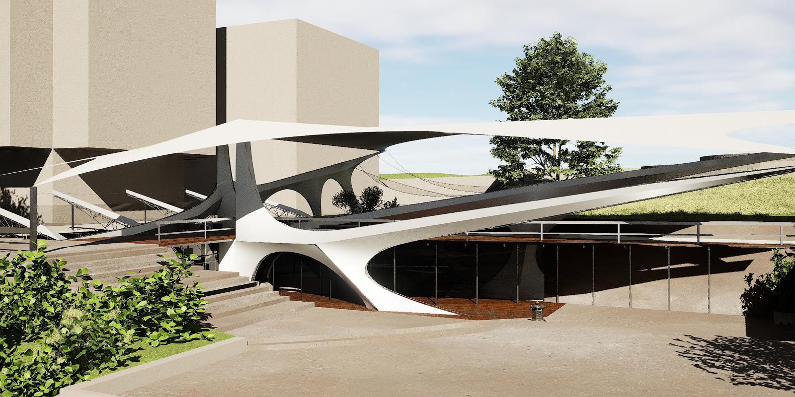
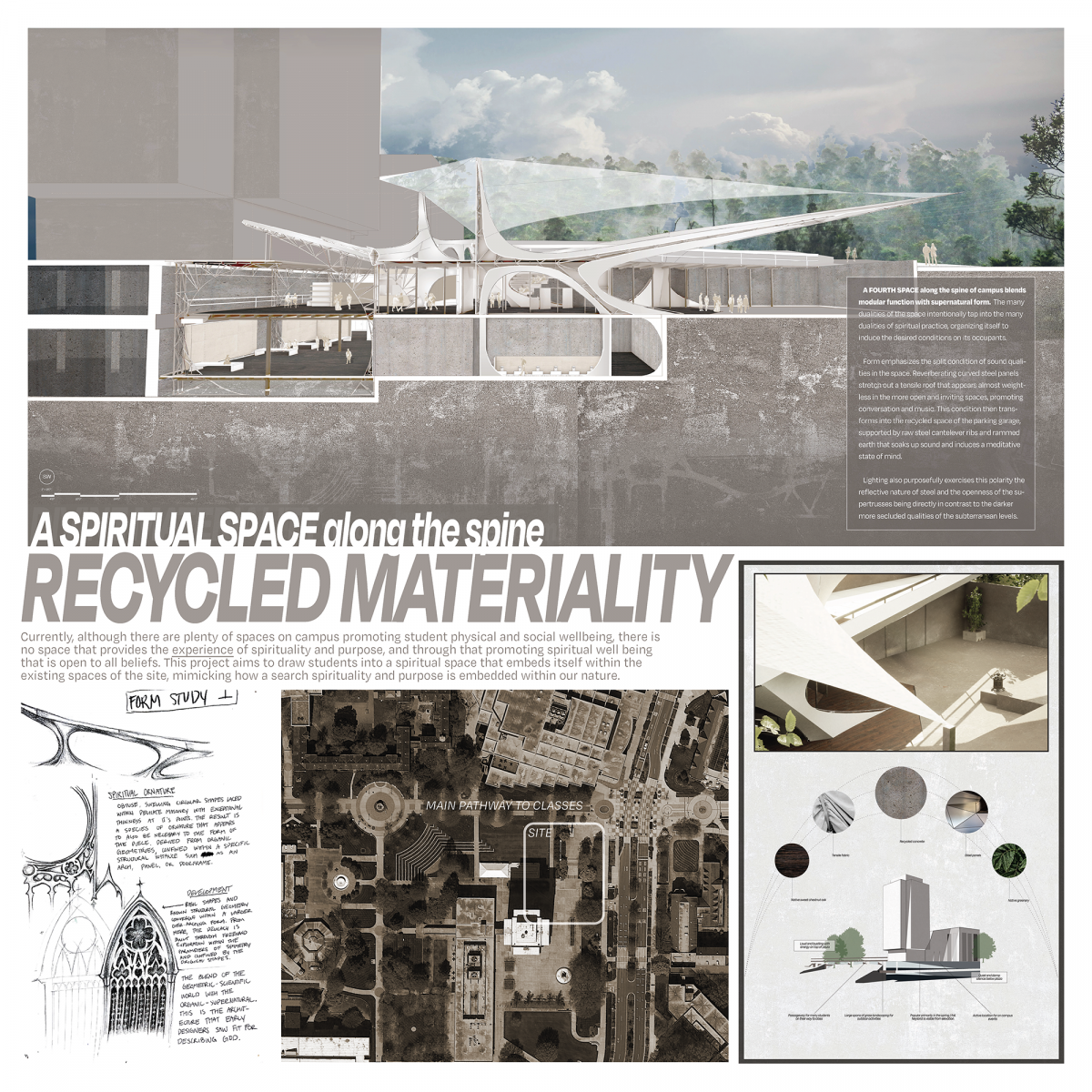
Along the Spine – Using Recycled Materiality to Induce Spiritual Splendor
Student: Julia Goodman
Faculty Sponsor: A. Katherine Ambroziak
Institution: University of Tennessee-Knoxville
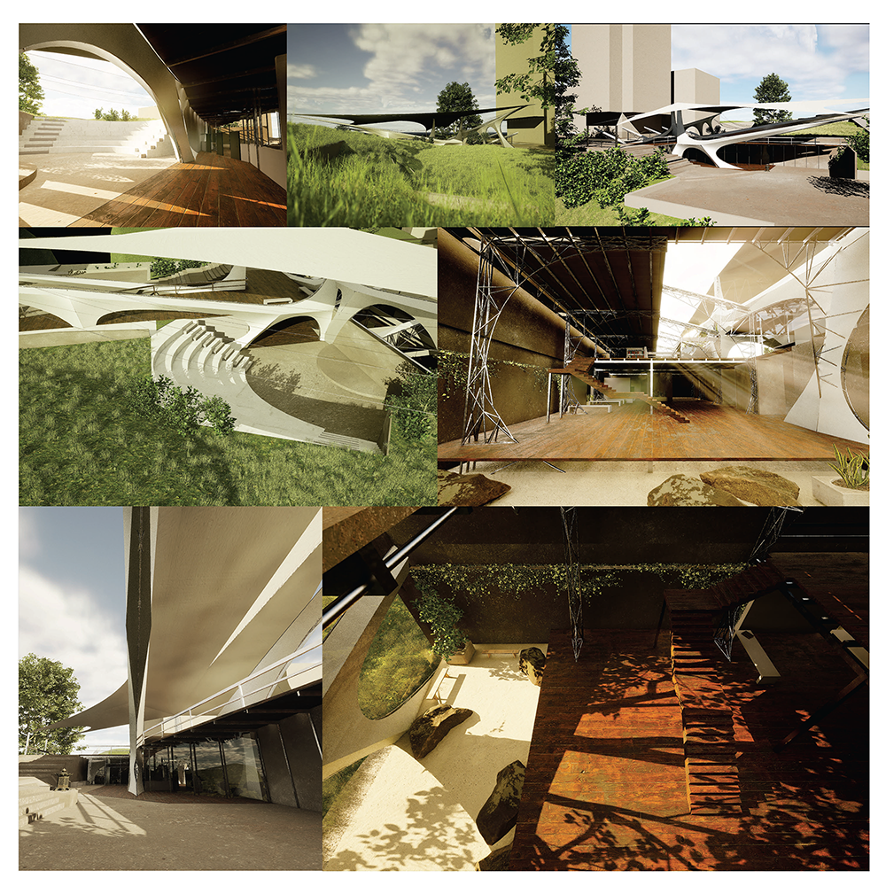
Juror Comments: Along the Spine – Using Recycled Materiality to Induce Spiritual Splendor is an honorable mention for the creative use of hand sketches and renderings. The detailed drawings of the steel assembly are both engaging and provocative.
Project Description
A FOURTH SPACE along the spine of campus blends modular function with supernatural form. The many dualities of the space intentionally tap into the many dualities of spiritual practice, organizing itself to induce the desired conditions on its occupants. Form emphasizes the split condition of sound qualities in the space. Reverberating curved steel panels stretch out a tensile roof that appears almost weightless in the more open and inviting spaces, promoting conversation and music. This condition then transforms into the recycled space of the parking garage, supported by raw steel cantelever ribs and rammed earth that soaks up sound and induces a meditative state of mind. Lighting also purposefully exercises this polarity the reflective nature of steel and the openness of the supertrusses being directly in contrast to the darker more secluded qualities of the subterranean levels.
Currently, although there are plenty of spaces on campus promoting student physical and social wellbeing, there is no space that provides the experience of spirituality and purpose, and through that promoting spiritual well being that is open to all beliefs. This project aims to draw students into a spiritual space that embeds itself within the existing spaces of the site, mimicking how a search spirituality and purpose is embedded within our nature.
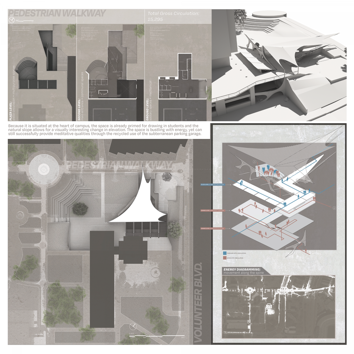
Because it is situated at the heart of campus, the space is already primed for drawing in students and the natural slope allows for a visually interesting change in elevation. The space is bustling with energy, yet can still successfully provide meditative qualities through the recycled use of the subterranean parking garage.
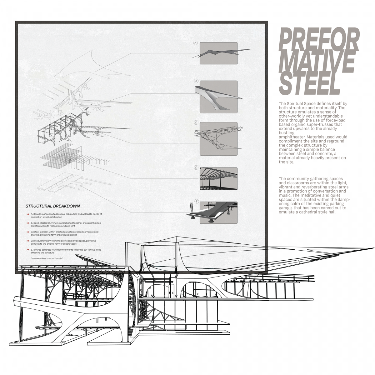
The Spiritual Space defines itself by both structure and materiality. The structure emulates a sense of other-worldly yet understandable form through the use of force-load based organic super-trusses that extend upwards to the already
bustling amphitheater. Materials used would compliment the site and reground the complex structure by maintaining a simple balance between steel and concrete, a material already heavily present on the site. The community gathering spaces
and classrooms are within the light, vibrant and reverberating steel arms in a promotion of conversation and music. The meditative and quiet spaces are situated within the dampening calm of the existing parking garage, that has been carved out to emulate a cathedral style hall.
Honorable Mention
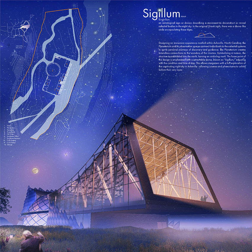
Sigillum
Student: Ana Krekman
Faculty Sponsor: Daniel Brown
Institution: Savannah College of Art and Design
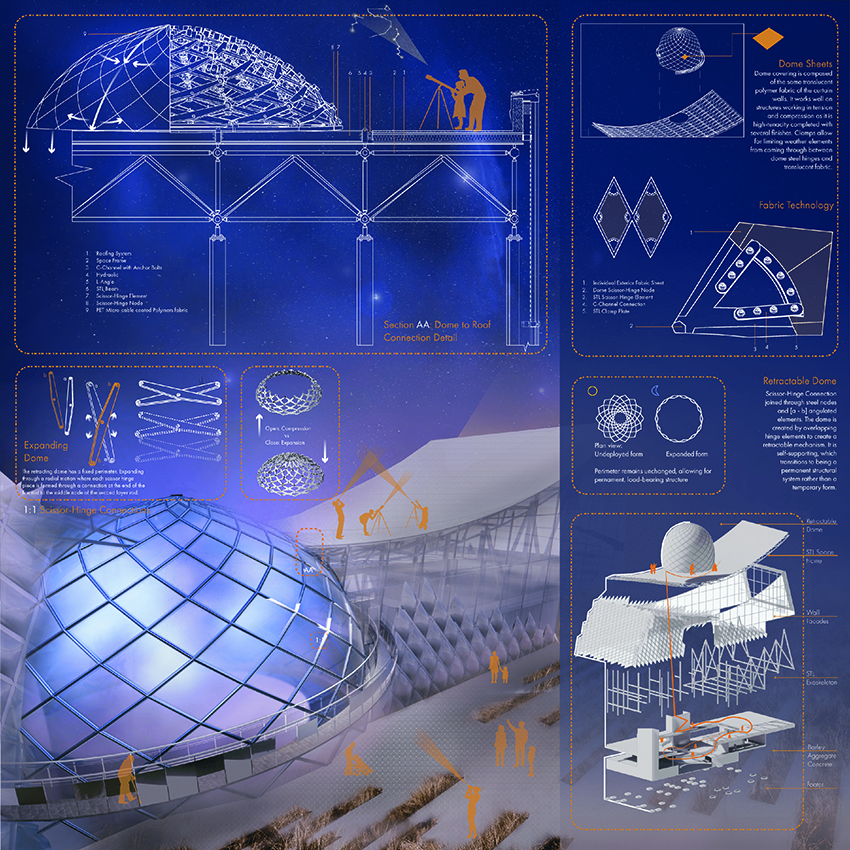
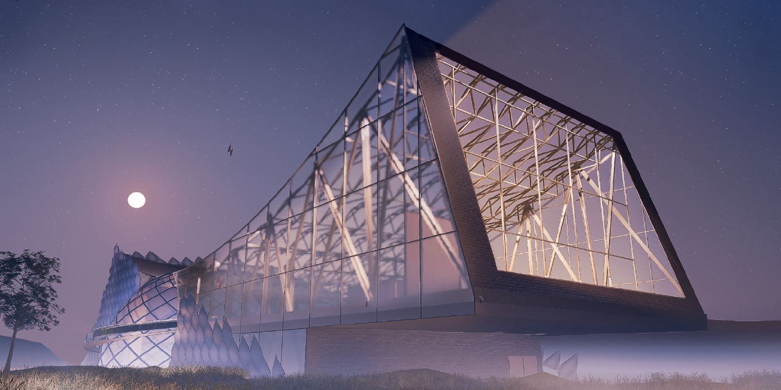
Juror Comments: Sigillum receives an honorable mention for the exquisite and poetic diagrams. The aspect of the retractable dome is smart and compelling. The design is a striking representation of what steel can do.
Project Description
Nestled within Asheville, North Carolina, the Planetarium beckons individuals to embark on transformative journeys of discovery through the cosmos. This architectural marvel symbolizes a meteor, leaving a lasting mark on the earth as a testament to our boundless fascination with the night sky.
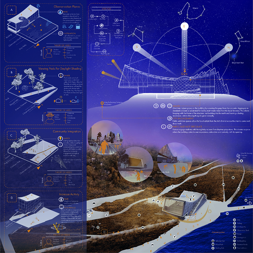
At the heart of our design is “Sigillum,” a retractable dome that serves as the focal point, dynamically adapting to the conditions of the day and night. This innovative feature grants stargazers an unobstructed view of Asheville’s mesmerizing night sky, allowing celestial wonders to unfold before their eyes. The vision for this project was to create a space that is equally vibrant at night as it is during the day, offering a safe and exhilarating environment for all who come. The planetarium seamlessly integrates with the surrounding park, fostering community engagement through observation decks strategically placed both around and on the structure, providing educational and recreational opportunities for everyone.
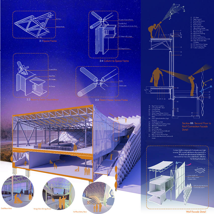
The ETFE double membrane panels adorning the facade serve a dual purpose. They not only protect the structure from heat gain and other external factors but are also incorporated into dome-like shading structures scattered throughout the park. These panels offer shading during the day and emit a luminous glow at night, to limit light pollution and to enhance the experience of the celestial systems above. Observation decks are thoughtfully designed away, ensuring an optimal environment for observing the stars and other cosmic phenomena.
In line with the design philosophy, the park’s pathways are thoughtfully divided into “hard” and “soft” surfaces, accommodating both pedestrians and bicyclists. A theory of needs was thought out, categorizing users into leisure, culture, adventure, and growth. This was to design a holistic understanding when creating spaces.
Inside “Sigillum,” spaces are meticulously intertwined based on function and practicality. From the ground level (exhibition) with ramps extending to the basement level (education) and the top deck (experiential), visitors move freely, broadening their perspectives. Ensuring ADA accessibility was of utmost importance, allowing equal participation for all individuals and echoing the central theme of the structure: “participate, not speculate.”
To further enrich the ground level’s purpose, an exhibition space was designed to serve as a hub for local artists from the Arts District across the river. The symbiotic connection between the planetarium and the local community reinforces the commitment to nurturing creativity and collaboration within Asheville.
In a nod to sustainability and local pride, the building blocks of the structure incorporate concrete made from barley malt waste, a byproduct of the local brewery. This not only minimizes material waste but also serves as a symbolic link to Asheville’s brewing heritage, connected to the park by a dedicated path.
The Sigillum Planetarium is more than a celestial observatory; it’s a place where curiosity and wonder converge, inviting everyone to join in the cosmic journey, transcending the boundaries of time and space, and leaving an indelible mark on the spirit of exploration.
CONCEPT STATEMENT:
Designing an immersive experience nestled within Asheville, North Carolina, the Planetarium, and its observation spaces connect individuals to the celestial systems to ignite journeys of discovery and guidance. The planetarium creates boundless connections to the wonders of the cosmos. Symbolizing a meteor, the structure is embedded into the earth, leaving an enduring mark. The focus point of the design is emphasized with a retractable dome, known as “Sigillum,” adjusting with the condition and time of day. This allows stargazers with a full exploration of the captivating night sky of Asheville – allowing cosmos and phenomena to unfold before their very eyes.
Honorable Mention
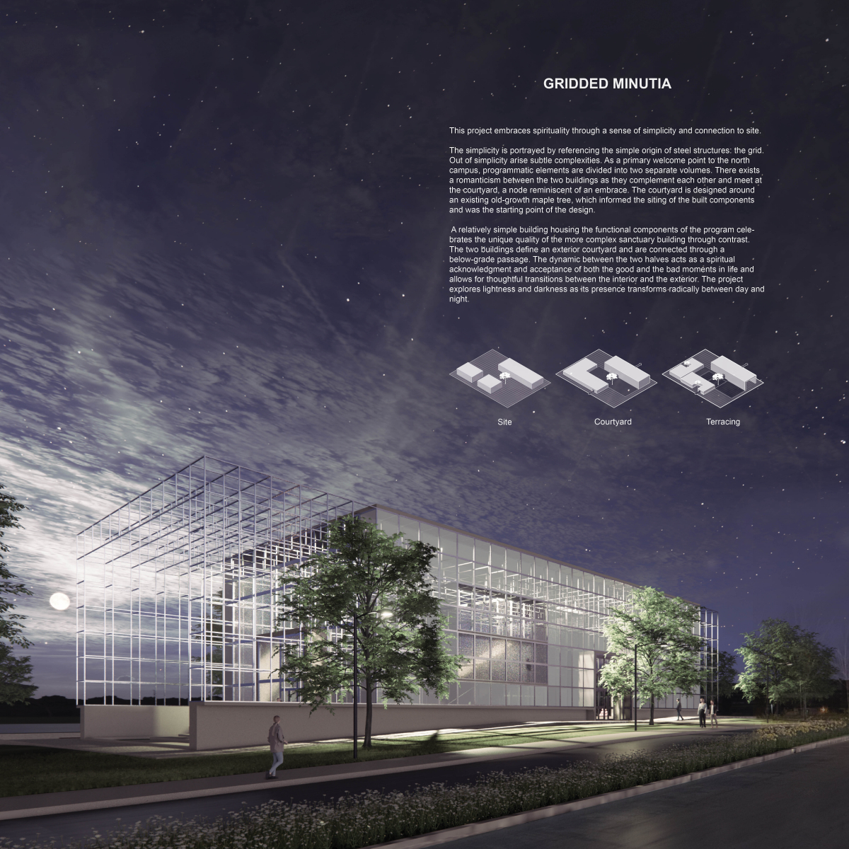
Gridded Minutia
Student: Becca Northey
Faculty Sponsor: Timothy Gray
Institution: Ball State University
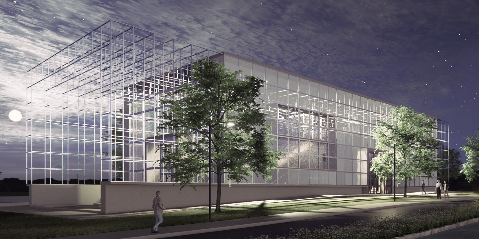
Juror Comments: Gridded Minutia is an honorable mention that shows well developed and clearly designed submission boards. The effort to create a green habitable outdoor space is brought to the forefront through the beautiful renderings.
Project Description
Gridded Minutia
This project embraces spirituality through a sense of simplicity and connection to site.
The simplicity is portrayed by referencing the simple origin of steel structures: the grid. Out of simplicity arise subtle complexities. As a primary welcome point to the north campus, programmatic elements are divided into two separate volumes. There exists a romanticism between the two buildings as they complement each other and meet at the courtyard, a node reminiscent of an embrace. The courtyard is designed around an existing old-growth maple tree, which informed the siting of the built components and was the starting point of the design.
A relatively simple building housing the functional components of the program celebrates the unique quality of the more complex sanctuary building through contrast. The two buildings define an exterior courtyard and are connected through a below-grade passage. The dynamic between the two halves acts as a spiritual acknowledgment and acceptance of both the good and the bad moments in life and allows for thoughtful transitions between the interior and the exterior. The project explores lightness and darkness as its presence transforms radically between day and night.
Site Courtyard Terracing
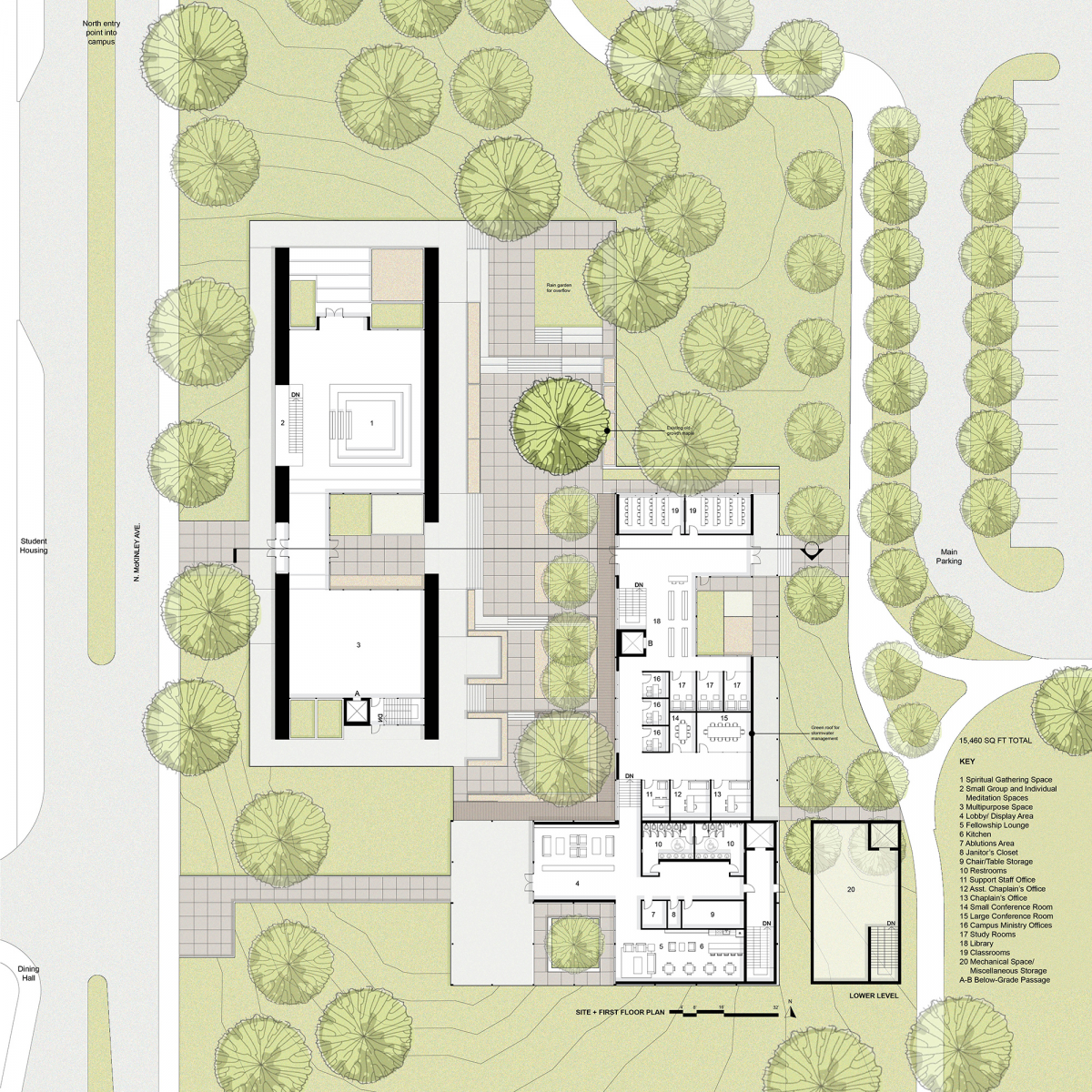
Site + First Floor Plan
Lower Level
15,460 SQ FT Total
Key
Spiritual Gathering Space
Small Group and Individual Meditation Spaces
Multipurpose Space
Lobby/Display Area
Fellowship Lounge
Kitchen
Ablutions Atea
Janitor’s Closet
Chair/Table Storage
Restrooms
Support Staff Office
Asst. Chaplain’s Office
Chaplain’s Office
Small Conference Room
Large Conference Room
Campus Ministry Office
Study Rooms
Library
Classrooms
Mechanical Space/ Miscellaneous Storage
A-B Below-Grade Passage
North entry point into campus
Student Housing
N. McKinley Ave
Dining Hall
Main Parking
Rain garden for overflow
Existing old-growth maple
Green roof for stormwater management
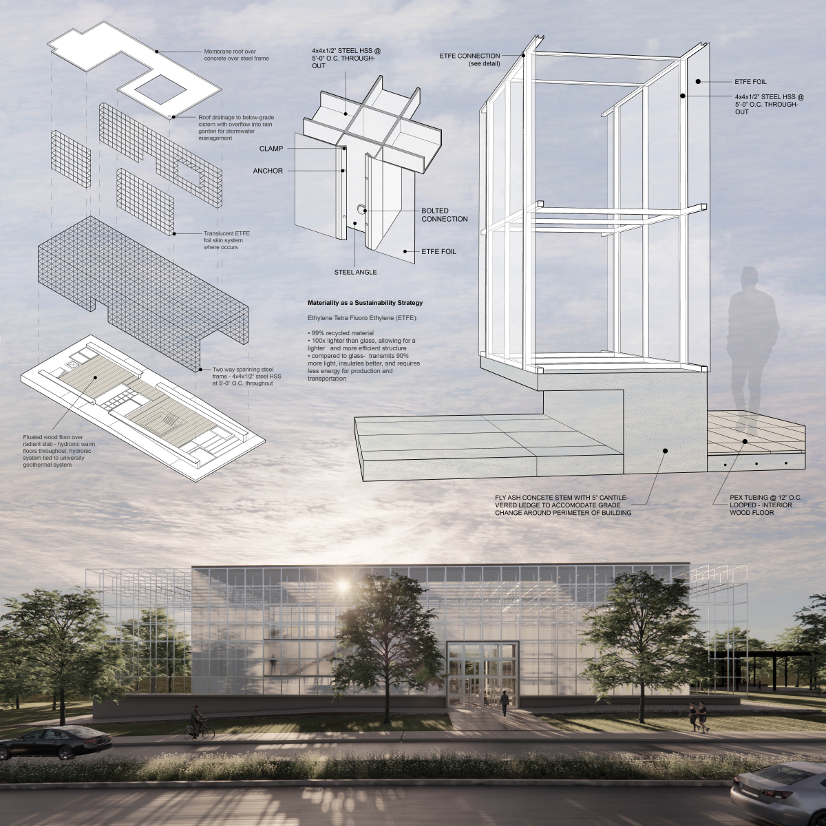
Membrane roof over concrete over steel frame
Roof drainage to below-grade cistern with overflow into rain garden for stormwater management
Translucent ETFE foil skin where occurs
Two-way spanning steel frame – 4x4x1/2” steel HSS at 5’-0” O.C. throughout
Floated wood floor over radiant slab – hydronic warm floors throughout, hydronic system tied to university geothermal system
4x4x1/2” steel HSS at 5’-0” O.C. throughout
Clamp
Anchor
Bolted connection
ETFE Foil
Steel Angle
Materiality as a Sustainability Strategy
Ethylene Tetra Fluoro Ethylene (ETFE):
*99% recycled material
*100x lighter than glass, allowing for a lighter and more efficient structure
*Compared to glass – transmits 90% more light, insulates better, and requires less energy for production and transportation
ETFE Connection (see detail)
ETFE Foil
4x4x1/2” steel HSS at 5’-0” O.C. throughout
Fly ash concrete stem with 5” cantilevered ledge to accommodate grade change around the perimeter of the building
Pex tubing @ 12” O.C. looped – interior wood floor
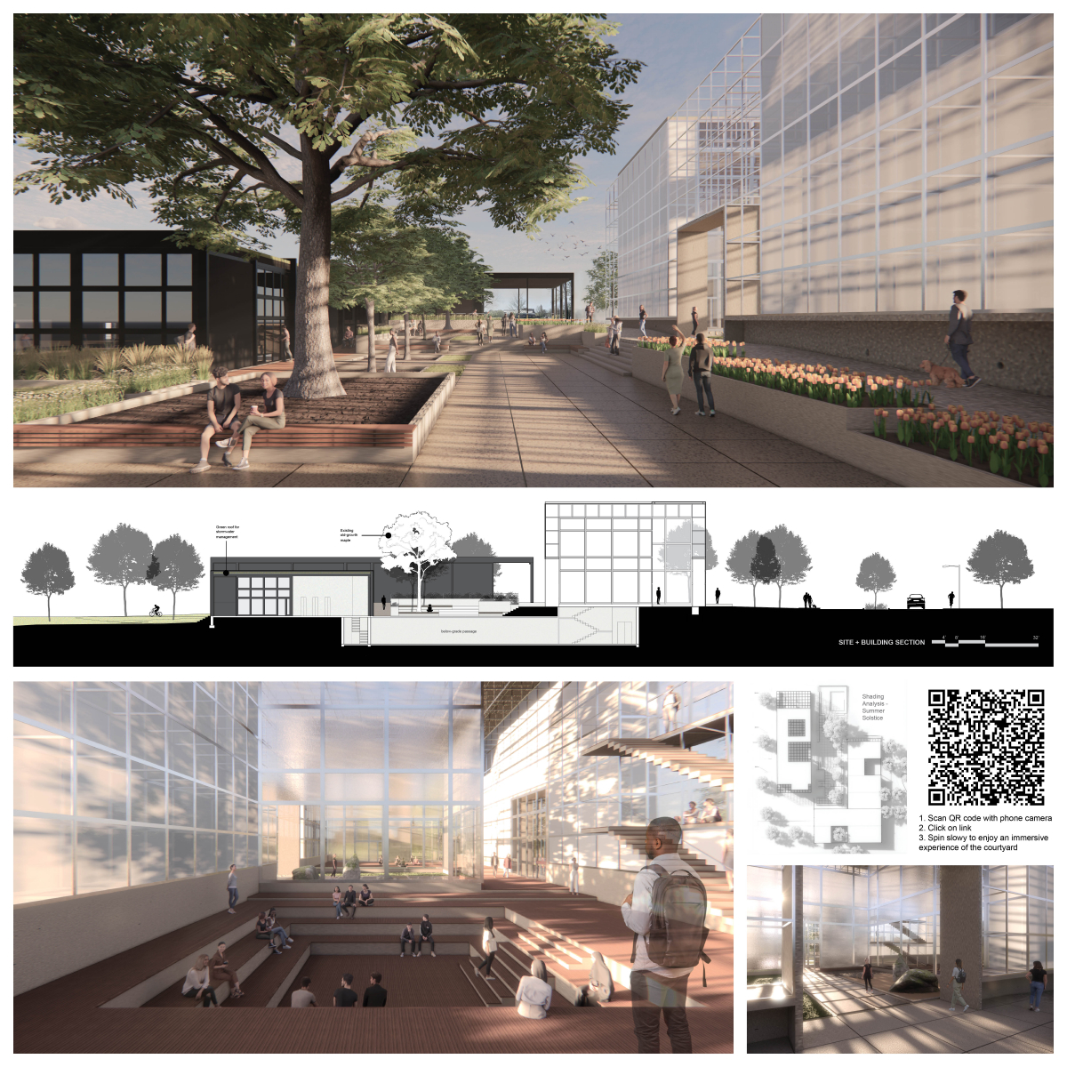
Site + Building Section
Existing old-growth maple
Green roof for stormwater management
Below-grade passage
Shading Analysis – Summer Solstice
1. Scan QR code with a phone camera
2. Click on link
3. Spin slowly to enjoy an immersive experience of the courtyard
Honorable Mention
Ampelos Winery
Student: Biming Liu
Faculty Sponsor: Daniel Brown
Institution: Savannah College of Art and Design
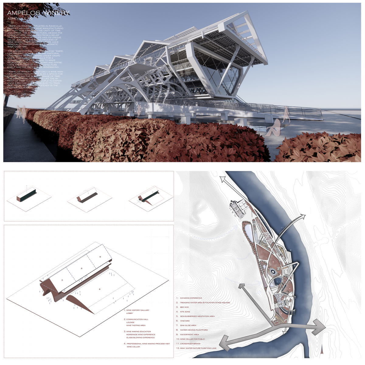
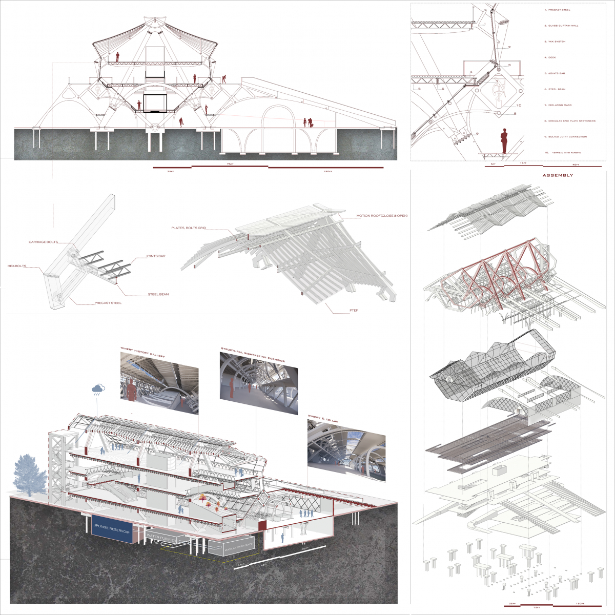
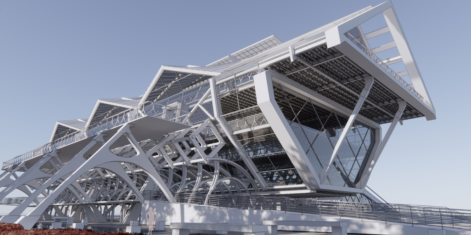
Juror Comments: Ampelos Winery is an honorable mention with sections that are reminiscent of a church or monastery. The hybrid framing of steel and wood is masterfully achieved through immaculate graphics.
Project Description
ARCHITECTURE THESIS OF AMPELOS WINERY
SITE: AMPELOS WINERY RIVERSIDE PARK, ASHEVILLE, NC
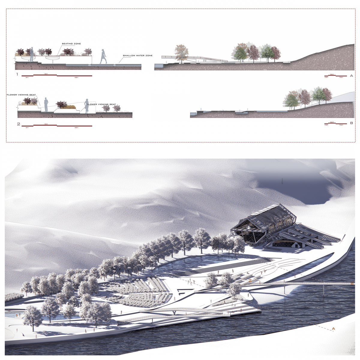
The park features two entrances: one for local residents to walk in, and another for visitors driving into the parking lot, seamlessly blending convenience and inclusivity for all types of guests. Once visitors park, they can access the park through three gateways. At the central entrance, there’s a self-service rental station for bikes and kayaks. Additionally, a safe kayak training area is available for beginners. After mastering the basics in this training zone, they can paddle upstream, immersing themselves in the enchanting allure of nature.
From the northern gateway, visitors are led directly to the central vineyard, allowing them to meander amidst lush grapevines, experiencing the journey from grape to wine. The southern entrance introduces guests to a shallow water play area with a depth of just one foot, enabling adults to wade with their children. Within this aquatic space, plant-covered island seats offer a resting point. Moving forward, visitors are greeted by a lively musical fountain square, a vibrant communal space suitable for various local events, offering a gathering place for locals and tourists alike.
The parking area also features a direct lane to AMPELOS WINERY, accessible for emergency vehicles like fire trucks and ambulances. During regular times, this lane caters to golf carts ferrying guests between the parking lot and the winery. Alongside the river, a waterfront platform is designed for guests to safely touch the river waters. Above this, a glass observation deck stretches over the river, giving the sensation of walking in mid-air. To the platform’s north lies a bridge spanning the river, connecting directly to an arts park on the opposite bank. To the south, a vast kite-flying park awaits. The expansive grassland, juxtaposed against the river views and complemented by winds from every direction in Asheville, makes it a prime spot for kite enthusiasts.
All paths eventually guide visitors to the heart of the park—AMPELOS WINERY. More than just a place to savor and craft exquisite wines, it stands as an ideal destination for exploring and indulging in nature, time and culture.
AMPELOS WINERY , ASHEVILLE, NC
The architectural design of AMPELOS WINERY ingeniously melds multifunctionality, eco-friendliness, and a unique experience, unveiling a cutting-edge architectural vision. The main building’s elevated structure showcases originality; the steel arches on either side not only function as pathways for bicycles but also epitomize the harmonious blend of modern material technology with classical architectural aesthetics. These arches elicit profound admiration for their craftsmanship and simultaneously serve as the building’s façade, offering a visually striking appearance.
The sunken bicycle parking area, complemented by the surrounding green zones, presents the public with both a practical and pleasant space. The auxiliary building, cleverly situated beneath the main structure’s steel framework, conceals a professional wine-making facility. Visitors can directly access this wine sanctuary from the square.
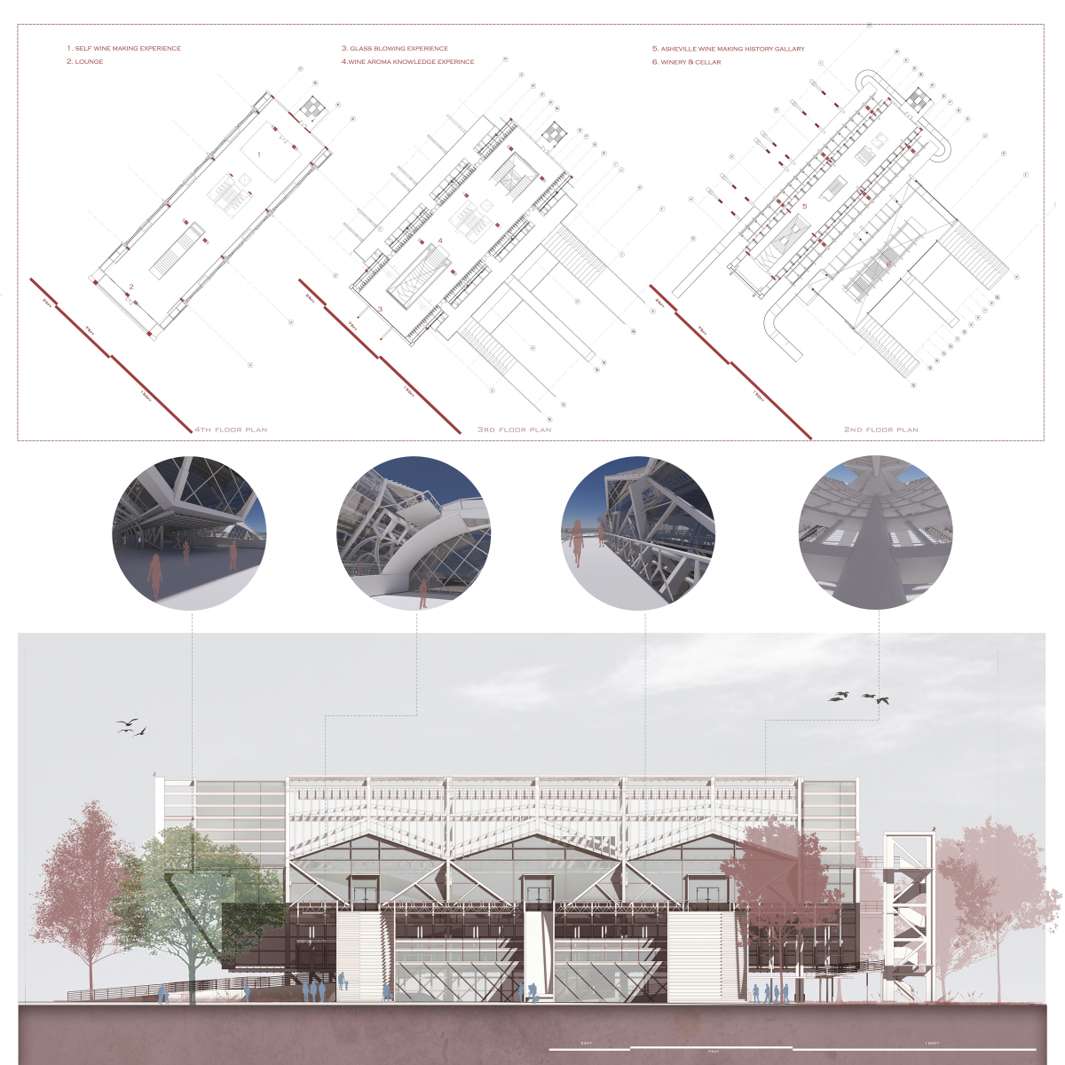
Upon entering the main edifice, a centrally positioned, eye-catching staircase and accessible pathways on both sides facilitate easy movement for visitors. The ground floor not only chronicles Asheville’s winemaking history but also features an indoor grapevine slope, allowing individuals to closely interact with, experience, and learn the enchantment of wine production.
The second floor is an artistic realm, combining a glassblowing experience with wine aroma tasting. Parents can guide their children here to craft exclusive containers for their wine. Additionally, a welcoming terrace garden graces this level. From the riverside avenue, guests can opt to ascend via the staircase or enjoy a fun slide descent. Further enhancing this space, the architectural design incorporates a vertical wind power generator, underscoring a staunch commitment to renewable energy.
The third floor is an airy, expansive lounge and wine tasting space. Here, visitors can not only savor wines but also immerse themselves in the winemaking process. A specially designed adjustable rooftop can ventilate, collect rainwater, and modulate indoor natural lighting as required, manifesting the building’s eco-friendly pledge and design philosophy.
Winemaking is akin to penning a diary, with time serving as its guide. Years later, as children mature and visit AMPELOS WINERY with friends, they can proudly retrieve a bottle of wine from the cellar, sharing, “Hey, this wine was crafted years ago with my parents.” Let’s relish the process of fermenting a delightful and serene record of time for our future!
Honorable Mention
The Steel Collector: Reclaiming Landscapes
Student: Elsie O’Connell
Faculty Sponsor: A. Katherine Ambroziak
Institution: University of Tennessee-Knoxville
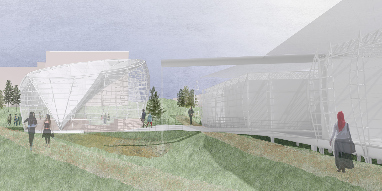
Juror Comments: The Steel Collector: Reclaiming Landscapes is an honorable mention creating inventive steel fish trusses and design. The submission is a thorough investigation into steel construction, which the jury appreciated.
Project Description
The natural environment connects all people on the Earth. For many, nature is spiritual; for others, it is a connection to what came before. As the environment becomes threatened worldwide, densifying campuses are beginning to realize the immense lack of green space and overall lack of value placed on the student experience and student health. A spiritual space introduces the interconnectivity modern campuses seek, while making students feel seen no matter their identity. In this context, green space becomes more than a space to occupy but a way to amplify and serve a spiritual center.
The University of Tennessee(UT) Agricultural Campus is separated from main campus by Knoxville’s third creek, creating a unique piece of campus encircled by water spanning out to cliff sides and mountains. Viewed as an archeological artifact, this pocket of land possess layered histories of value toward the environment. The agricultural college was one of the first colleges of UT, highlighting a tradition of agriculture in the region for centuries prior, one where the environment not only supplies us with life but with peaceful beauty. This site was also chosen as a final resting place for what is estimated to be the Hamilton indigenous tribe, whose burial mound dates to 640 A.D. Speaking to the erasure of identity and culture of indigenous people of the region, the university has not always made efforts to preserve the mound, and since the 1980’s a 800 foot long parking lot encroaches just 50 feet from the prehistoric mound which now has a small park dedicated to it.
This project proposes a reclaiming of the parking lot to restore it to a public greenspace home to an energetic spiritual center. The architectural landscape ties people through heightened awareness of the natural resources of this region through a structural expression of local wind, water, and sun patterns. The landscape preserves existing circulation while the remaining earth falls away, forming soft craters holding programmatic spaces. Views of the mound from the public entrance of the UT Botanical gardens are reinforced through earthen paths and the framing of woven steel spaces. The structure takes on a complex dialogue of a small cityscape, with normative spaces adapting piered trapezoidal forms to engage southern orientation and allow the ground to remain landscape, and the spiritual space functioning as a sundial enclosed in glass with rammed earth floors and seating that rests upon the ground. Inspired by the earthen mound, the height of spaces is dependent on sacredness, with most sacred touching the earth and most mundane being lifted farthest from it. Roof systems collect and channel water into dry creek beds, while the structure filters sun and expresses wind through a vertical truss and cable system.
The proposal is in part a steward of the landscape, inviting sustainable strategies and the use of plants in service, and on the other hand a spiritual collector of rain, sun, and wind. Steel provides an extremely lightweight delicacy and woven rhythm incomparable to any other structural material.
Board 1:
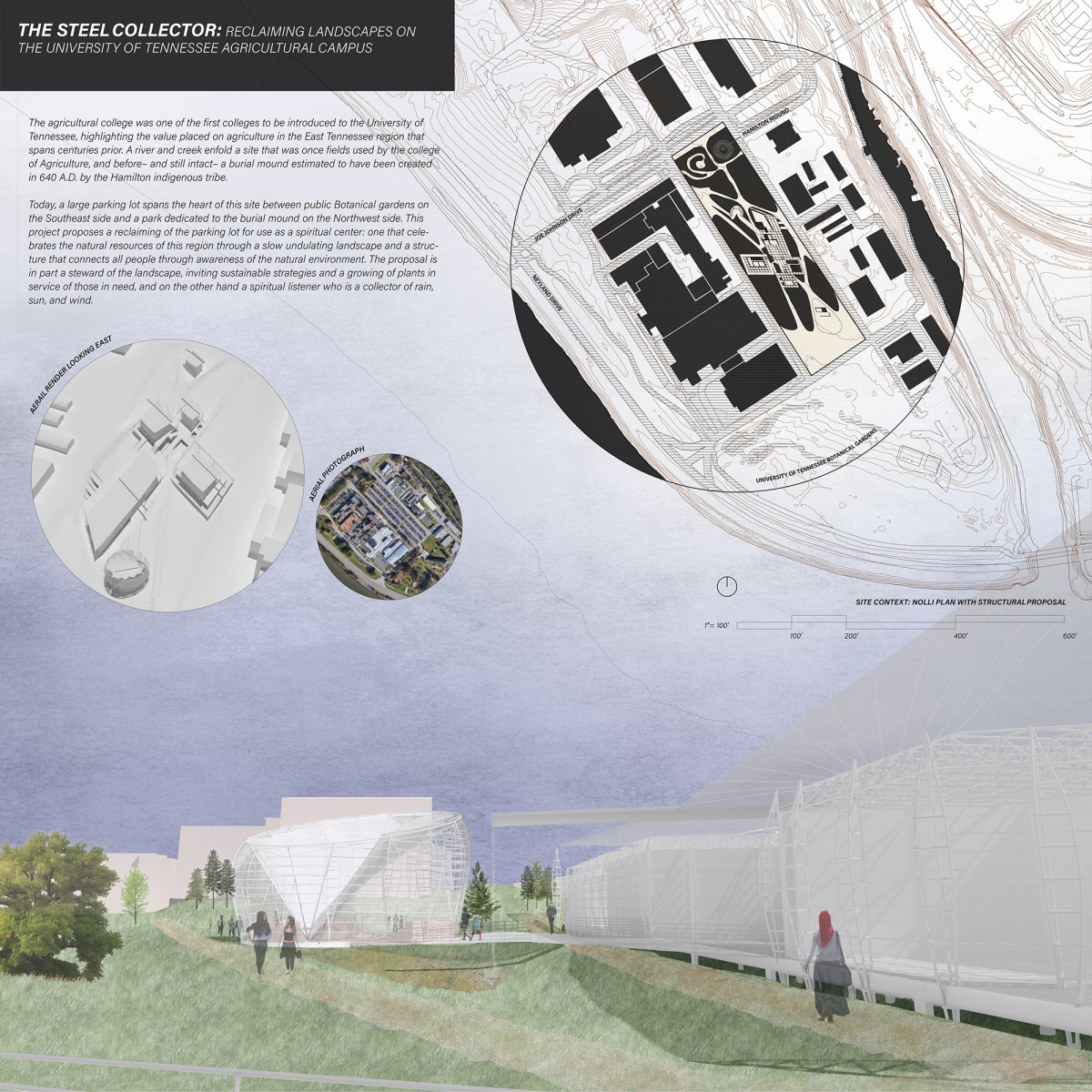
THE STEEL COLLECTOR: RECLAIMING LANDSCAPES ON THE UNIVERSITY OF TENNESSEE AGRICULTURAL CAMPUS
The agricultural college was one of the first colleges to be introduced to the University of Tennessee, highlighting the value placed on agriculture in the East Tennessee region that spans centuries prior. A river and creek enfold a site that was once fields used by the college of Agriculture, and before– and still intact– a burial mound estimated to have been created in 640 A.D. by the Hamilton indigenous tribe.
Today, a large parking lot spans the heart of this site between public Botanical gardens on the Southeast side and a park dedicated to the burial mound on the Northwest side. This project proposes a reclaiming of the parking lot for use as a spiritual center: one that celebrates the natural resources of this region through a slow undulating landscape and a structure that connects all people through awareness of the natural environment. The proposal is in part a steward of the landscape, inviting sustainable strategies and a growing of plants in service of those in need, and on the other hand a spiritual listener who is a collector of rain, sun, and wind.
Board 2:
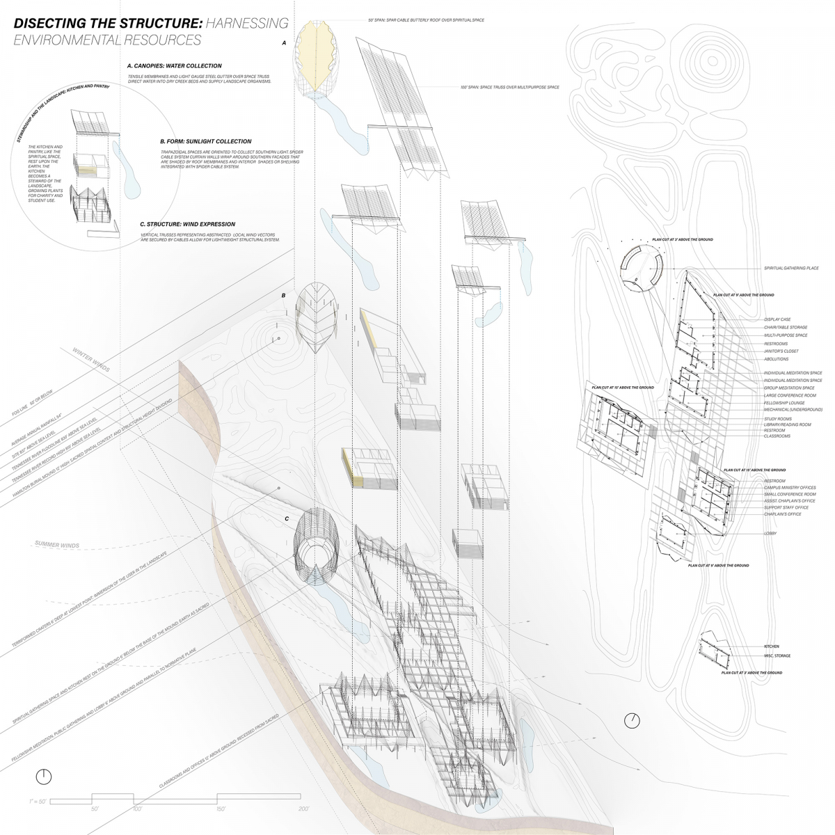
DISSECTING THE STRUCTURE: HARNESSING ENVIRONMENTAL RESOURCES
STEWARDSHIP AND THE LANDSCAPE: KITCHEN AND PANTRY
THE KITCHEN AND PANTRY, LIKE THE SPIRITUAL SPACE, REST UPON THE EARTH. THE KITCHEN BECOMES A STEWARD OF THE LANDSCAPE, GROWING PLANTS FOR CHARITY AND STUDENT USE.
A. CANOPIES: WATER COLLECTION
TENSILE MEMBRANES AND LIGHT GAUGE STEEL GUTTER OVER SPACE TRUSS DIRECT WATER INTO DRY CREEK BEDS AND SUPPLY LANDSCAPE ORGANISMS.
B. FORM: SUNLIGHT COLLECTION
TRAPEZOIDAL SPACES ARE ORIENTED TO COLLECT SOUTHERN LIGHT. SPIDER CABLE SYSTEM CURTAIN WALLS WRAP AROUND SOUTHERN FACADES THAT ARE SHADED BY ROOF MEMBRANES AND INTERIOR SHADES OR SHELVING INTEGRATED WITH SPIDER CABLE SYSTEM. SPACES ARE WRAPPED IN DECKING ON THE SOUTH SIDE, ELONGATING OCCUPIED SOLAR ZONES WITH A STRUCTURAL LIGHTNESS REMINISCENT OF THE REGIONAL VERNACULAR SCREENED PORCH.
C. STRUCTURE: WIND EXPRESSION
VERTICAL TRUSSES REPRESENTING ABSTRACTED LOCAL WIND VECTORS ARE SECURED BY CABLES ALLOW FOR LIGHTWEIGHT STRUCTURAL SYSTEM.
FOG LINE 50’ OR BELOW
AVERAGE ANNUAL RAINFALL 54”
SITE 837’ ABOVE SEA LEVEL
TENNESSEE RIVER FLOODLINE 830’ ABOVE SEA LEVEL
TENNESSEE RIVER RECORD HIGH 819’ ABOVE SEA LEVEL
HAMILTON BURIAL MOUND 12’ HIGH: SACRED SPATIAL CONTEXT AND STRUCTURAL HEIGHT DIVIDEND
TERRIFORMED CRATERS 6’ DEEP AT LOWEST POINT: IMMERSION OF THE USER IN THE LANDSCAPE
SPIRITUAL GATHERING PLACE AND KITCHEN REST ON THE GROUND 6’ BELOW THE BASE OF THE MOUND: EARTH AS SACRED
FELLOWSHIP, MEDITATION, PUBLIC GATHERING AND LOBBY 6’ ABOVE GROUND AND PARALLEL TO NORMATIVE PLANE
CLASSROOMS AND OFFICES 12’ ABOVE THE GROUND: RECESSED FROM SACRED
50’ SPAN: SPAR CABLE BUTTERLY ROOF OVER SPIRITUAL SPACE
100’ SPAN: SPACE TRUSS OVER MULTIPURPOSE SPACE
Board 3:
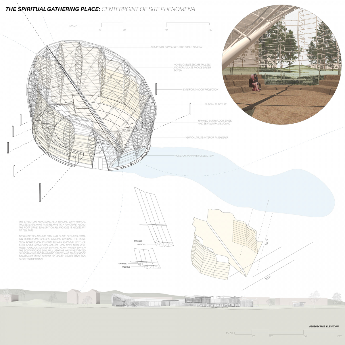
THE SPIRITUAL GATHERING PLACE: CENTERPOINT OF SITE PHENOMENA
SOLAR AXIS: CANTILEVER SPAR CABLE, 50’ SPAN
WOVEN CABLES SECURE TRUSSES AND FORM GLASS FACADE SPIDER SYSTEM
EXTERIOR SHADOW PROJECTION
SUNDIAL PUNCTURE
RAMMED EARTH FLOOR, STAGE, AND SEATING FRAME MOUND
VERTICAL TRUSS: INTERIOR TIMEKEEPER
POOL FOR RAINWATER COLLECTION
THE STRUCTURE FUNCTIONS AS A SUNDIAL, WITH VERTICAL TRUSSES DISPLAYING TIME RELATIVE TO A PUNCTURE ALONG THE ROOF SPINE. SUNLIGHT ON ALL FACADES IS NECESSARY TO TELL TIME. MITIGATING SOLAR HEAT GAIN AND GLARE REQUIRES SHADING DEVICES AND SPECIFIC GLAZING OPTIONS. THE OVERHEAD CANOPY AND INTERIOR SHADES COINCIDE WITH THE STEEL CABLE STRUCTURAL SYSTEM , AND HAVE BEEN OPTIMIZED TO BLOCK SUMMER SUN AND ADMIT WINTER SUN ON THE SOUTH FACADE. SIMILARLY, LIGHTING WAS INVESTIGATED ON NORMATIVE PROGRAMMATIC SPACES AND TENSILE ROOF MEMBRANES WERE RESIZED TO ADMIT WINTER RAYS AND BLOCK SUMMER RAYS.
Board 4:
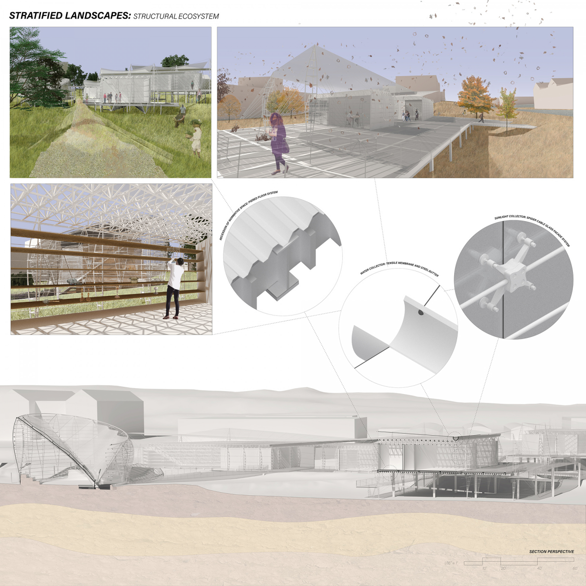
STRATIFIED LANDSCAPES: STRUCTURAL ECOSYSTEM
RECESSION OF NORMATIVE SPACE: PIERED FLOOR SYSTEM
WATER COLLECTOR: TENSILE MEMBRANE AND STEEL GUTTER
SUNLIGHT COLLECTOR: SPIDER CABLE GLASS FACADE SYSTEM
Participating Schools
The competition had over 1,000 participants from the following schools:
American University of Sharjah, Ball State University, Boston Architectural College, California Polytechnic State University, California State Polytechnic University, Pomona, Carleton University, Catholic University of America, Clemson University, Cornell University, Florida Agricultural and Mechanical University, Georgia Institute of Technology, Harvard University, Kansas State University, Kean University, Kennesaw State University, Louisiana State University, Louisiana Tech University, Madison College, Morgan State University, New Jersey Institute of Technology, New York Institute of Technology, North Carolina State University, Oklahoma State University, Pontifical Catholic University of Puerto Rico, Rensselaer Polytechnic Institute, Savannah College of Art and Design, South Dakota State University, Southern Illinois University, Syracuse University, Texas A&M University, The University of Adelaide, Toronto Metropolitan University, Tulane University, University of Colorado Denver, University of Hawaii at Manoa, University of Houston, University of Illinois, Urbana-Champaign, University of Maine, University of Maine at Augusta, University of Massachusetts Amherst, University of Minnesota, University of New Mexico, University of North Carolina at Charlotte, University of Tennessee-Knoxville, University of Toronto, University of Washington, Virginia Tech, Woodbury University
Competition Partners
Edwin Hernández
Programs Coordinator
ehernandez@acsa-arch.org
202.785.2324
Eric Wayne Ellis
Senior Director of Operations and Programs
eellis@acsa-arch.org
202.785.2324

 Study Architecture
  ProPEL