CATEGORY II: WINNERS
OPEN
Offers architecture students the opportunity to select a site and building program using steel as the primary material. This competition category permits the greatest amount of flexibility for any building type.
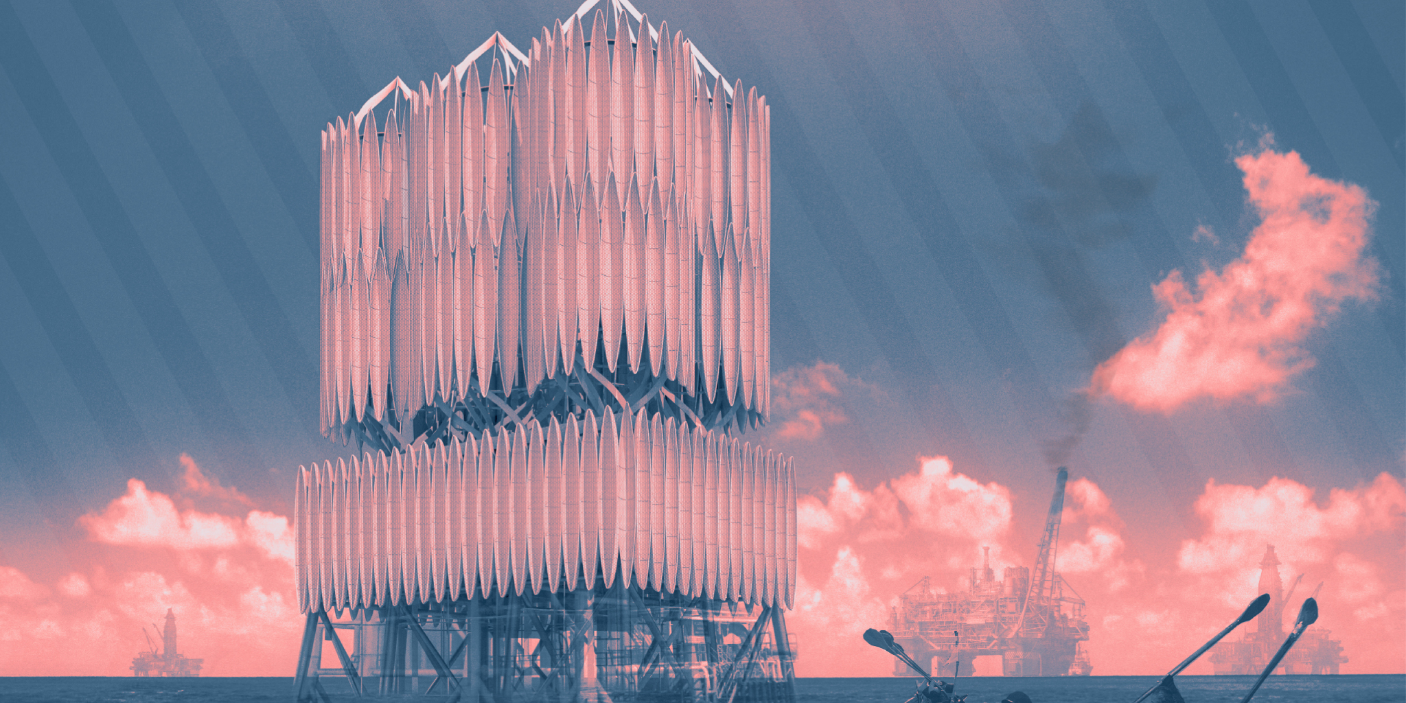

1st Place
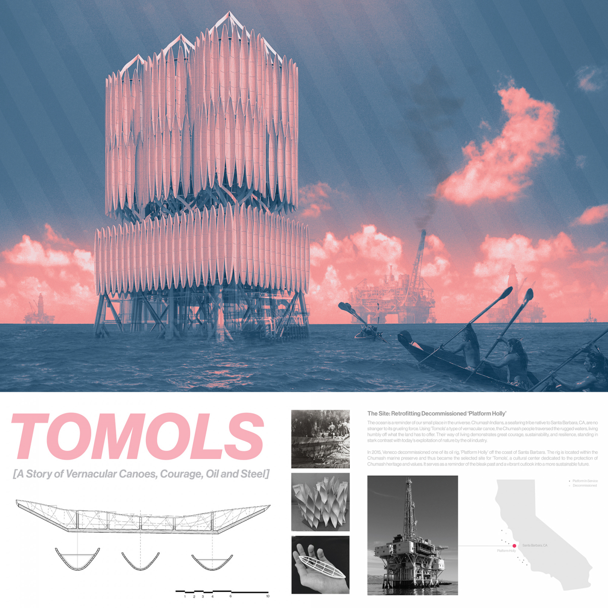
Tomols
Student: Ron Patanavin
Faculty Sponsor: Thomas Fowler
Institution: California Polytechnic State University
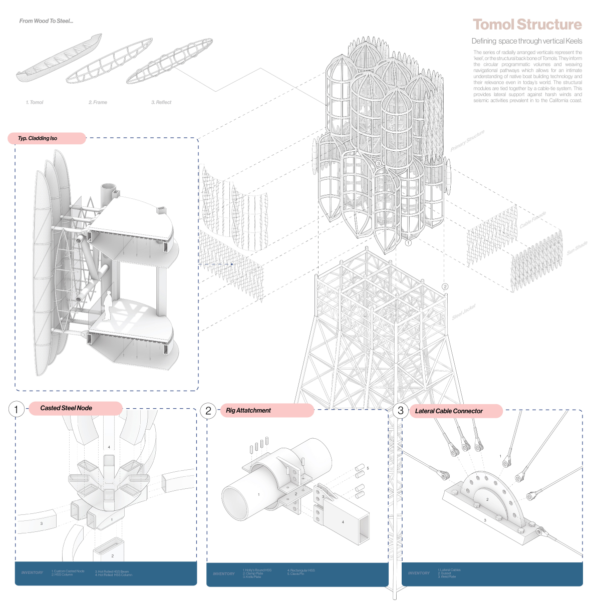
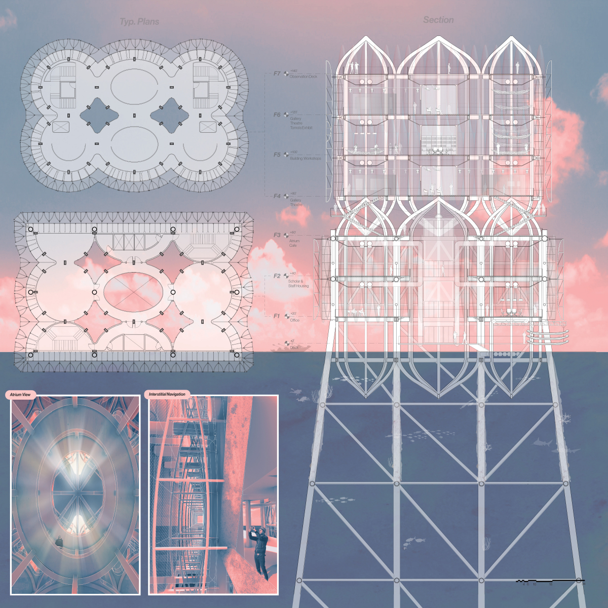
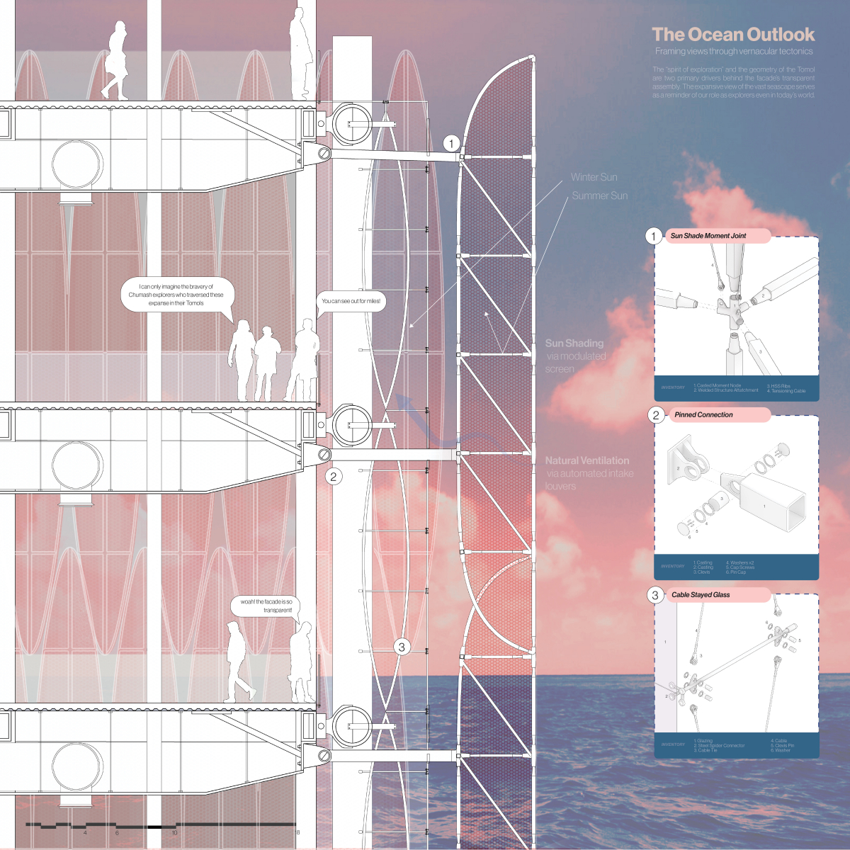
Tomols elegantly uses steel structure to demonstrate the design concept and message about the Chumash history and its cultural value. The detailed axonometric drawing shows how the steel comes together allowing the project to feel grounded. The overall design is structurally well designed, clear and a great example of reuse.
Project Description
[A Story of Vernacular Canoes, Courage, Oil and Steel]
The Site: Retrofitting Decommissioned ‘Platform Holly’
The ocean is a reminder of our small place in the universe. Chumash Indians, a seafaring tribe native to Santa Barbara, CA, are no stranger to its grueling force. Using ‘Tomols’, a type of vernacular canoe, the Chumash people traversed the rugged waters, living humbly off what the land has to offer. Their way of living demonstrates great courage, sustainability, and resilience, standing in stark contrast with today’s exploitation of nature by the oil industry.
In 2015, Veneco decommissioned one of its oil rig, ‘Platform Holly’ off the coast of Santa Barbara. The rig is located within the Chumash marine preserve and thus became the selected site for ‘Tomols’, a cultural center dedicated to the protection of Chumash heritage and values. It serves as a reminder of the bleak past and a vibrant outlook into a more sustainable future.
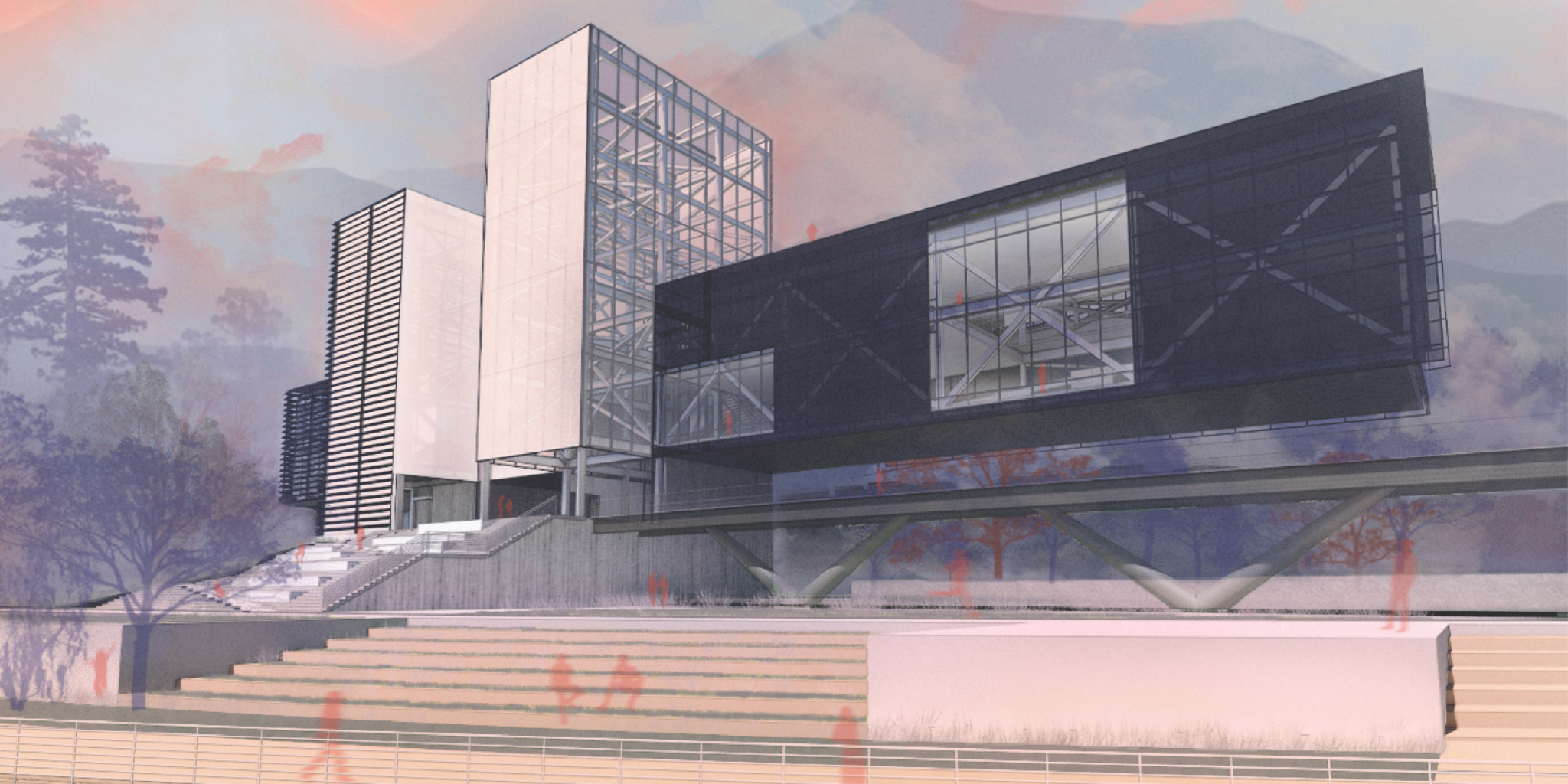

2nd Place
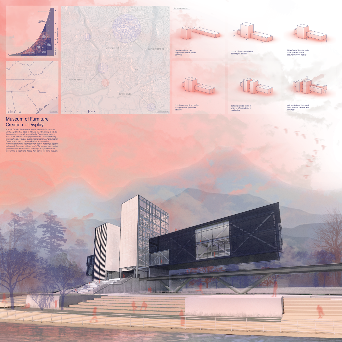
Furniture Museum, Creation + Display
Student: Randolph Allison
Faculty Sponsor: Daniel Brown
Institution: Savannah College of Art and Design
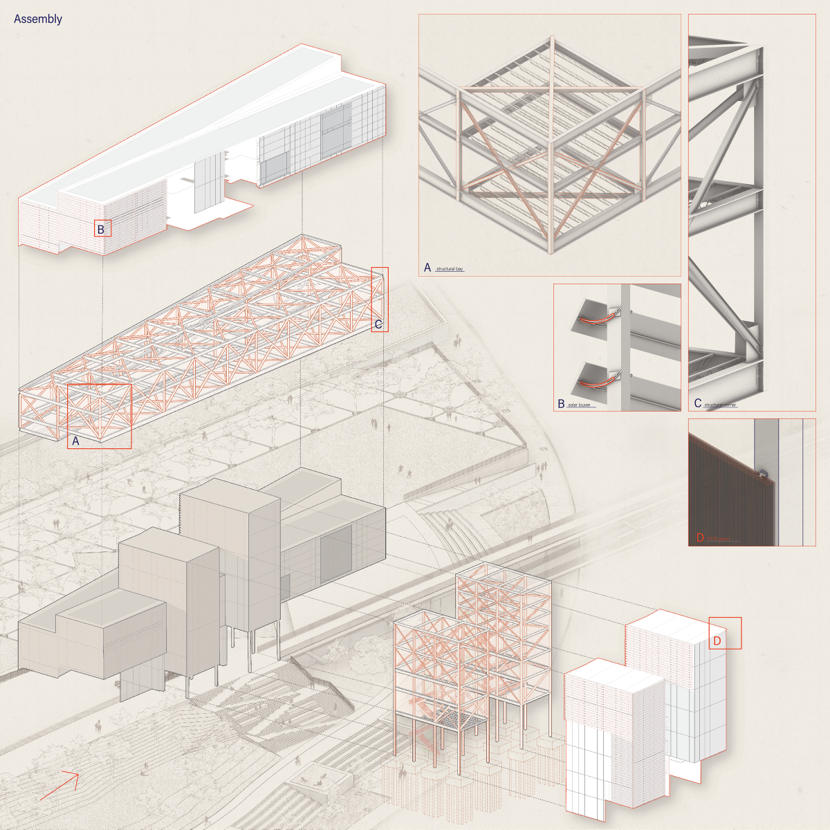
Furniture Museum, Creation + Display is a poetic use of steel. The stacking of boxes is an inventive way to create the form. The overall structure is proportional to the design, which adds a quality of refinement and reality.
Project Description
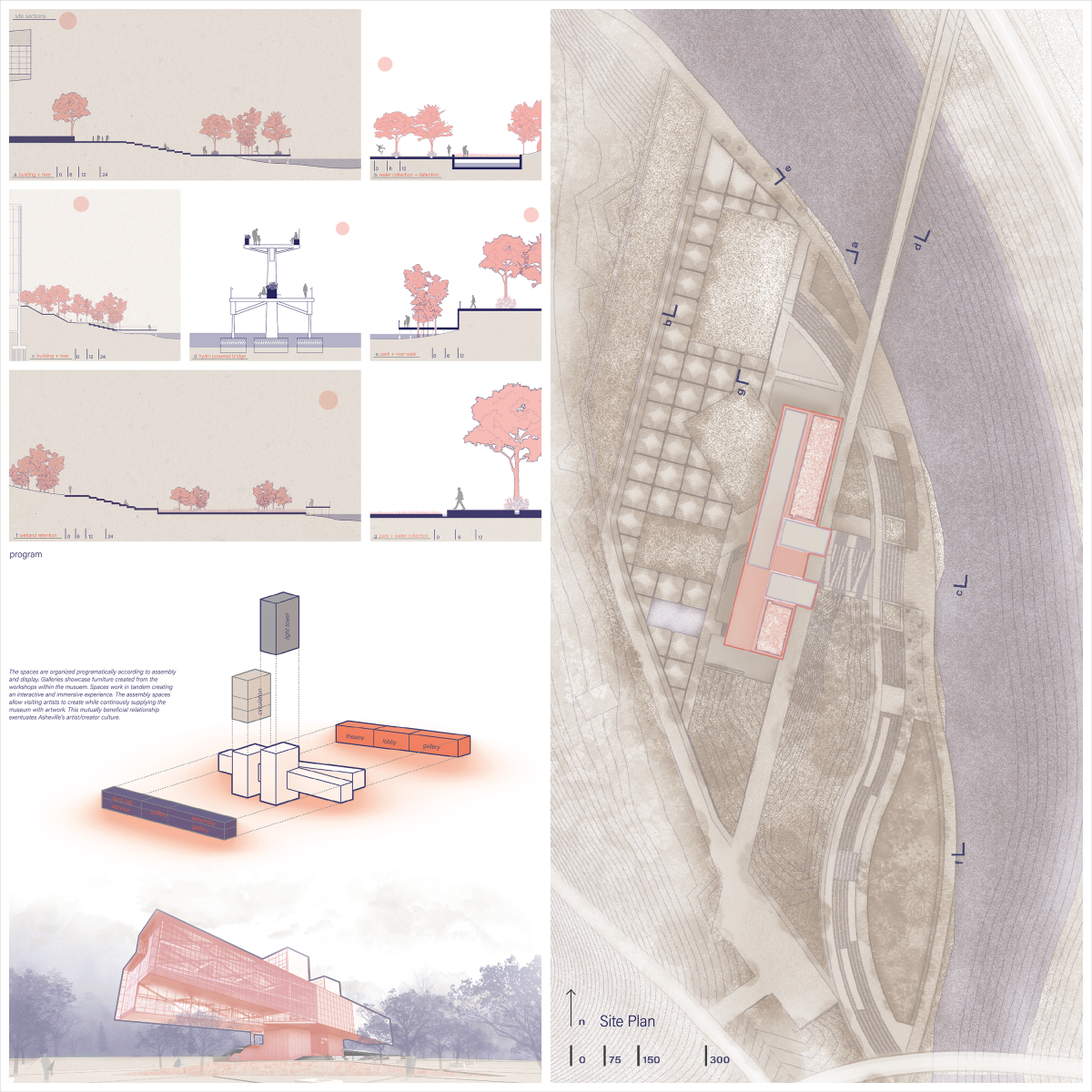
In North Carolina, furniture has been a way of life for centuries. Craftspeople from all walks of life have used creatitivity to elevate themselves economically and spiritually. This museum seeks to assist in the creation and display of furniture. The craft has long been neglected by culture due to mechanization and globalization. The architecture and its site work with the surrounding communities to create a connected art district that brings together craftspeople from many different crafts. The program was inspired by the river arts district nearby. Workshops and gallery spaces allow artists to create and display their work in the same museum.
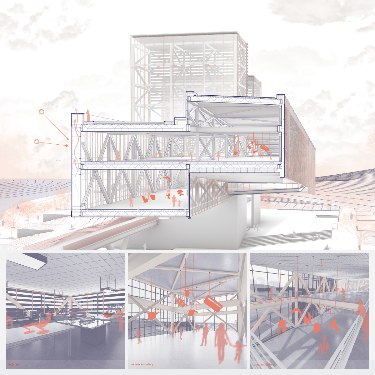
The spaces are organized programmatically according to assembly and display. Galleries showcase furniture created from the workshops within the museum. Spaces work in tandem creating an interactive and immersive experience. The assembly spaces allow visiting artists to create while continuously supplying the museum with artwork. This mutually beneficial relationship accentuates Asheville’s artist/creator culture.
Furniture is something that sets the stage for our everyday interactions. It controls our social settings. It interrupts and interjects. The function is primal and the aesthetics functional. Every culture from every corner of the world has their version of the furniture archetypes, each revealing something about the culture that created them.
The site of this museum has a deep history and culture of furniture making. Largely influenced by the millions of hardwood trees native to the area, furniture making became one of the most prominent businesses in the state early in its history. Crafting became a vehicle for financial mobility and remains one til this day.
So the question poses itself: How to design a museum for a place with a strong craft culture and how can the spaces serve the craft?
The answer comes through looking at the museum like we look at our furniture. The building then becomes the setting, while the furniture becomes the active participants in the drama. The objects are displayed in a way that changes the viewers perspective. This perspective shift creates an environment honoring the craft by glorifying the object.
The museum is unique in that it features creation and display. Display spaces serve as a setting for the drama of craft. Creation spaces make the craft the object on display. The process is glorified and on view. By elevating the craft, the objects become something other than tools for sitting or storing. The spaces serve the craft and create a perspective shifting experience.
Programmatically the spaces are divided into two volumes. Spaces for creation are highlighted and put on display. The creation spaces are designed to enhance the experience of the craftspeople, taking into account the crafts-peoples needs. The large display spaces serve the craft by changing the perspective of the objects, creating a more dramatic interaction between the user and the objects. Two large vertical towers serve as “lanterns” for the museum. During the day they flood the interior spaces with light and at night they act as a beacon, a guiding light for the lost craftsperson. Other programmatic elements are a library space and a theater space that serve as spaces for education and instruction. The site features many opportunities for interaction between user and craft. To the north of the building is the more formal park space, with outdoor gallery spaces, event spaces, and spaces for recreation. To the south east of the building is the less formal park space. These spaces are designed to create interactions between users and the natural landscape. Spaces for relaxation and isolation create the setting for reflection. These spaces help decompress users after the museum experience. Programmatically the site and the building seek to serve furniture craftspeople in Asheville, North Carolina.
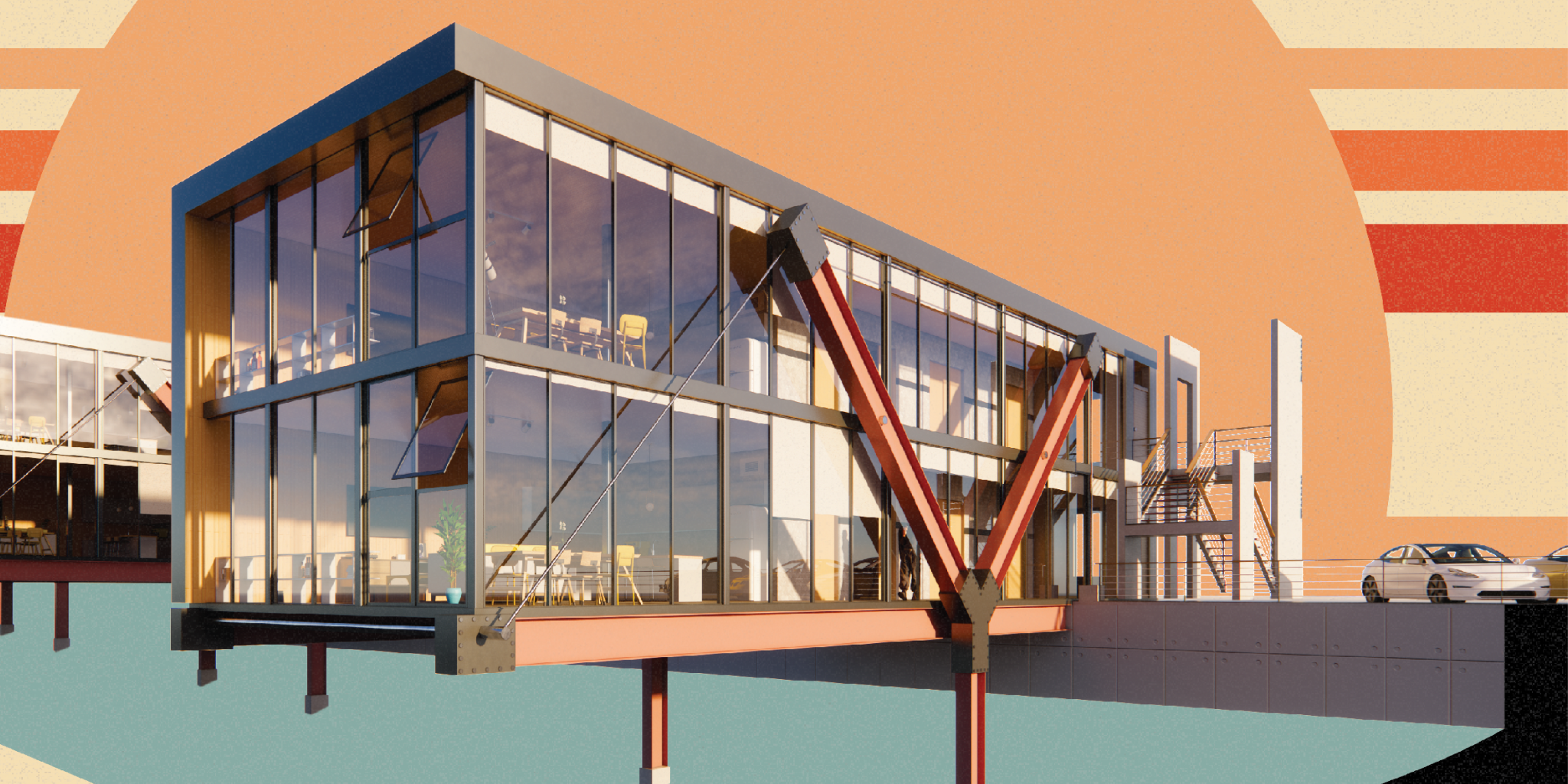

3rd Place
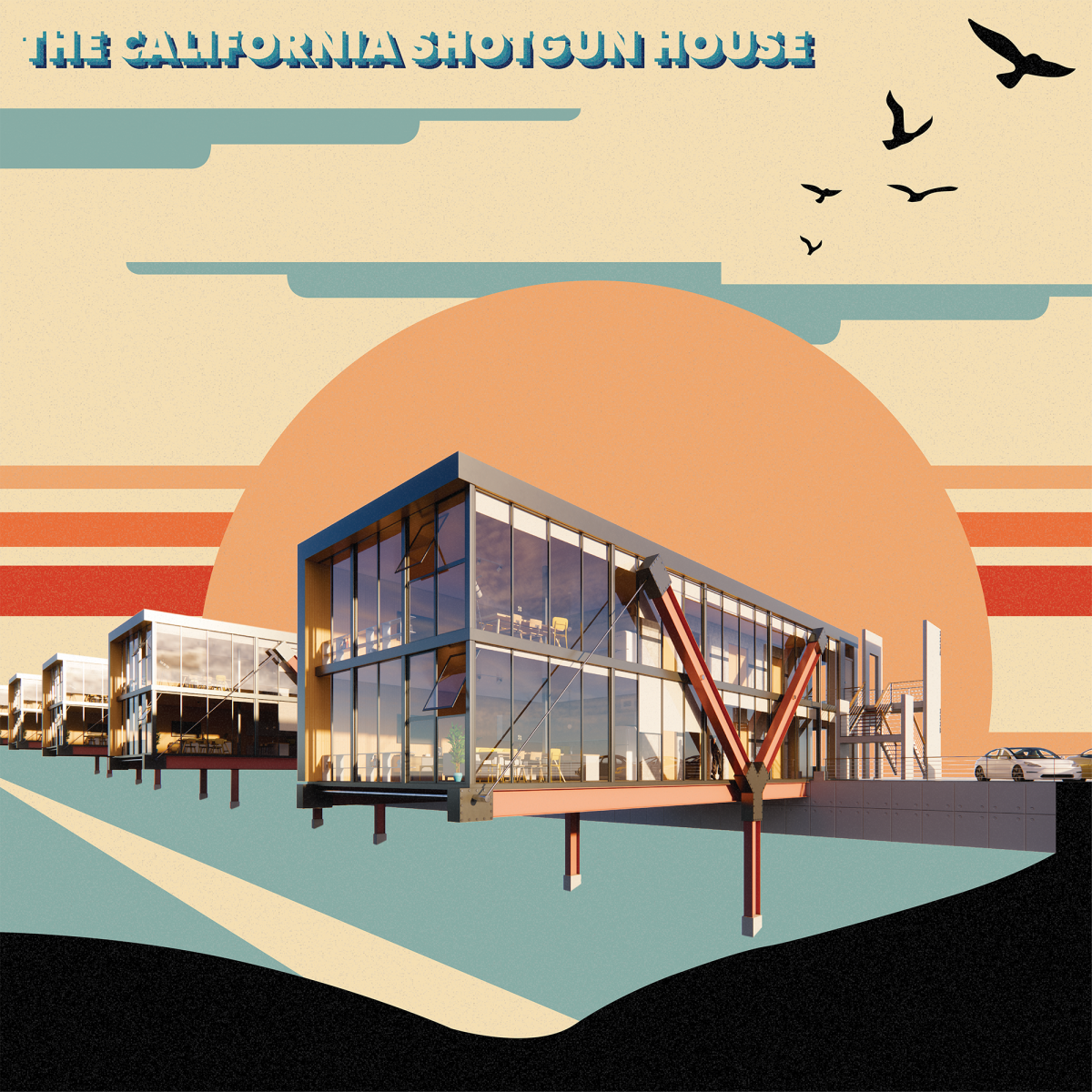
The California Shotgun House
Student: Bryce Humbrecht
Faculty Sponsors: Gary Gilbert, Tara Street, & Kristopher Palagi
Institution: Louisiana State University
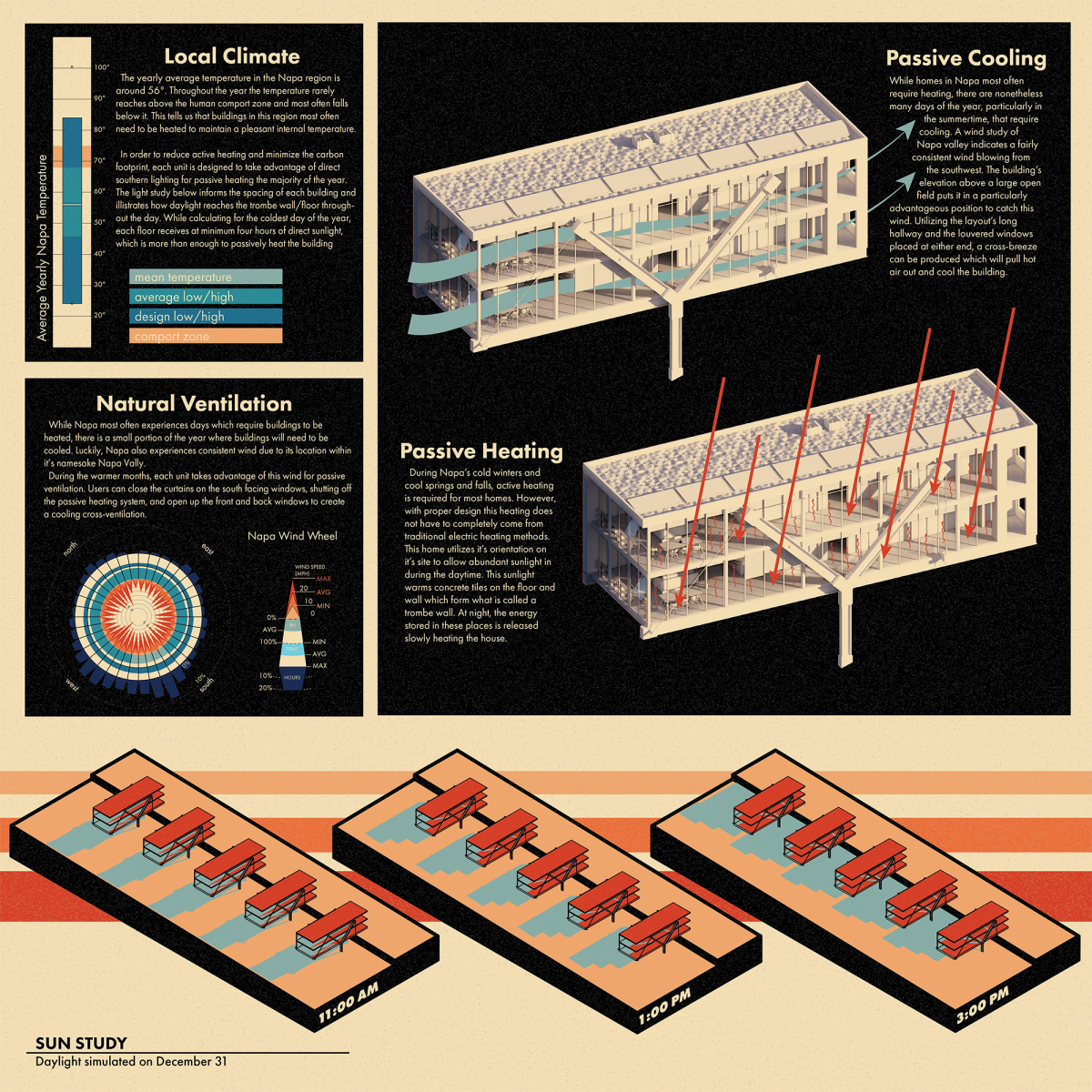
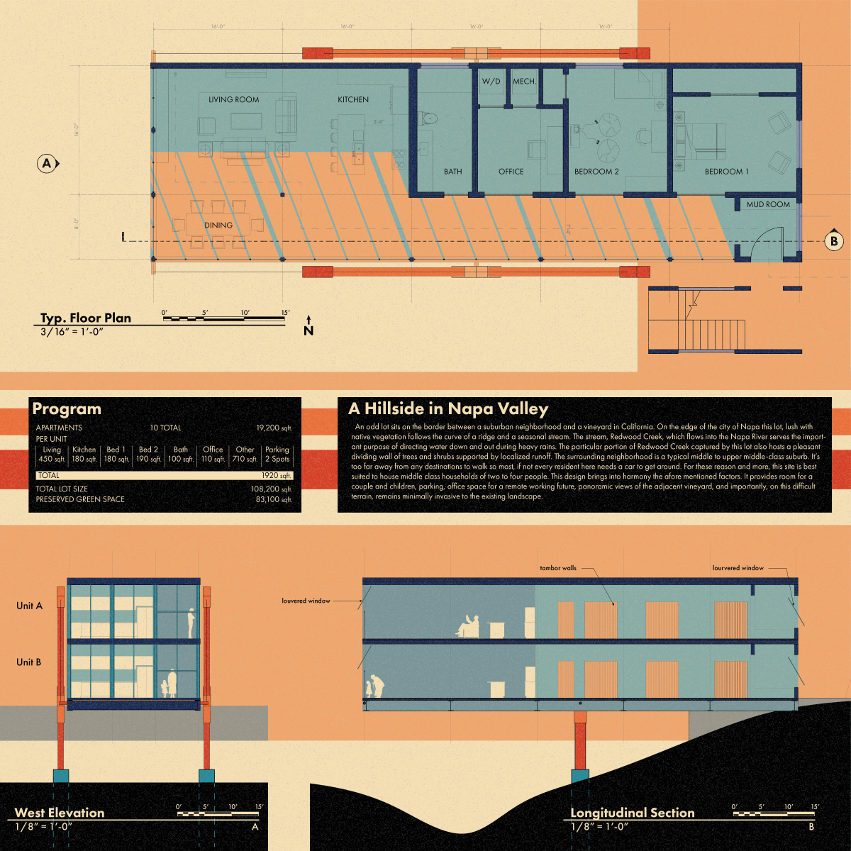
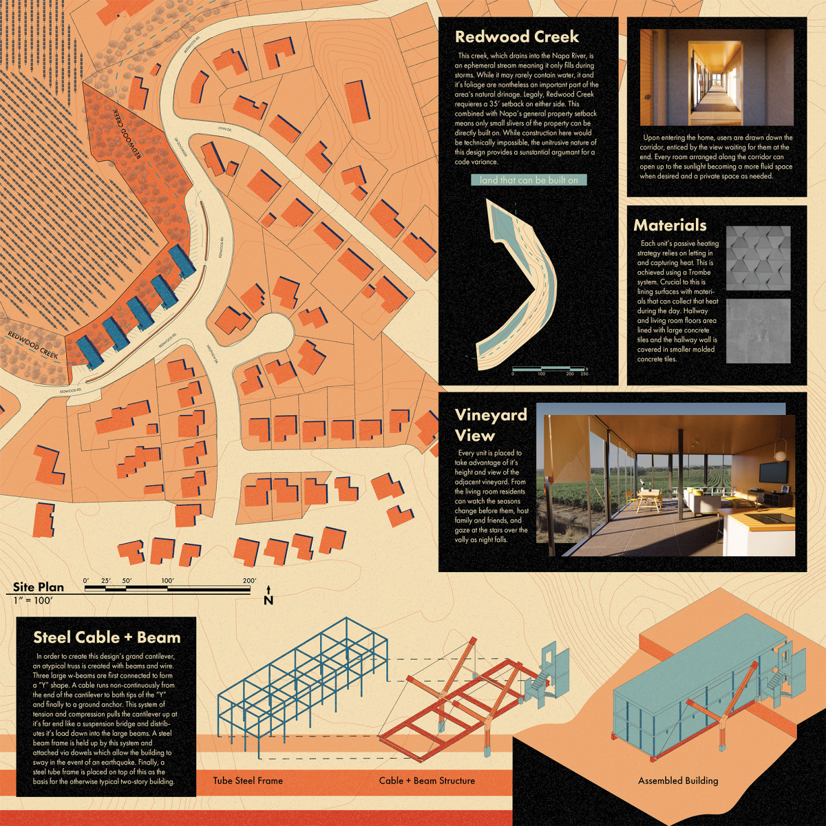
The California Shotgun House is a structurally sound design that brings forward an inventive solution for needed housing. The signature architectural elements on the façade with the wide columns are both functional and expressive. The student took a holistic approach to the structural creativity and made the graphics visually compelling.
Project Description
A Hillside in Napa Valley
An odd lot sits on the border between a suburban neighborhood and a vineyard in California. On the edge of the city of Napa this lot, lush with native vegetation follows the curve of a ridge and a seasonal stream. The stream, Redwood Creek, which flows into the Napa River serves the important purpose of directing water down and out during heavy rains. The particular portion of Redwood Creek captured by this lot also hosts a pleasant dividing wall of trees and shrubs supported by localized runoff. The surrounding neighborhood is a typical middle to upper middle-class suburb. It’s too far away from any destinations to walk so most, residents here need a car to get around. For these reasons and more, this site is best suited to house middle class households of two to four people. This design brings into harmony the aforementioned factors. It provides room for a couple and children, parking, office space for a remote working future, panoramic views of the adjacent vineyard, and importantly, on this difficult terrain, it remains minimally invasive to the existing landscape.
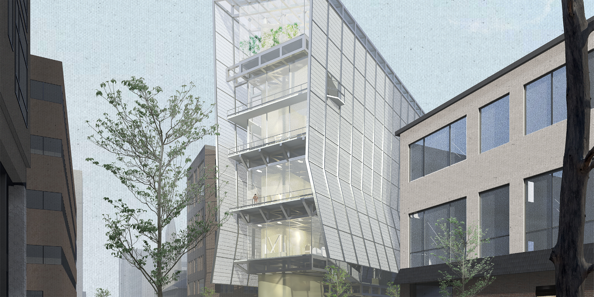

Honorable Mention
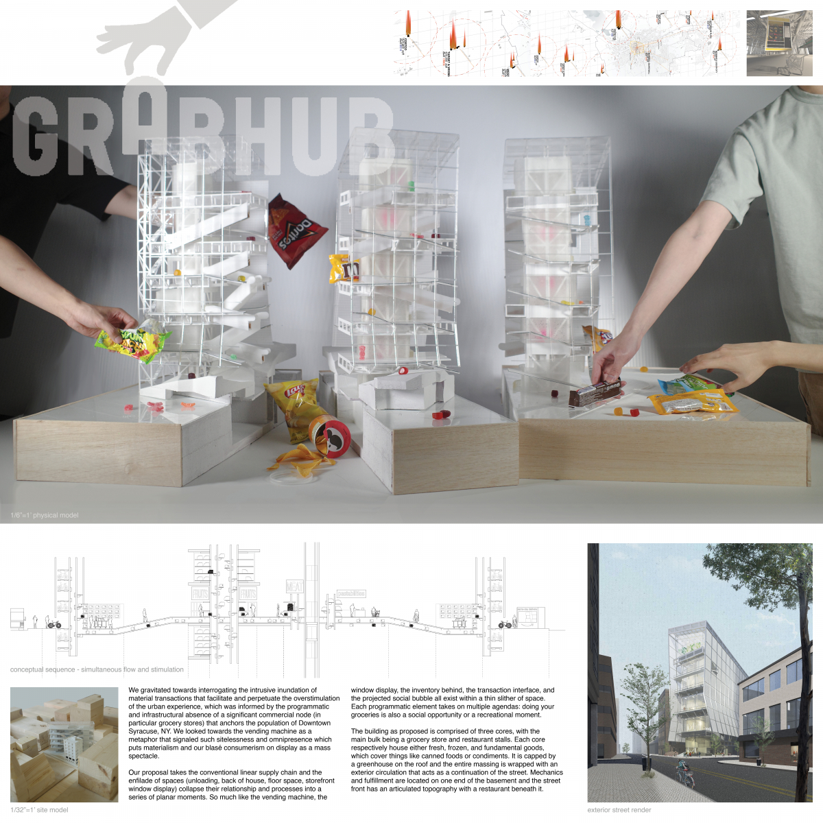
GrabHub
Students: Nicholas Chung & Chenhao Luo
Faculty Sponsor: Daekwon Park
Institution: Syracuse University
GrabHub receives an honorable mention with an impressive design and provocative 3D models. The project is an ambitious idea with a well documented process and beautiful submission boards.
Project Description
We gravitated towards interrogating the intrusive inundation of material transactions that facilitate and perpetuate the overstimulation of the urban experience, which was informed by the programmatic and infrastructural absence of a significant commercial node (in particular grocery stores) that anchors the population of Downtown Syracuse, NY. We looked towards the vending machine as a metaphor that signaled such sitelessness and omnipresence which puts materialism and our blasé consumerism on display as a mass spectacle.
Our proposal takes the conventional linear supply chain and the enfilade of spaces (unloading, back of house, floor space, storefront window display), and collapses their relationship and processes into a series of planar moments. So much like the vending machine, the window display, the inventory behind, the transaction interface, and the projected social bubble all exist within a thin slither of space. Each programmatic element takes on multiple agendas; doing your groceries is also a social opportunity or a recreational moment.
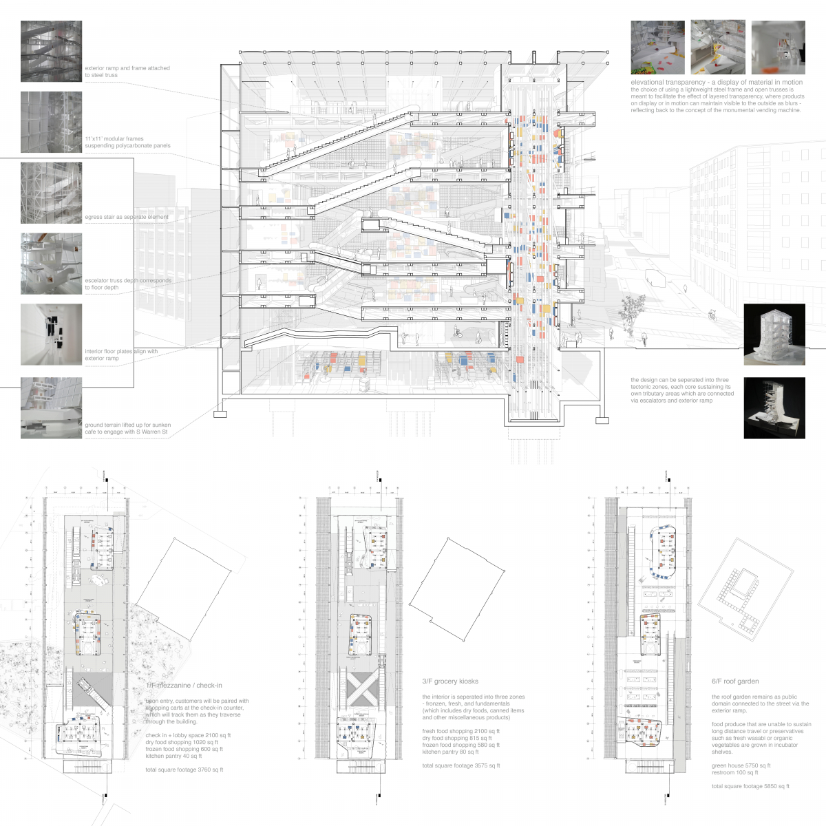
The building as proposed is comprised of three cores, with the main bulk being a grocery store and restaurant stalls. Each core respectively houses either fresh, frozen, and fundamental goods, which cover things like canned foods or condiments. It is capped by a greenhouse on the roof and the entire massing is wrapped with an exterior circulation that acts as a continuation of the street. Mechanics and fulfillment are located on one end of the basement and the street front has an articulated topography with a restaurant beneath it.
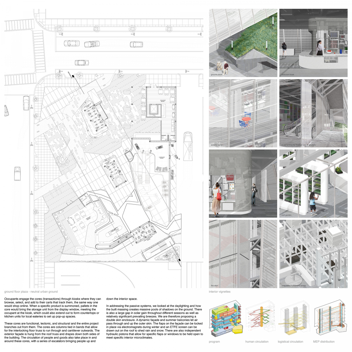
Occupants engage the cores (transactions) through kiosks where they can browse, select, and add to their carts that track them, the same way one would shop online. When a specific product is summoned, pallets in the core would bring the storage unit from the display window, meeting the occupant at the kiosk, which could also extend out to form countertops or kitchen units for local eateries to set up pop-up spaces.
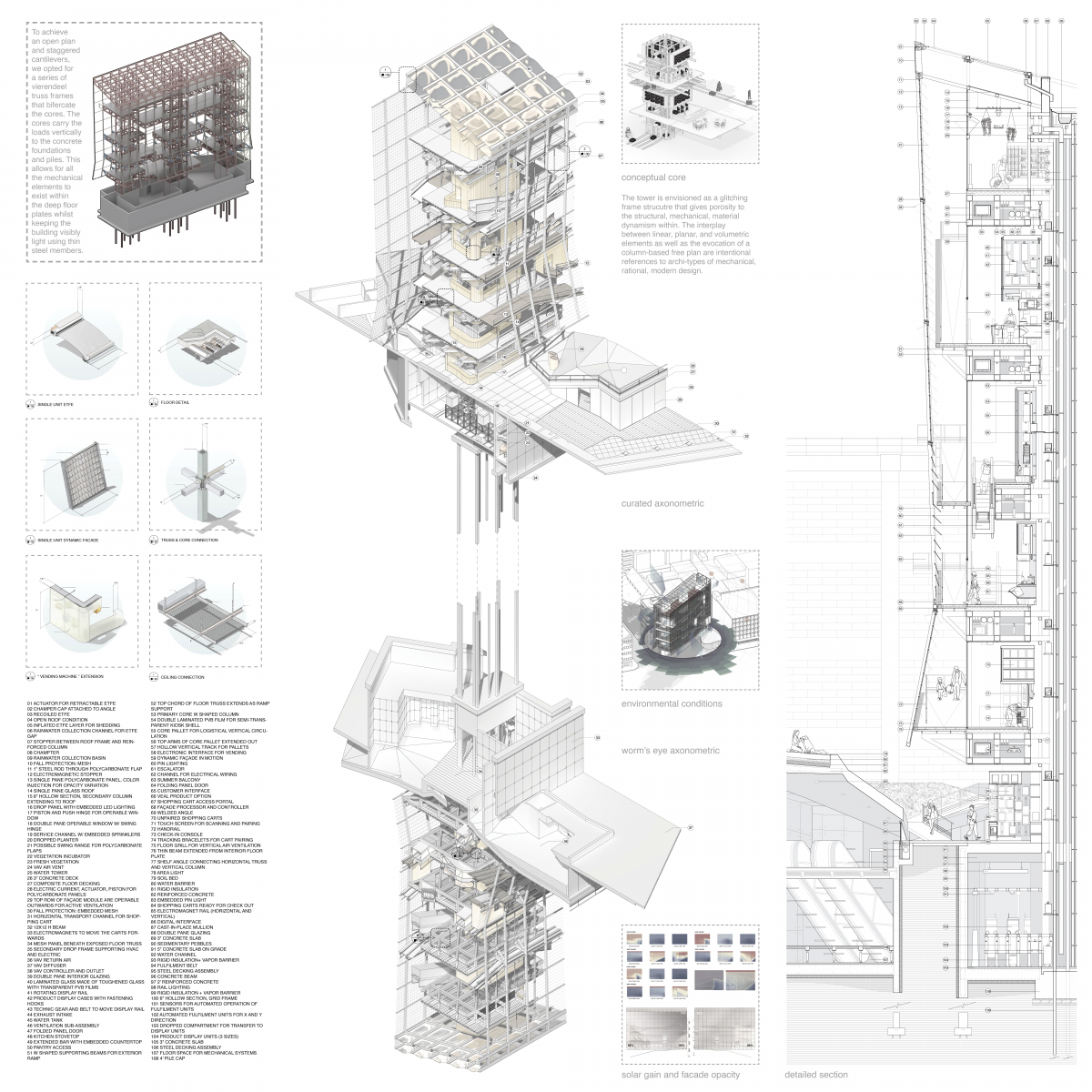
These cores are functional, tectonic, and structural and the entire project branches out from them. The cores are columns tied in bands that allow for the interlocking floor truss to run through and cantilever outwards. The exterior façade is hung from the roof truss and drapes down both sides of the building. The circulation of people and goods also take place in and around these cores, with a series of escalators bringing people up and down the interior space.
In addressing the passive systems, we looked at the daylighting and how the built massing creates massive pools of shadows on the ground. There is also a large gap in solar gain throughout different seasons as well as relatively significant prevailing breezes. We are therefore proposing a double skin enclosure. A dynamic façade and summer balconies let air pass through and up the outer skin. The flaps on the façade can be locked in place via electromagnets during winter and an ETFE screen can be drawn out on the roof to shed rain and snow. There are also independent hydraulic pistons that allow for specific flaps or windows to be held open to meet specific interior microclimates.
The exterior dynamic façades are polycarbonate flaps held in 11×11 frames that have thin rods running through and stoppers in front. As the prevailing breeze moves along the façade, it would cause the entire skin to flicker, thereby turning the vending machine and the people inside it into moving art of different transparencies.
The polycarbonate panels also have different opacities depending on the amount of annual glare the façade receives. The result is basically a gradation where pockets of the interior are more visible to let more daylight in.
At the urban scale, the project in site would read as a mass spectacle, a billboard, a pinball vending machine that signifies the potential dynamism of downtown Syracuse, performing as an essential civic node for locals, and an attraction point that can in turn activate and reinvigorate the city.

Honorable Mention
Arrival
Student: Matt Yearout
Faculty Sponsor: Awilda Rodriguez Carrion
Institution: Oklahoma State University
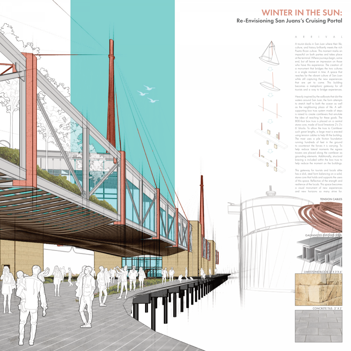
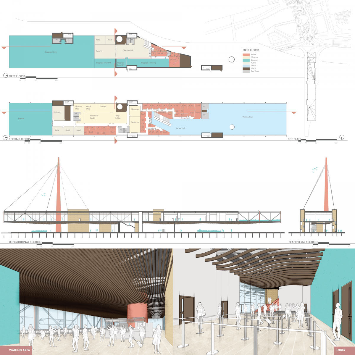
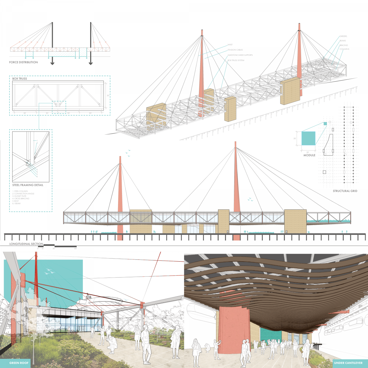
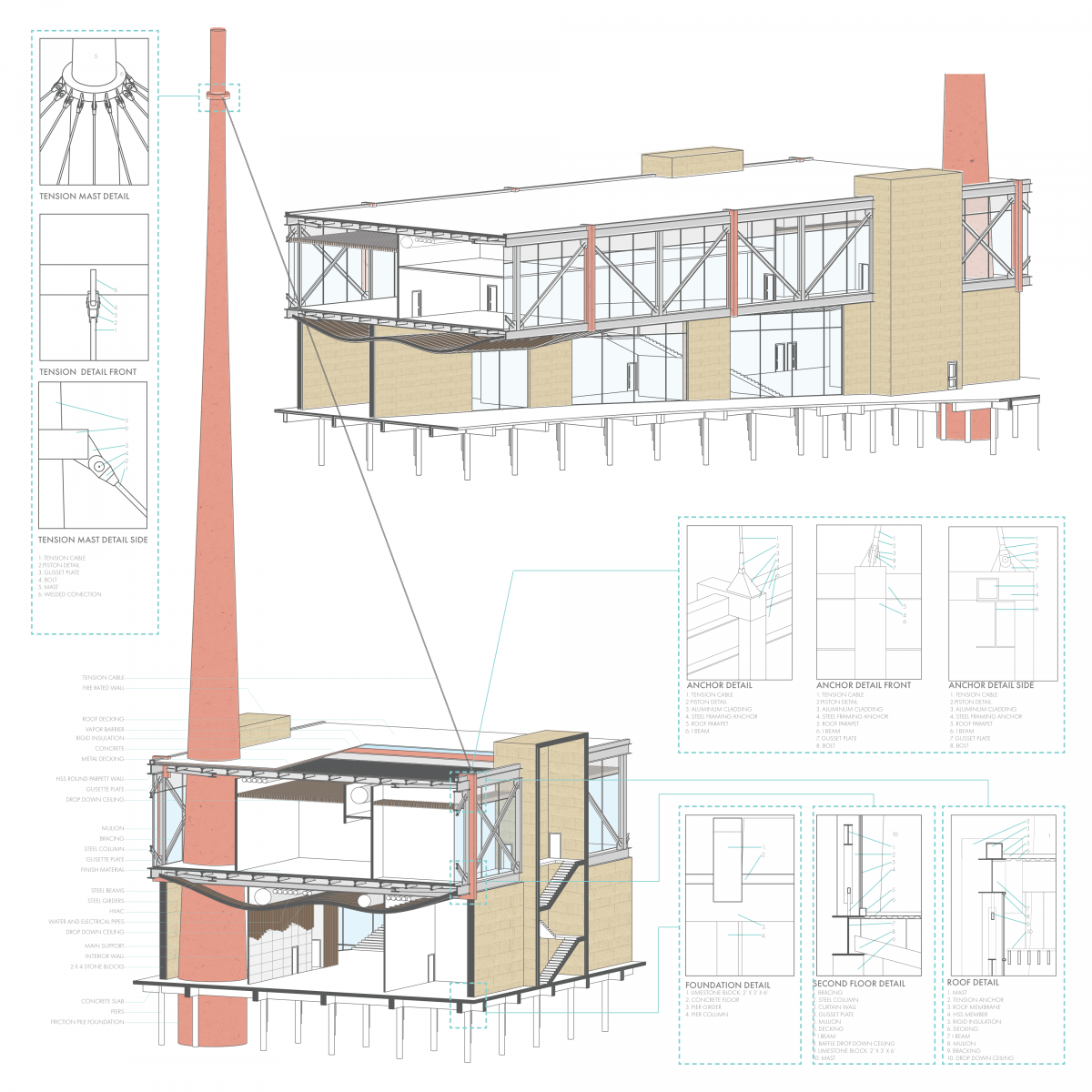
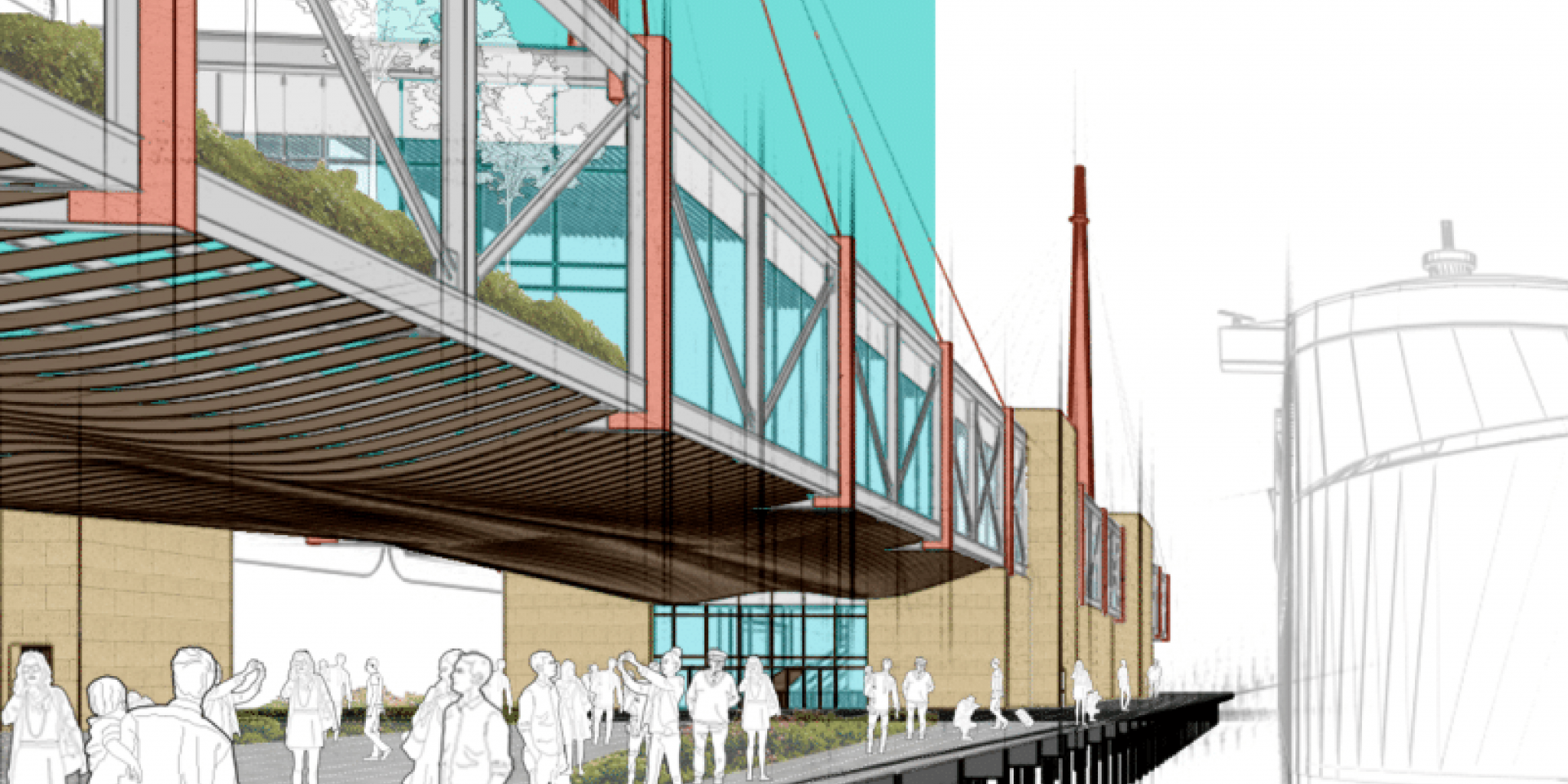
Arrival is an honorable mention for its unique structural system. The design does a great job blending architecture with structural function, confirming the architectural possibilities with steel.
Project Description
A tourist docks in San Juan where their life, culture, and history brilliantly meet the rich Puerto Rican culture. This moment marks an impact on both parties and takes place at the terminal. Where journeys begin, some end, but all leave an impression on those who have this experience. The creation of a monument bridges the two cultures in a single moment in time. A space reaches for the vibrant culture of San Juan while still capturing the new experiences that are yet to come. This building becomes a metaphoric gateway for all tourists and a way to bridge experiences.
Heavily inspired by the sailboats that dot the waters around San Juan, the form attempts to stretch to both the ocean as well as the neighboring plaza of life. A self-supporting box truss system made of steps is raised to create cantilevers that emulate the idea of reaching for these goals. The 800-foot box truss is placed on a central stone core, made of local limestone 2’x 3’x 6’ blocks. To allow the truss to Cantilever such great lengths, a large mast is erected using tension cables to help lift the building. The mast uses a pile friction foundation running hundreds of feet in the ground to counteract the forces it is carrying. To help reduce lateral moments, the egress towers are placed along the cantilever as grounding elements. Additionally, structural bracing is included within the box truss to help reduce the moment on the buildings.
This gateway for tourists and locals alike has a slick, steel form balancing on a solid, stone core that holds and supports the users of this space, reflective of the strength and resilience of the locals. This space becomes a visual monument of new experiences and new horizons so many strive for.

Honorable Mention
Water Museum – W/M
Student: Karalina Shastavets
Faculty Sponsor: Daniel Brown
Institution: Savannah College of Art and Design
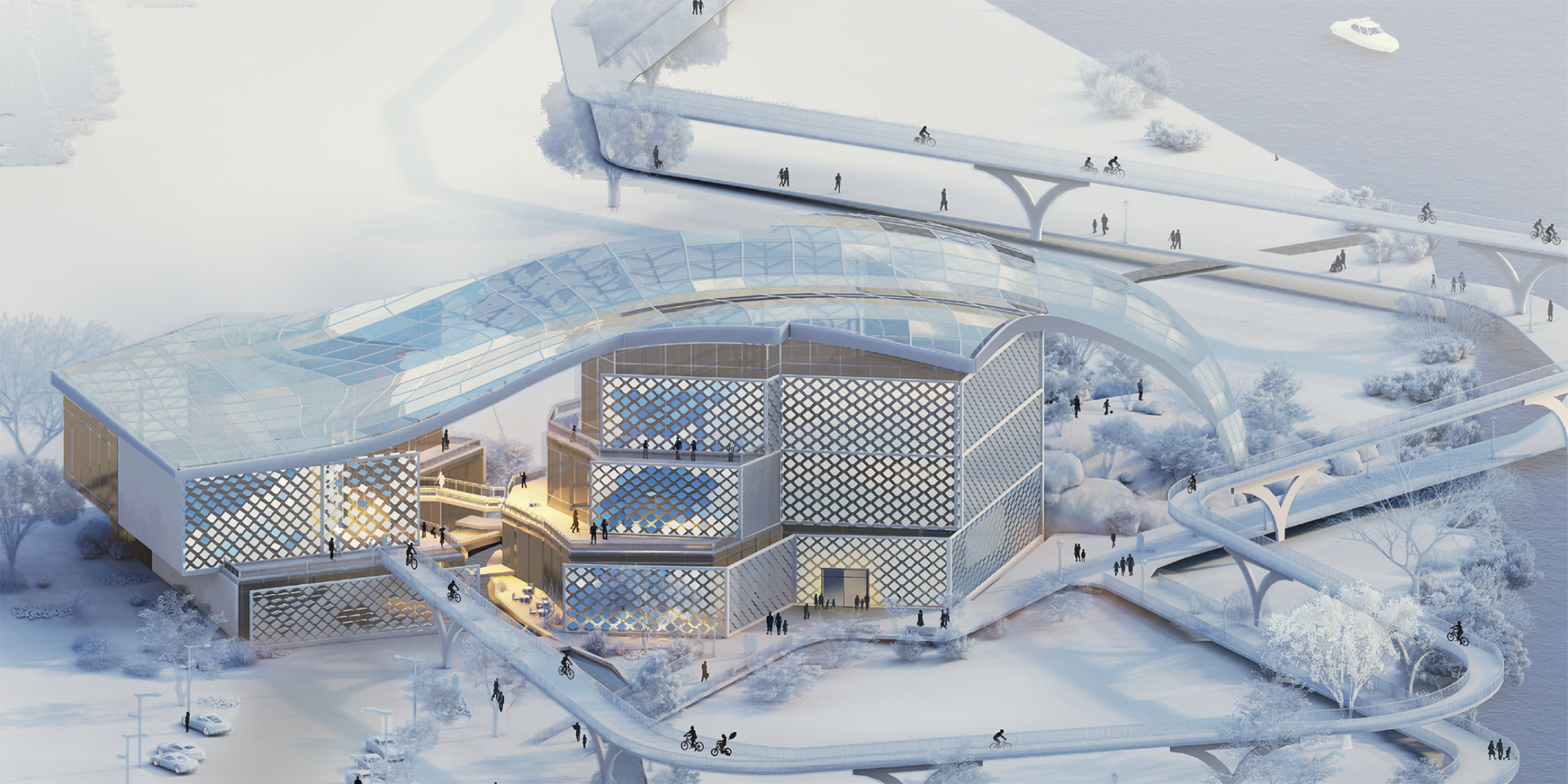
Water Museum – W/M receives an honorable mention with explicitly using steel as an exterior façade. The design encompasses a thorough study of environment and site condition integration into the overall project.
Project Description
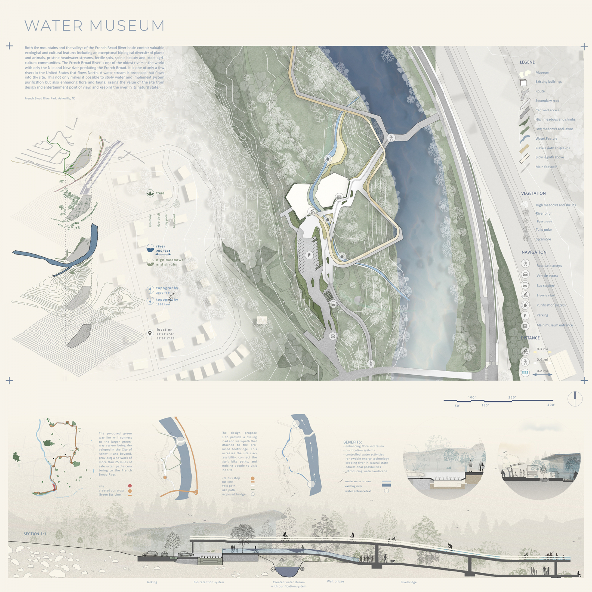
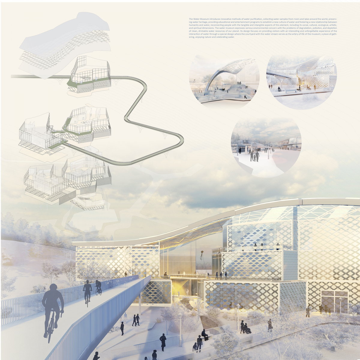
The Water Museum (W/M) introduces innovative methods of water treatment, collects water samples from rivers and lakes around the world, and provides educational and entertainment programs. The W/M visitors and corporate customers receive thought-provoking exposure to water, including engaging water experiments, inventions, installations, and teaching, that reveal the value of pursuing water conservation. The Water Museum expresses serious environmental concern about the degradation, pollution, and depletion of clean drinking water resources on our planet.
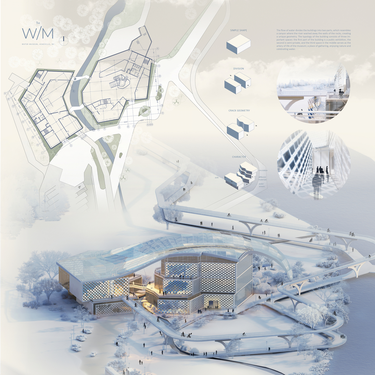
The W/M is located in Asheville, NC near French Broad River which is one of the oldest rivers in the world. The water stream is created that flows into the site. This not only makes it possible to study water and implement system purification but also enhancing flora and fauna and raising the value of the site from design and entertainment point of view. The flow of water divides the Water Museum into two parts, which resembles a canyon where the river washed away the walls of the rocks, creating a unique geometry. The typology of the building consists of three important spaces: the first part of the building is a public exhibition, the second is semi-private, and the third space in the middle serves as the artery of life of the museum: a place of gathering, enjoying nature and celebrating water.
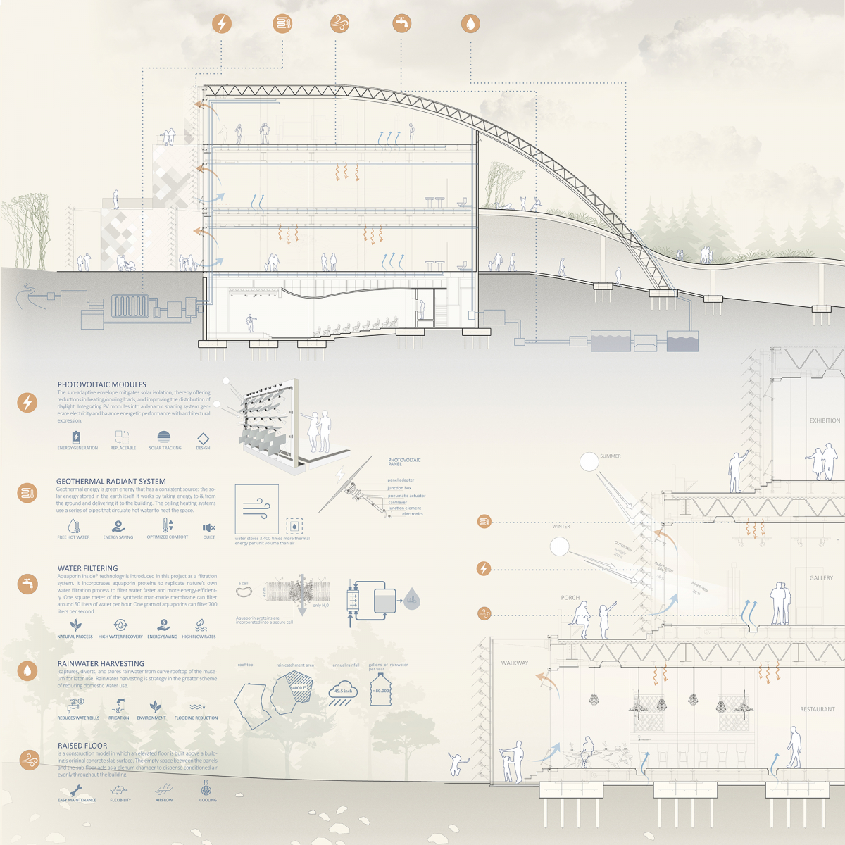
The application of sustainable practices is an important part of the museum’s function and design. The sun-adaptive envelope, water filtering, rainwater harvesting, and geothermal systems make the building sustainable and unique. Integrating PV adaptive modules into a dynamic shading system generate electricity and balance energetic performance with architectural expression. The innovative filtration system incorporates aquaporin proteins to replicate nature’s own water filtration process to filter water faster and more energy-efficiently. Rainwater system captures, diverts, and stores rainwater from curve rooftop.
The W/M seeks a new culture of water and the strengthening of a new relationship between humanity and water, including its social, cultural, environmental, artistic, and spiritual dimensions.

Honorable Mention
Aspire
Students: Madison Waldron & Jacob Forst
Faculty Sponsors: Pasquale De Paola, Kevin Singh, & Wei Zhao
Institution: Louisiana Tech University
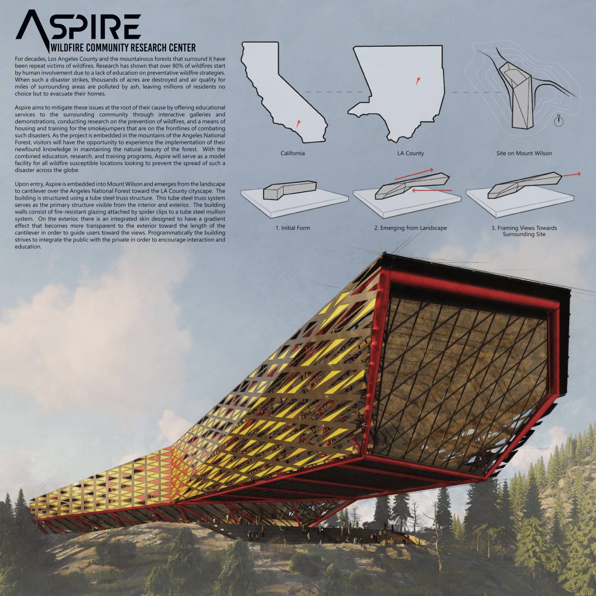
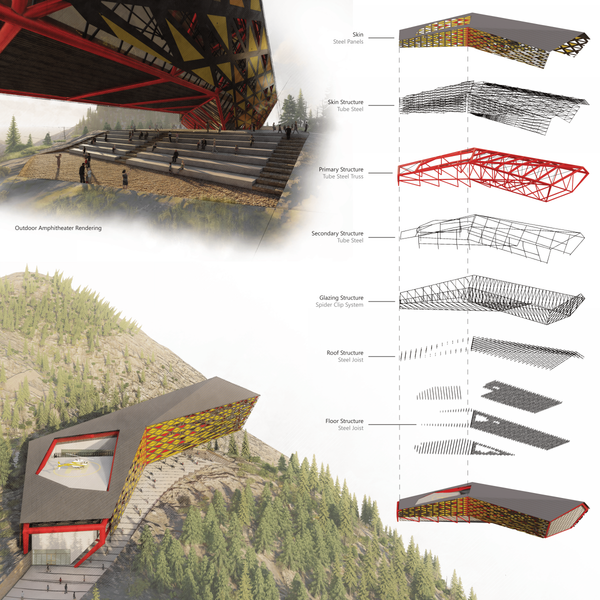
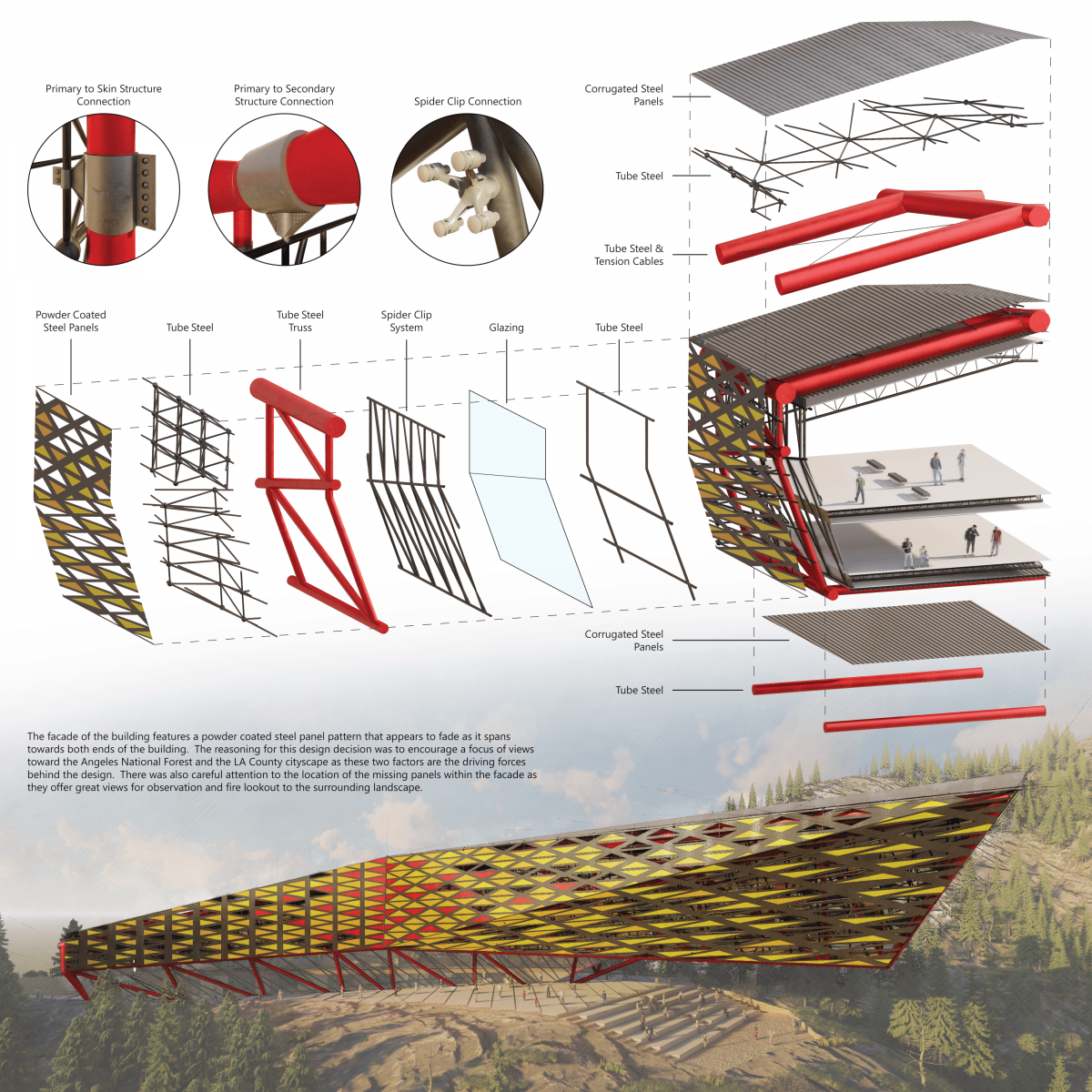
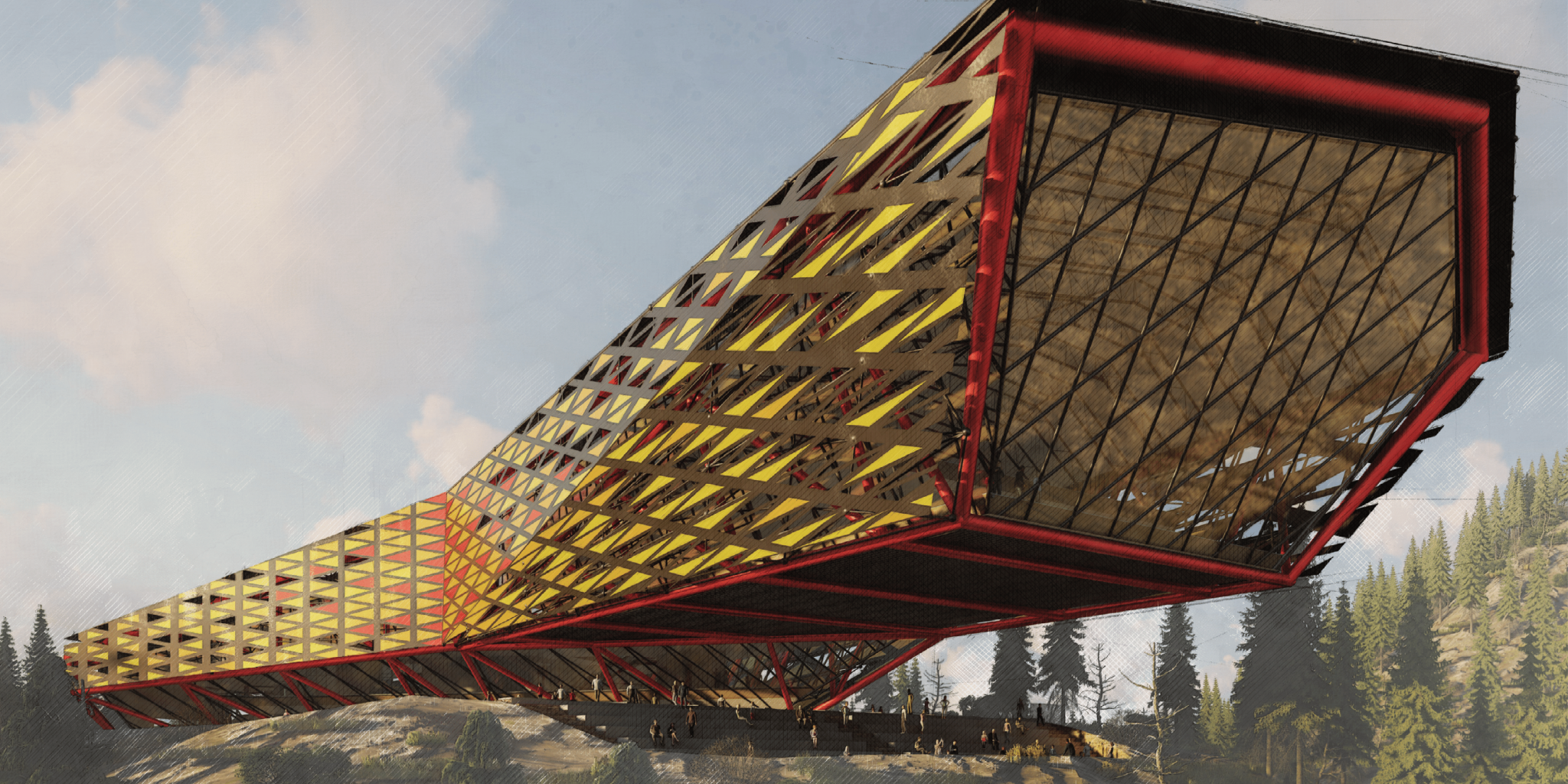
Aspire receives an honorable mention with a thorough study of structure and well developed drawings. The trusses span the entire height of the building to allow more flexibility for the cantilever which is highly commendable.
Project Description
For decades, Los Angeles County and the mountainous forests that surround it have been repeat victims of wildfires. Research has shown that over 80% of wildfires start by human involvement due to a lack of education on preventative wildfire strategies. When such a disaster strikes, thousands of acres are destroyed and air quality for miles of surrounding areas are polluted by ash, leaving millions of residents no choice but to evacuate their homes.
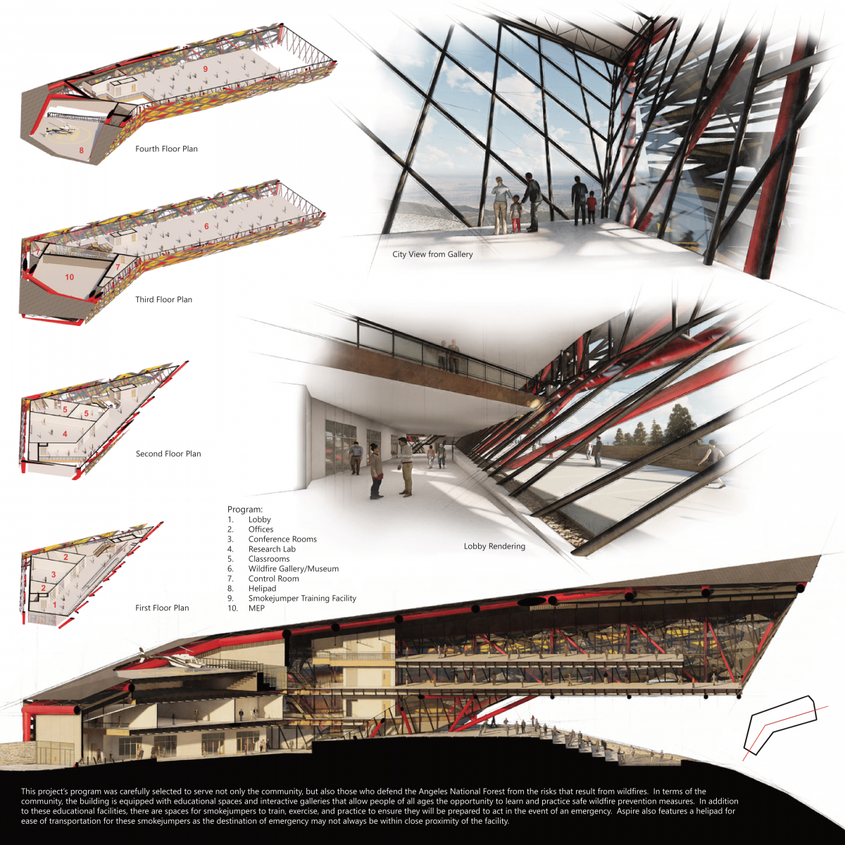
Aspire aims to mitigate these issues at the root of their cause by offering educational services to the surrounding community through interactive galleries and demonstrations, conducting research on the prevention of wildfires, and a means of housing and training for the smokejumpers that are on the frontlines of combating such disasters. As the project is embedded in the mountains of the Angeles National Forest, visitors will have the opportunity to experience the implementation of their newfound knowledge in maintaining the natural beauty of the forest. With the combined education, research, and training programs, Aspire will serve as a model facility for all wildfire susceptible locations looking to prevent the spread of such a disaster across the globe.
Upon entry, Aspire is embedded into Mount Wilson and emerges from the landscape to cantilever over the Angeles National Forest toward the LA County cityscape. The building is structured using a tube steel truss structure. This tube steel truss system serves as the primary structure visible from the interior and exterior. The building walls consist of fire-resistant glazing attached by spider clips to a tube steel mullion system. On the exterior, there is an integrated skin designed to have a gradient effect that becomes more transparent to the exterior toward the length of the cantilever in order to guide users toward the views. Programmatically the building strives to integrate the public with the private in order to encourage interaction and education.

Honorable Mention
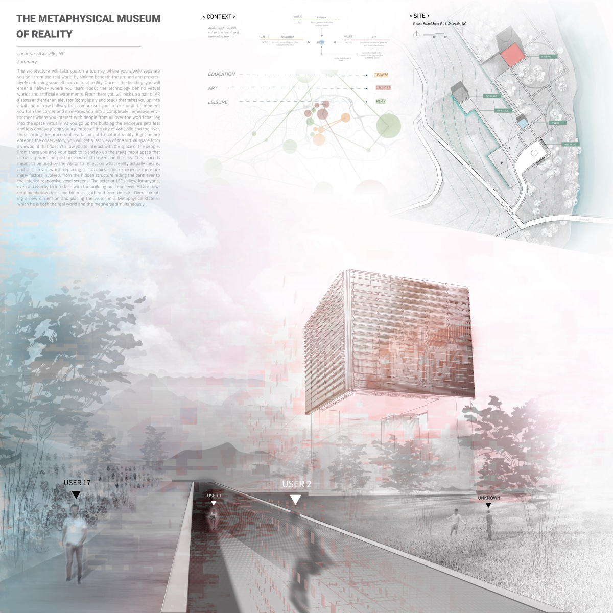
The Metaphysical Museum of Reality
Student: Daniel Jaraba
Faculty Sponsor: Daniel Brown
Institution: Savannah College of Art and Design
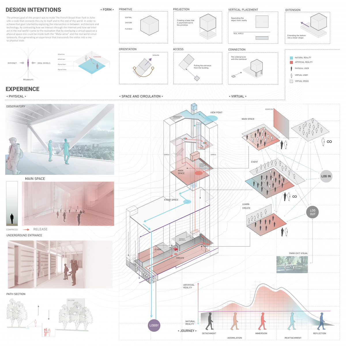
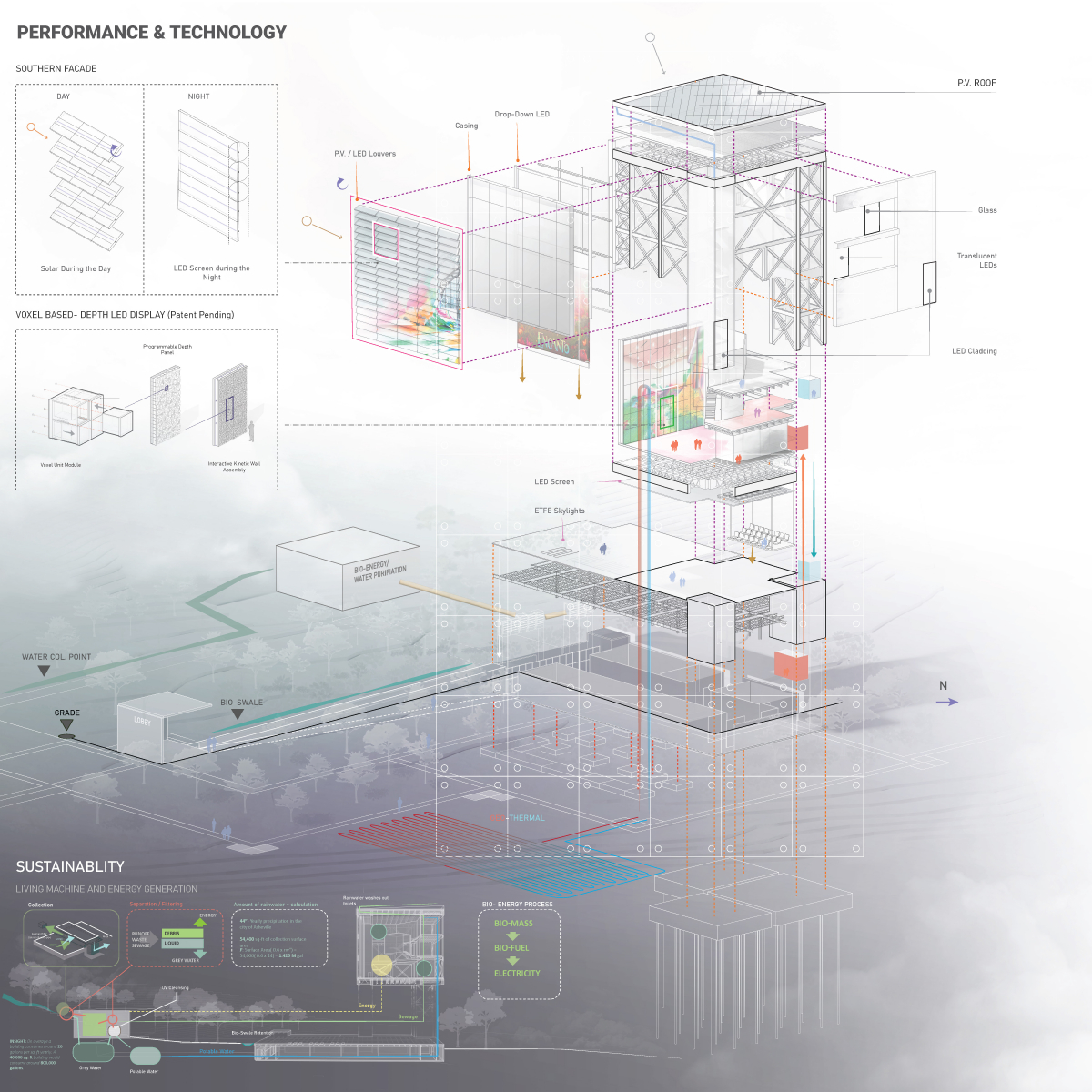
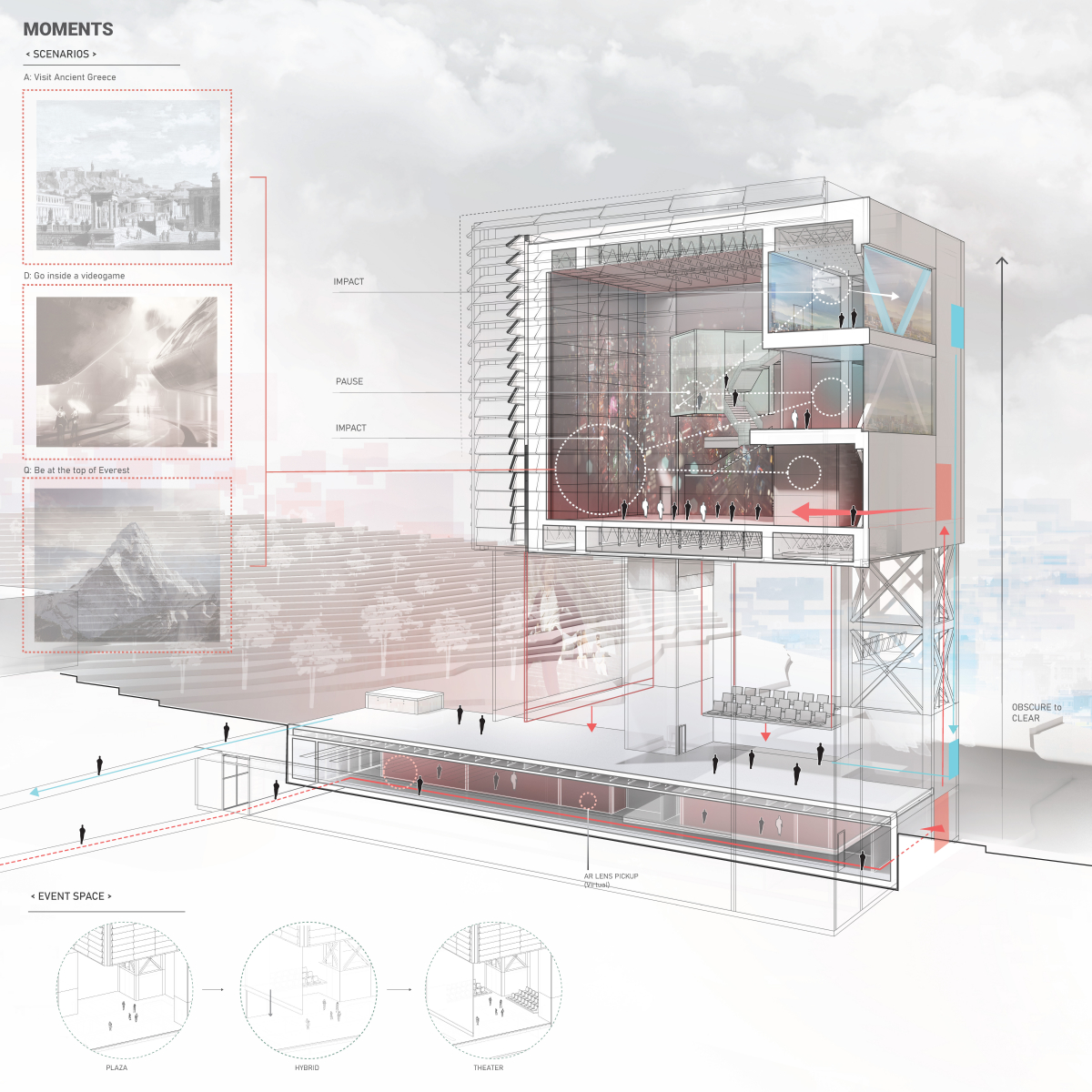
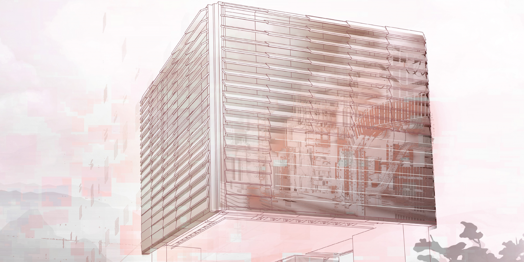
The Metaphysical Museum of Reality is an honorable mention with fantastic visuals and a stunning architectural design. The building as a whole is beautiful and drawn through the clear sections and diagrams.
Project Description
The primary goal of The Metaphysical Museum of Reality was to make The French Broad River Park in Asheville, North Carolina, a node that connects the city to itself and to the rest of the world. In order to achieve that, I started exploring the intersection between architecture and technology. By contrasting how we interact through the Internet and how we interact in the real world, I came to the realization that by overlaying a virtual space on a physical space, one could be inside both the “Meta-verse” and the real world simultaneously, thus generating an experience that transcends the visitor into a metaphysical state.
“When you first approach the building, the architecture takes you on a journey where you slowly separate yourself from the real world by sinking beneath the ground, thus, progressively detaching your mind from natural reality. Once in the building, you will enter a hallway where you learn about the technology behind virtual worlds and artificial environments. From there, you will pick up a pair of AR glasses and enter an elevator (completely enclosed) that takes you up into a tall and narrow hallway that compresses your senses until the moment you turn the corner, and it releases you into a completely immersive environment where you interact with people from all over the world that log into the space virtually. As you go up the building, the enclosure gets less and less opaque, giving you a glimpse of the city of Asheville and the river, thus starting the process of reattachment to natural reality. Right before entering the observatory, you will get a final view of the virtual space from a viewpoint that doesn’t allow you to interact with the interface or the people. From there, you turn around and go up the stairs into a space that allows a prime and pristine view of the river and the city. This place is meant to be used by the visitor to reflect on what reality actually means, and if it is even worth replacing it.”
To achieve this holistic experience, there are many factors involved, from the hidden structure hiding the cantilever to the interior, responsive voxel screens. Externally, the LEDs allow for anyone, even a passerby, to interface with the building on some level which in turn democratizes the space. Sustainability within the project was addressed by cladding the building with photovoltaics and by using bio-mass gathered from the site to generate electricity.
All in all, the form, the values, and the technology all work together to make this museum a place that celebrates the creative culture of Asheville and shares it with the world.
Competition Partners
Edwin Hernández
Programs Coordinator
ehernandez@acsa-arch.org
202.785.2324
Eric Wayne Ellis
Senior Director of Operations and Programs
eellis@acsa-arch.org
202.785.2324

 Study Architecture
  ProPEL